4
$\begingroup$

I am working on a project in R using the General Social Survey that charts the numbers of one religious group who convert to another (Catholic $\rightarrow$ Evangelical, Evangelical $\rightarrow$ None, None $\rightarrow$ Catholic, Catholic $\rightarrow$ None, etc.). I'd like to create a graphic representation of this showing the relative sizes of the populations that are making these shifts. Currently I'm using a stacked bar chart but it is difficult to read. Is there a better chart to show the flow of data from one state to another?

code for data set

Region  <- rep(c('Midwest'),9)
RELIG16 <- rep(c('Protestant','Catholic','None'),3)
OutRel  <- rep(c('Protestant'), 3) 
OutRel  <- append(OutRel, rep(c('Catholic'),3))
OutRel  <- append(OutRel, rep(c('None'),3))
value   <- rep(c(77.35, 10.25, 18.18),3)
df      = data.frame(Region, RELIG16, OutRel, value)

ggplot(df, aes(x=RELIG16, y=value, fill=OutRel)) + geom_bar(stat="identity") +
  xlab("Original Religious Affilliation") + ylab("Percentage") +
  scale_fill_discrete(name="Conversion\nType",
                  # breaks=c("protestant.prop", "catholic.prop", "none.prop"),
                  labels=c("to Protestant", "to Catholicism", "to None")) +
  ggtitle("Conversion of All Millennials By Region")
$\endgroup$
3
  • 2
    $\begingroup$ Stack Overflow is a site for help w/ R code. If you want to know what type of graph is appropriate for a certain type of data, you should ask on Cross Validated (the SE site for statistics, data visualization, etc.). If you wait, we will try to migrate this for you. In the interim, it would help if you could provide a reproducible example. $\endgroup$ Commented Nov 13, 2016 at 14:11
  • 1
    $\begingroup$ You might take a look at chord plots: stackoverflow.com/questions/30708674/… $\endgroup$
    – lawyeR
    Commented Nov 13, 2016 at 14:55
  • 1
    $\begingroup$ I would also investigate a sankey diagram and suggest riverplot $\endgroup$
    – Jake Kaupp
    Commented Nov 13, 2016 at 17:03

1 Answer 1

4
$\begingroup$

Your data are a little odd to me. I'm guessing that value is intended to be the proportion of members of a given religion who were believers in the RELIG16 religion previously. I tweaked the numbers so they added up to 100%.

Region  <- rep(c('Midwest'),9)
RELIG16 <- rep(c('Protestant','Catholic','None'),3)
OutRel  <- rep(c('Protestant'), 3) 
OutRel  <- append(OutRel, rep(c('Catholic'),3))
OutRel  <- append(OutRel, rep(c('None'),3))
value   <- c(77.35, 15.25, 7.4)[c(1:3,2,1,3,2,3,1)]
df      = data.frame(Region, RELIG16, OutRel, value)
df
#    Region    RELIG16     OutRel value
# 1 Midwest Protestant Protestant 77.35
# 2 Midwest   Catholic Protestant 15.25
# 3 Midwest       None Protestant  7.40
# 4 Midwest Protestant   Catholic 15.25
# 5 Midwest   Catholic   Catholic 77.35
# 6 Midwest       None   Catholic  7.40
# 7 Midwest Protestant       None 15.25
# 8 Midwest   Catholic       None  7.40
# 9 Midwest       None       None 77.35

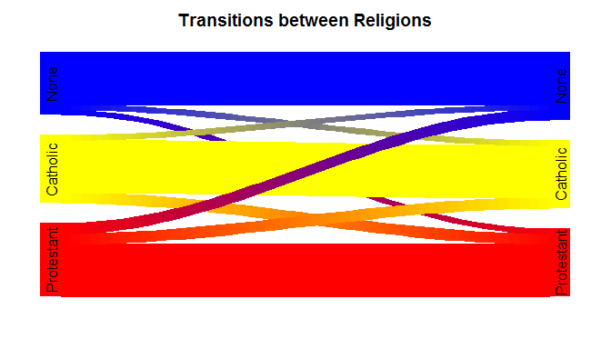
Since your data are flows, I agree with @JakeKaupp that a Sankey diagram is most appropriate. I further agree about using the riverplot package in R. There are various packages for making Sankey diagrams in R (although I am not familiar with a ggplot2 version), but I am most familiar with riverplot. Here is an example Sankey diagram with your (modified) data:

library(riverplot)
eg = data.frame(N1=rep(letters[1:3], times=3), 
                N2=rep(letters[4:6], each=3), 
                Value=df$value)
nd = data.frame(ID=letters[1:6], x=rep(1:2, each=3), labels=df[1:6,2])
rp = makeRiver(nodes=nd, edges=eg, node_styles=list(
                   a=list(col="red"), b=list(col="yellow"), c=list(col="blue"), 
                   d=list(col="red"), e=list(col="yellow"), f=list(col="blue") ))
windows(height=4, width=7)
  plot(rp, plot_area=.7, gravity="bottom")
  title(main="Transitions between Religions", line=-1.5)

enter image description here


If you had a matrix with the actual numbers of people in each combination of before and after religious preferences, you could use standard methods for visualizing contingency tables, such as mosaic plots or possibly correspondence analysis.

$\endgroup$

Your Answer

By clicking “Post Your Answer”, you agree to our terms of service and acknowledge you have read our privacy policy.

Not the answer you're looking for? Browse other questions tagged or ask your own question.