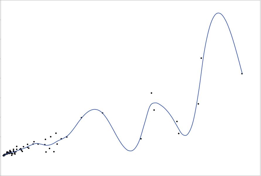
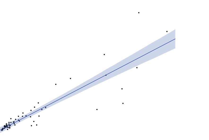
Polynomials are notoriously bad at extrapolating trends. They are mathematically bound to go to $\pm \infty$ whereas our intuition of trends does not. This should be a cautionary tale for anyone considering splines for inference or prediction. Looking at your graphic, I am certain that is displaying overfitting, which applies to your question whether it is for inferential or predictive statistics.
You can penalize your splines, like with a LOESS smoother, if your desire is to generate a descriptive non-parametric summary of a possibly non-linear trend.
In your comments you note you transform $Y$ to log and the trend is non-linear. It seems to me your visual inspection of these data is heavily weighted by the high influence/leverage points in the tails. It seems less than 5% of the data lie in the right 2/3rds of the graphic. I would suggest graphing these data with a log transform applied to the $X$ axis. If you would like to find a single polynomial function which relates $X$ to $Y$ in this graphic, consider the use of fractional polynomials, rather than fitting scads of models higgledy piggledy.


