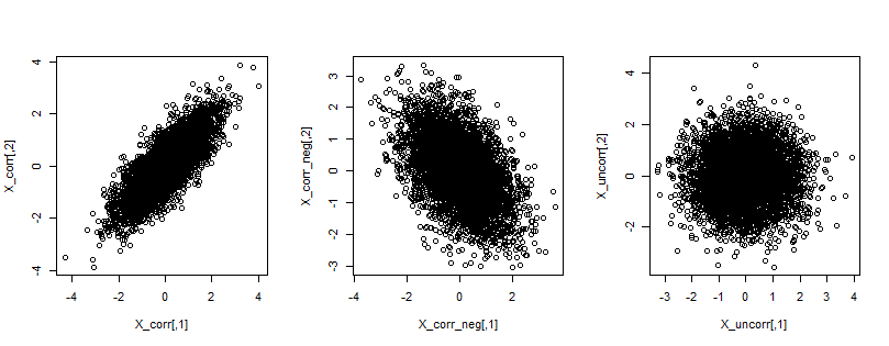
Actually this is pretty simple. Recall that correlation measures linear relationship between two variables. If variables are correlated, then the bivariate plot is more or less skew (depending on the value of correlation), while in case of non-correlated variables, it is "random" and symmetric.
You can find an illustration below, where on the first plot you see quite strong positive correlation, on the second one negative correlation, and on the third plot no correlation. While the shapes of the point-clouds will not always be roundish (here they are since I used multivariate normal distribution), their skewness will suggest correlation.

set.seed(123)

library(mvtnorm)

partmp <- par(mfrow = c(1,3))

Sigma_corr <- matrix(
  c(
    1,   0.8,
    0.8, 1
  ), ncol = 2, byrow = TRUE
)

X_corr <- rmvnorm(5000, sigma = Sigma_corr)
cor(X_corr)
plot(X_corr)

Sigma_corr_neg <- matrix(
  c(
    1,   -0.5,
    -0.5, 1
  ), ncol = 2, byrow = TRUE
)

X_corr_neg <- rmvnorm(5000, sigma = Sigma_corr_neg)
cor(X_corr_neg)
plot(X_corr_neg)

Sigma_uncorr <- matrix(
  c(
    1,   0.0,
    0.0, 1
  ), ncol = 2, byrow = TRUE
)

X_uncorr <- rmvnorm(5000, sigma = Sigma_uncorr)
cor(X_uncorr)
plot(X_uncorr)

par(partmp)

