0
$\begingroup$

I have a dataset composed of 2 factors of several levels each (i.e. exercise[A-B-C] x muscle [1-2-3-4-5-6]. I'm interested on the effect of the different exercises (A,B,C) on the muscle activation amplitude (i.e. 6 different muscles).

After performing the Analysis of Variance of Aligned Rank Transformed Data I found a significant interaction exercise x muscle. Thus, I tested (post hoc) differences of differences for the interaction term (pairwise comparisons).

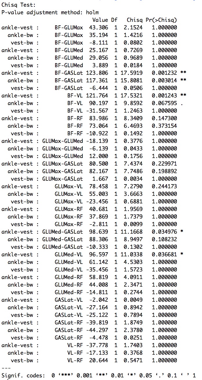
I obtained some significant results but I'm struggling with the interpreation. Below an example of the statistical outcome:

A - B : 1 - 3 p = 0.001 ***; A - C : 1 - 3 p = 0.003 **; B - C : 1 - 3 p = 1;

Basically, we can ask, is the difference A - B different when muscle = 1 compared to when muscle = 2? So, that seems ok but what does it mean practically?

Thanks Fig 1 - ANOVA table (non parametric version)

Fig 2 - Post Hoc

$\endgroup$
2
  • $\begingroup$ Could you post the results of your model & the post-hoc comparisons? $\endgroup$
    – mkt
    Commented Jul 30, 2017 at 21:16
  • $\begingroup$ Yes, added above in the original post. The analysis was done using rstudio and the packages were artool [1] and phia. In the original post I have used general codes for factors (i.e. A,B,C, and 1-2-3, etc.), however, actual results report real levels names. [1] depts.washington.edu/madlab/proj/art $\endgroup$
    – gcim82
    Commented Jul 30, 2017 at 22:55

1 Answer 1

1
$\begingroup$

I find that the easiest way to interpret interactions is to either make a table of predicted values or to graph these values for the different levels of the independent variables.

Since you have two categorical variables with 3 and 6 levels, you have 18 combinations. You could make a table with 18 rows, each of which would have the level of the two variables and the prediction of the dependent variable.

You could also graph these values, but you want to be careful to not interpret any graphs as being about continuous data. This thread shows how to do this in ggplot2 in R.

$\endgroup$
1
  • $\begingroup$ Thanks Peter, I have created graphs at first, though because of many combinations I'm struggling with the overall meaning of the statistical outcome. I used lines to show interactions but too many (6) IV make the reading difficult. I'm trying with side-by-side boxplots but I'm unsure whether I should group on the x axis the "muscle" IV or the other way around (still thinking about how to best convey the message and interpret the overall result). Any suggestion? $\endgroup$
    – gcim82
    Commented Jul 31, 2017 at 16:25

Your Answer

By clicking “Post Your Answer”, you agree to our terms of service and acknowledge you have read our privacy policy.

Not the answer you're looking for? Browse other questions tagged or ask your own question.