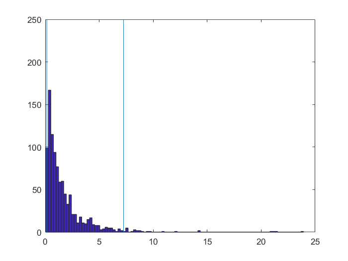
By and large, with this kind of sample size marginal distributions hardly matter to comparisons of means (and the fact that you have paired observations helps too, as you are looking at the pattern of differences).
Backing up first with some discursive remarks: It is common in many fields to compare measurements using two or more methods. When there is some gold standard or benchmark measurement taken to be true, we can say which method is best by comparison. Otherwise we can always look at the extent of agreement.
What I think requires some adjustment of thought here is that we have, as I understand it, not the original measurements (declared irrelevant!) but scores of how well each method did. So agreement of those scores doesn't necessarily mean that the methods agree, just that they are equally good or bad. That difference seems to make some methods for comparing methods less useful than they are with original measurements, or at least to imply that they need to be thought about differently.
We are comparing two distributions but values are paired and that structure needs to be respected. Assuming that I have interpreted the data files correctly, we can draw scatter plots too. Here are the original data:

It is hard to see what is going on there, even with some use of transparency, but the results are naturally consistent with the strongly skewed distributions shown by the OP.
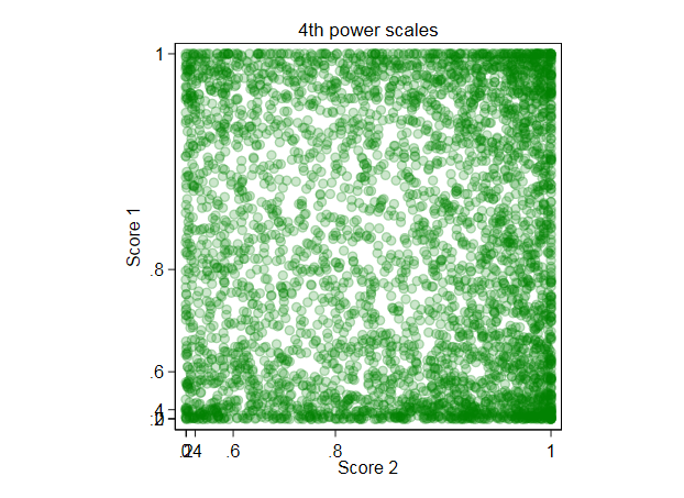
I followed up my own suggestion of fourth powers (which arose from some earlier simulations with loosely similar beta distributions). The fourth power respects the interval $[0, 1]$ as $0^4 = 0$, $1^4 = 1$ and the transformation does not fall over if either extreme ($0$ or $1$) is met. More crucially, it does a reasonable job of making the distributions more symmetric and so a little easier to think about. People might say this transformation is ad hoc and they would be right: translated in 21st century terms, that means "fit for purpose".

Again, it is hard to see much structure there. Although not shown here, various smoothers don't help either. This is good news in so far as all the useful information is implied to be in distribution plots, to which we now turn. Here I use quantile-box plots in which quantile plots (each value against its rank) have median and quartile boxes superimposed. I also add lines for means.

As before we look at transformed scales too.

In short, the conclusion that method 2 is systematically better than method 1 is confirmed as robust under use of mean or median and under use of original and strongly transformed scales.
On the question of significance tests, I suggest that a general solution is to convert this to a different but related problem: find a confidence interval for the mean difference, that mean being something we can calculate on whatever scale we please.
I did this in Stata. The code should seem not too cryptic to those enamoured of other software.
* original measurements: score 1 - score 2
. bootstrap, reps(1000) nodots: mean sdiff
(running mean on estimation sample)

Mean estimation                   Number of obs   =      4,252
                                  Replications    =      1,000

--------------------------------------------------------------
             |   Observed   Bootstrap         Normal-based
             |       Mean   Std. Err.     [95% Conf. Interval]
-------------+------------------------------------------------
       sdiff |    .074044   .0047372      .0647593    .0833286
--------------------------------------------------------------

. estat bootstrap, all

Mean estimation                                 Number of obs     =      4,252
                                                Replications      =       1000

------------------------------------------------------------------------------
             |    Observed               Bootstrap
             |        Mean       Bias    Std. Err.  [95% Conf. Interval]
-------------+----------------------------------------------------------------
       sdiff |   .07404398  -.0000625   .00473716    .0647593   .0833286   (N)
             |                                       .0649868   .0836285   (P)
             |                                       .0650588   .0838786  (BC)
------------------------------------------------------------------------------
(N)    normal confidence interval
(P)    percentile confidence interval
(BC)   bias-corrected confidence interval

* difference of 4th powers
. gen pdiff = p4_score2 - p4_score1

. bootstrap, reps(1000) nodots : mean pdiff
(running mean on estimation sample)

Mean estimation                   Number of obs   =      4,252
                                  Replications    =      1,000

--------------------------------------------------------------
             |   Observed   Bootstrap         Normal-based
             |       Mean   Std. Err.     [95% Conf. Interval]
-------------+------------------------------------------------
       pdiff |   .1058628   .0075672      .0910314    .1206942
--------------------------------------------------------------

. estat bootstrap, all

Mean estimation                                 Number of obs     =      4,252
                                                Replications      =       1000

------------------------------------------------------------------------------
             |    Observed               Bootstrap
             |        Mean       Bias    Std. Err.  [95% Conf. Interval]
-------------+----------------------------------------------------------------
       pdiff |    .1058628   .0004516   .00756718    .0910314   .1206942   (N)
             |                                       .0910895   .1211185   (P)
             |                                       .0905725   .1203873  (BC)
------------------------------------------------------------------------------
(N)    normal confidence interval
(P)    percentile confidence interval
(BC)   bias-corrected confidence interval
Firing all possible shotguns, it can be seen that no reasonable confidence interval goes anywhere near 0, so even extreme sceptics should be convinced that means differ.
EDIT: These comments appeared in an earlier version but now seem
off-target. They are kept for anyone trying to make sense of earlier discussion.
Feed your values to a paired $t$-test and to more appropriate beta
regressions and to generalised linear models with binomial
distributions, power links and robust standard errors. My prediction
is that figures of merit (e.g. $t$ or $z$ statistics) will remain
about the same.
What is more diverting is that your plot of differences suggests much
more structure than just method 2 scoring higher. If that's true, then
comparison of means alone is a very limited basis for comparison. I
would want to see method 2 smoothed as a function of method 1 and vice
versa. There are also pertinent exploratory methods that treat the
outcomes symmetrically. See e.g. this paper.
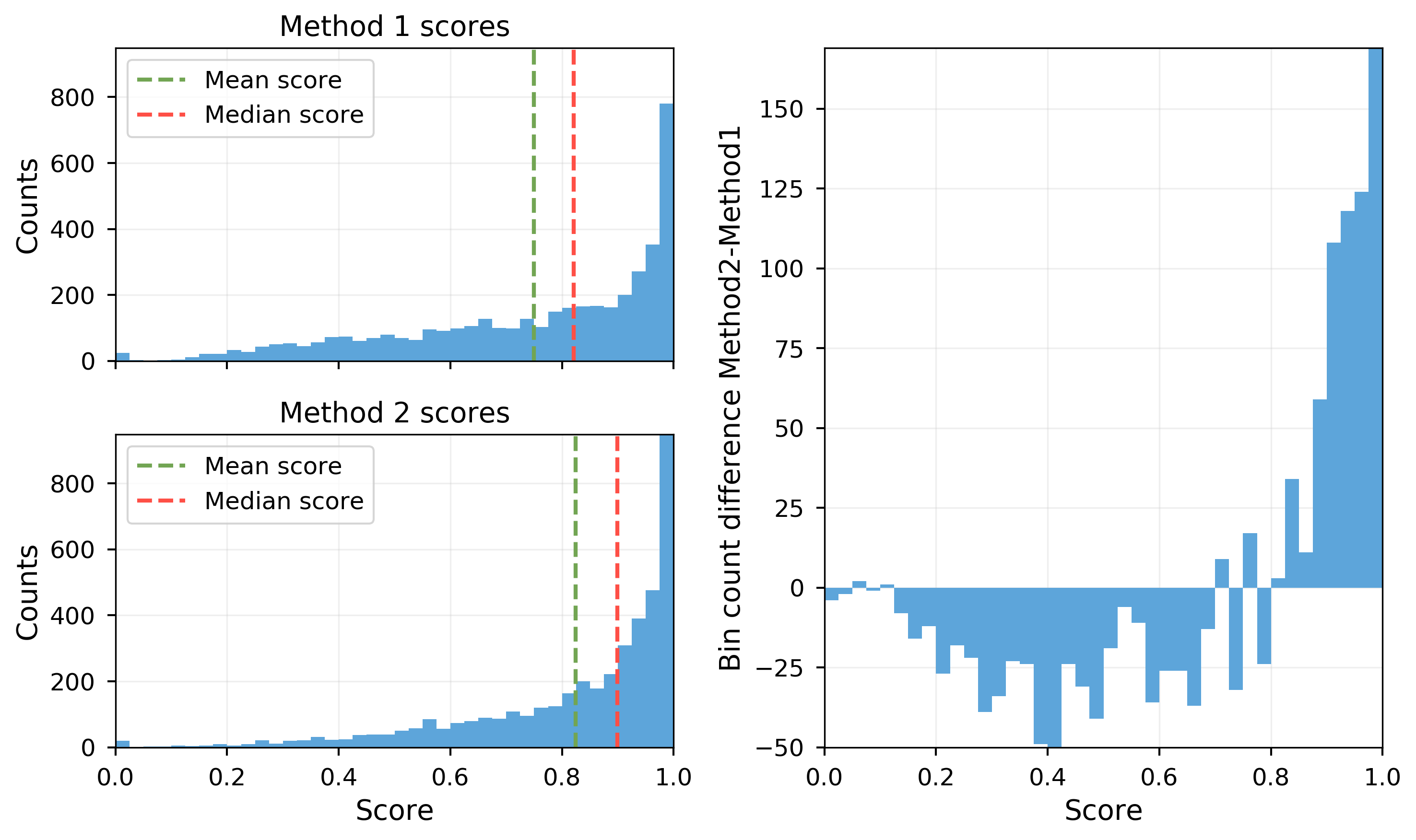 The sample means of method 1 and 2 are calculated as $\mu_1=0.75$, $\mu_2=0.824$ and the sample standard deviations are $\sigma_1=0.236$, $\sigma_2=0.194$.
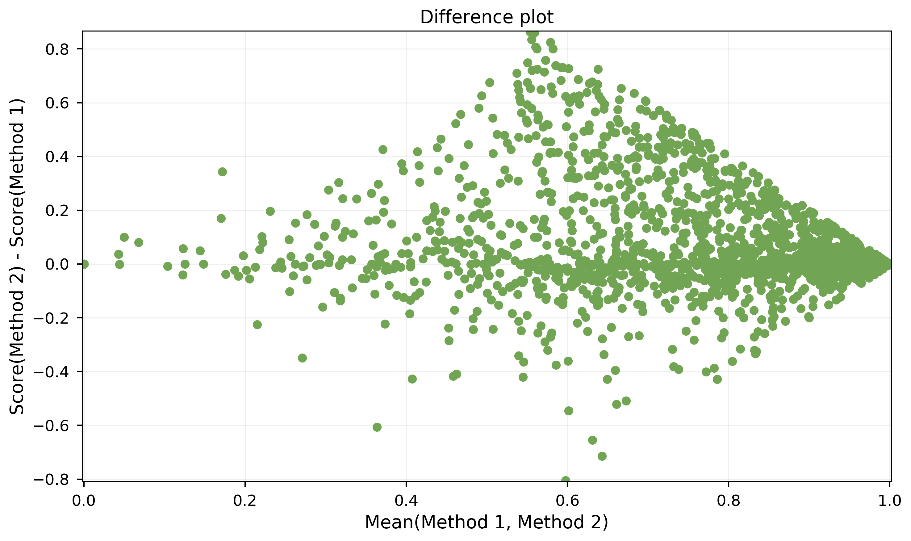 For each sample $i\in[1,n]$ the two scores $s_1^{(i)}$ and $s_2^{(i)}$ of method 1 and method 2 are used to calculate the difference $d_i=s_2^{(i)} - s_1^{(i)}$ and the mean $m_i=(s_1^{(i)}+s_2^{(i)})\cdot 0.5$ The point $(m_i/d_i)$ is then plotted.

