9
$\begingroup$

I have air temperature measurements from two fixed locations measured at hourly intervals. The code below is a random set of numbers used to represent the format of my data:

set.seed(1)
RandData <- rnorm(8760*2,sd=10)
Locations <- rep(c('UK','France'),each=8760)

Date = seq(from=as.POSIXct("1991-01-01 00:00"), 
              to=as.POSIXct("1991-12-31 23:00"), length=8760)

Final <- data.frame(Loc = Locations,
                    Doy = as.numeric(format(Date,format = "%j")),
                    Tod = as.numeric(format(Date,format = "%H")),
                    Temp = RandData)

I can plot the variation in temperature as a funtion of day of year with the following code:

require(lattice)
xyplot(Temp~Doy | Loc, data = Final, col = "black", type = "l")

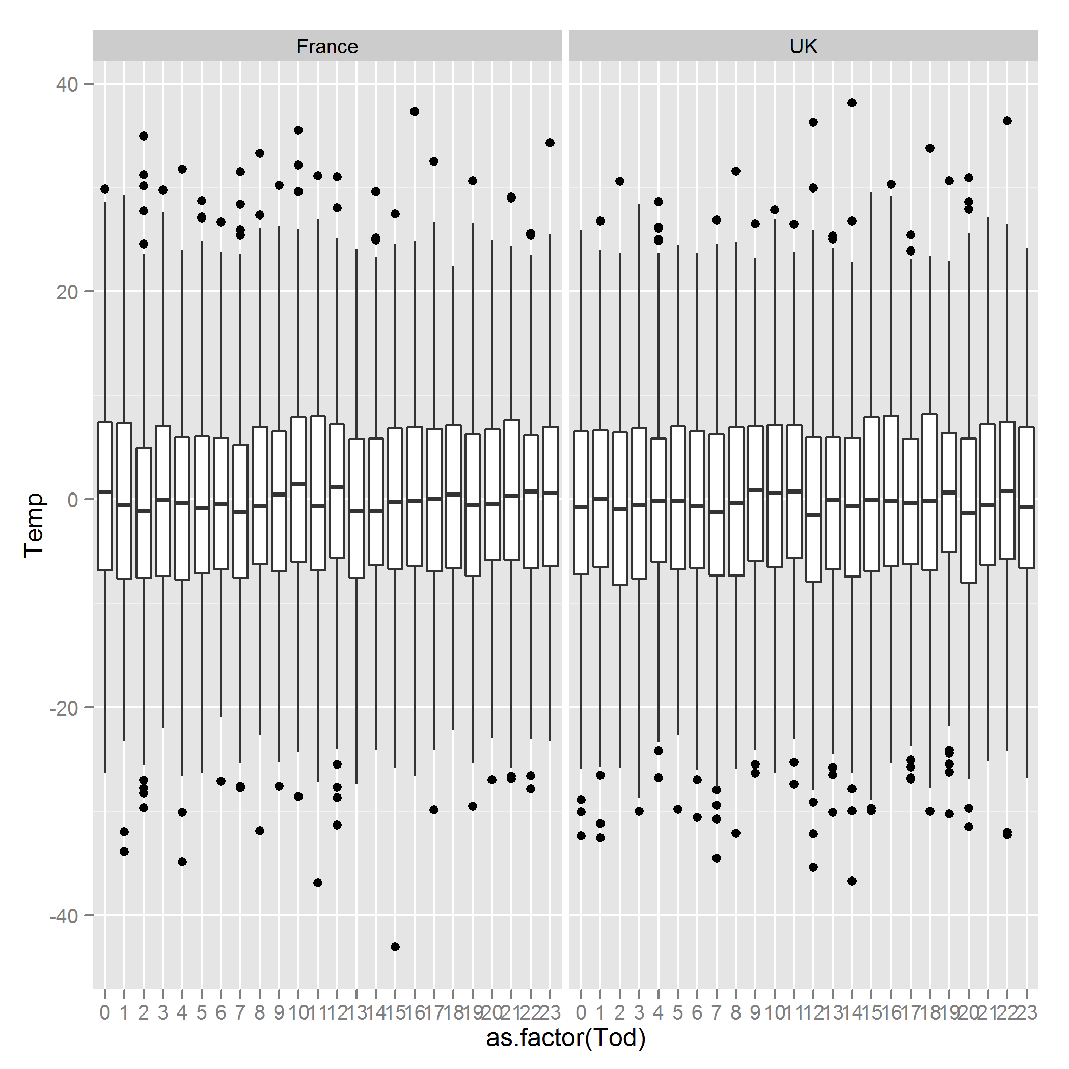
This would show the annual pattern of the data. However, what I would like to do is to produce boxplots of the variation in temperature for different times of the day. So, for the example above I would like two figures, one for each country and each figure should be composed of box plots showing the variation in temperature at 00:00, 01:00... and so on, referring to Final$Tod. How can this be achieved?

Many thanks for your help.

$\endgroup$

2 Answers 2

8
$\begingroup$

Something like this?

library(ggplot2)
ggplot(Final, aes(x = as.factor(Tod), y = Temp)) + geom_boxplot()  + facet_wrap(~ Loc)

enter image description here

$\endgroup$
3
$\begingroup$
library(robustbase)
adjbox(Final$Temp[Final$Loc=="UK"]~Final$Tod[Final$Loc=="UK"])

Boxplots are a visualization tool, so i'll give you a visual advice. What you have is essentially functional data so you want (for visualization reasons) to use a box-plot tool that acknowledges that. Try the functional boxplot function in the fda package.

$\endgroup$
1
  • 1
    $\begingroup$ Yes (+1), this is much easier to visualize than the many box plots as well. I will have to re-read to make sure, but I believe Tukey (in EDA) actually suggests to not use the box's like this anyway, but to connect the lines for the summary statistics (see this similar question). Of course using functional boxplots is a better replacement for identifying outliers as well. $\endgroup$
    – Andy W
    Commented Jun 22, 2012 at 12:05

Your Answer

By clicking “Post Your Answer”, you agree to our terms of service and acknowledge you have read our privacy policy.

Not the answer you're looking for? Browse other questions tagged or ask your own question.