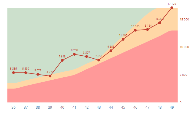
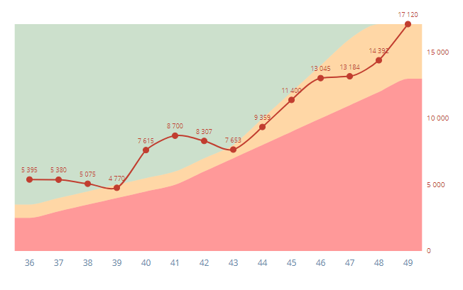
I'll phrase this, following your example, in terms of plotting with time on the $x$ or horizontal axis: that is pleasantly easy to imagine and discuss and (I guess) the most common example of this issue in practice. Translation to other variables on that axis, such as position in space, seems straightforward (until someone points out complications).
What seems tacit in your question is that at most one value is possible at any given time. That is, I am setting aside any kind of summary or smoothing issue producing some kind of summary{$y|x$} of possibly several values of $y$ at any one $x$.
There is a difference in principle between
measurements at all possible times (e.g. class attendance at every class)
measurements at some possible times (e.g. temperature or pressure measurements at certain times), so that other values could have been observed in between; they are just not included in the data.
For #1 straight-line connections are, I suggest, primarily for psychological support to aid mental grasp of a series as a whole, both general patterns (e.g. trends) and particular details (e.g. spikes). This only needs much discussion or defence if it is not clear to readers, or someone objects to it as meaningless.
As values in between observed times aren't defined, there is no sense in which a connecting line has the purpose of interpolation. (Commonly line connection is a graphical option or setting and doesn't require any call to an interpolation routine, but which part of one's software is used is an implementation detail.)
Personally I dislike nonlinear connection for such cases (rounded curves in terms of the question), but I imagine the defence for it as also that it is a psychological prop. I find it, uninvited, in student reports and gather that it's provided somehow in MS Excel. But wrong seems too strong a word. If the objection is that there is no evidence to support the picture of nonlinear change between known data points, then the same objection applies to linear change as well. So, the question seems more one of aesthetic preference or an appeal to simplicity, rather than a strongly statistical or scientific argument.
Whatever the grounds for the nonlinear connection, I would suggest that it is good practice to explain it in papers, reports and books, at least qualitatively, say by mentioning spline or polynomial interpolation or some other method. It is disturbing whenever researchers cannot explain how a curve was produced. In contrast, linear connections do not seem to need any comment, as being familiar from early puzzle books and schooling.
For #2 interpolation makes sense, as we have defined this to be the situation where further observations between data are possible. Even if it is decided that linear interpolation is as much as you want to consider, that is as much a matter of taste as anything else. More interestingly, what also can make sense is to interpolate using more than the data points on either side, in which case the interpolation need not be linear. (Again, this can grade into smoothing.)
But much depends on the details.
First example: population growth of most countries can be treated as continuous in magnitude and in time (forgetting what we do know about people being discrete). As such, it can be interpolated between census or estimate dates, but even then seasonality could be a detail. A sensible interpolation will often -- indeed usually -- not be linear at all.
Second example: if air or ground temperature is measured only once per day (as was customary until well into the 20th century) then finer interpolation is possible in principle because temperature is essentially continuously varying, but in practice interpolation within days would be pointless unless it reflected daily heating and cooling.
I am troubled by possible confusion in the question on what is linear and what is monotone, as locally linear interpolation is necessarily locally monotone too, and the curves you show have turning points.
There are attractive interpolation methods that combine cubic spline behaviour with respect for maxima and minima in the raw data. The results are monotone between given turning points, but not necessarily linear. In MATLAB terms, pchip (piecewise cubic Hermite interpolation), explained very well by Cleve Moler e.g. here, is one such method. I'll report that Moler's MATLAB code is very portable, even if like me you don't use MATLAB.


