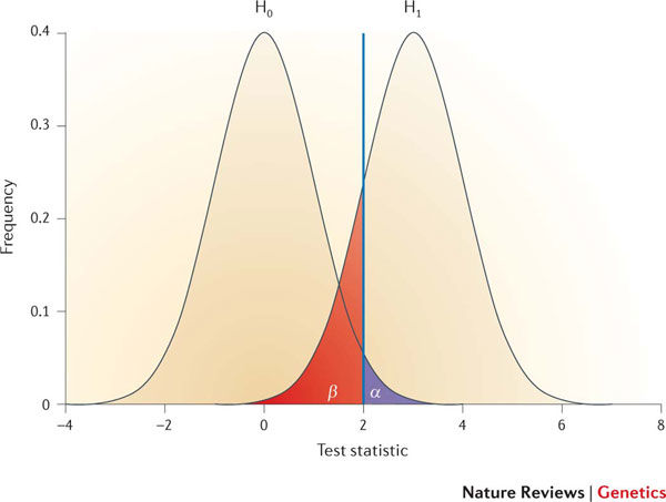
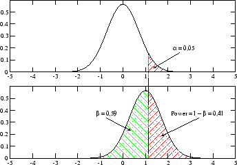
Figures like the one in the paper are very common for explaining power, but I don't like them because you have both distributions in the same panel. That implies they could both exist at the same time (which they can't), and makes it confusingly similar to figures that show the distributions from two different groups, experimental and control, whereas these distributions do not refer to groups. I prefer to put the two distributions in different panels:

How the universe actually works is either represented by the top panel or the bottom panel (although you will never truly know which). But certainly they can't both exist. Moreover, these are not the distributions of your two groups. Instead, the top panel refers to the sampling distribution of the test statistic when the null is true. The bottom panel refers to the sampling distribution of the test statistic when the null is false and a specific alternative is true. Of note, the effect size is not represented anywhere in this figure (these are theorized distributions of test statistics, not data).
Now consider this figure:

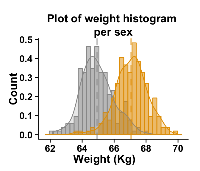
We will consider these to be actual samples of weights of some women (gray) and men (yellow) plotted as histograms with kernel density lines overlaid and the group means represented by vertical dashed lines. Then, the distance between the means is the realized value of the (raw) effect size. The frequencies of men and women in the sample does affect power (see here), but is unrelated to the effect size. If we made the wildly unrealistic assumption that the sample means in this figure were exactly correct, the distance between the vertical lines would be the true (raw) effect size. (Note that effect sizes are often presented in standardized form, that could be done and displayed here by just having standardized the data first, but it doesn't happen to be what is in this figure.)

