3
$\begingroup$

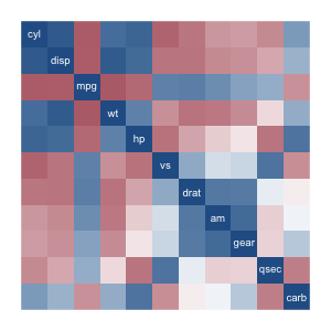
I'm trying to visualize correlation matrices using heatmaps. However, the results can be unsightly and seem unstructured. I give an example below (blue is positive correlation, red is negative).

$\hspace{4.5cm}$enter image description here

How could I bring the high correlation entries closer to the diagonal? That is, how can I reduce the bandwith of a correlation matrix through reordering of the variables?


Reducing the bandwith of a symmetric matrix is an important problem in numerical linear algebra. From what I found (GPS and Cuthill-Mckee algorithms), they usually approach the problem by first transforming the correlating matrix to the adjacency matrix of a graph. However, I do not want to introduce an arbitrary cutoff for this procedure and I would prefer simpler approaches.

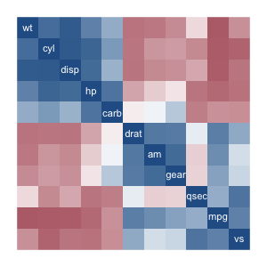
I tried re-ordering the variables by the sum of their squared correlation to each other (see below). It gives better-than-nothing results, but isn't quite nice enough.

$\hspace{4.5cm}$enter image description here


Here's my code.

cor.im <- function(df) {
  n = length(df)
  m = cor(df)
  image(x = 1:n, y = 1:n, z = m[,n:1], zlim = c(-1,1),
      xlab = "", ylab = "",
      col = colorRampPalette(
          colors = c("red", "white", "blue")
        )(256),
      axes = F
      )
  text(x = 1:n, y=n:1, labels=names(df), col="white")
}
$\endgroup$

2 Answers 2

4
$\begingroup$

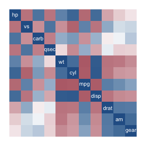
R has built-in functions for cluster analysis. The heatmap function automatically reorders the variables and plots a dendogram on top of the correlation matrix. The order given to a correlation matrix c can be recovered like this:

order.dendrogram(as.dendrogram(hclust(dist(c))))

Replacing c by abs(c) gives the second clustering below.

$\hspace{.8cm}$enter image description hereenter image description here

$\endgroup$
1
$\begingroup$

There are multiple packages in R on CRAN implementing visualization of correlation matrices. An overview is http://jamesmarquezportfolio.com/correlation_matrices_in_r.html

Here I will illustrate the use of one of them: (but for your purpose, maybe better to visualize the matrix of absolute values of correlations? so I do that)

library(ggcorrplot)
library(ade4)
data(monde84)  # dataset for the example
head(monde84)
             pib croipop morta anal scol
Afrique.Sud 2680      29    89   50   19
Algerie     2266      29   114   59   48
Argentine   2264      12    44    5   70
Australie   9938      13    10    0   86
Bresil      1853      22    75   24   62
Cameroun     939      24   106   55   45

ggcorrplot(abs(cor(monde84)), p.mat = cor_pmat(monde84), hc.order=TRUE, type='lower')

resulting in the plot:

Visualization of absolute value of correlation

$\endgroup$
2
  • $\begingroup$ I won't mark your answer as accepted because (like my answer) it does not explain how we can reduce the bandwidth of correlation matrices. Thanks for the links though, I'll look into that. $\endgroup$
    – Olivier
    Commented Feb 4, 2018 at 20:18
  • 1
    $\begingroup$ That's OK, thanks. It would be easier, maybe, to say something about reducing bandwith (I take that to mean the "bread" of the diagonal band) if you could say something about the use of the resulting correlation matrix, which could lead to some criterion to optimize, maybe ... $\endgroup$ Commented Feb 4, 2018 at 20:22

Your Answer

By clicking “Post Your Answer”, you agree to our terms of service and acknowledge you have read our privacy policy.

Not the answer you're looking for? Browse other questions tagged or ask your own question.