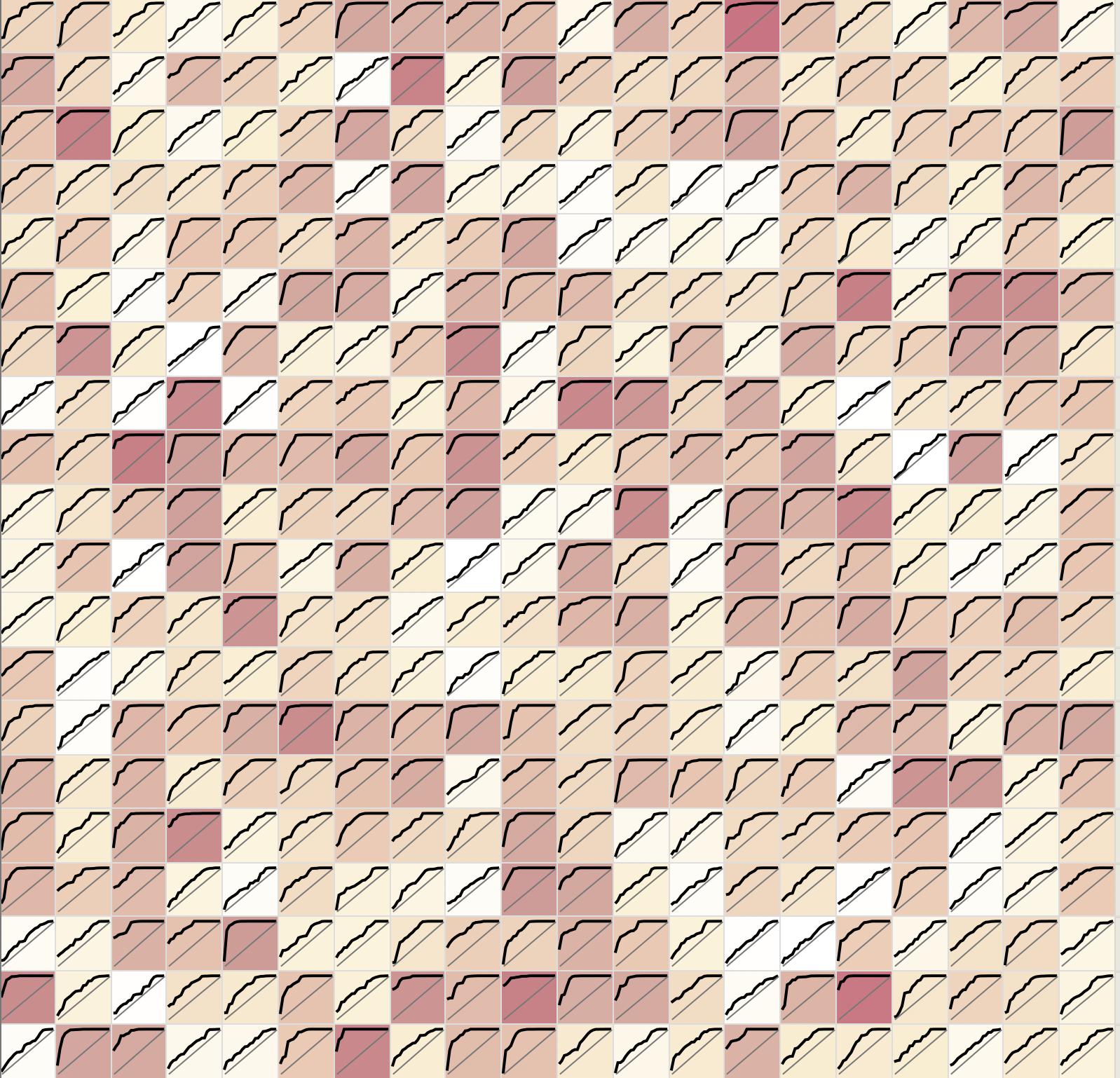
Experimenting with a few approaches to visualize error modes/rates for models with a large number (100-500) of classes. For smaller numbers of classes have been using ROC graphs (with each class represented as a separate line) confusion matrices, and some simple bar charts just displaying accuracy.
When it comes to hundreds of classes though, these visualizations are generally ineffective at conveying information. Have been looking at confusion matrix variants such as CMO (confusion matrix ordering), and some other confusion-matrix-centric options. Things like displaying groups of classes with high mutual confusion rates, and pulling out strong vertical and horizontal lines.
However, outside of expecting people to scroll through individual error rates for hundreds of classes, or the confusion-matrix variants above, I haven't found any techniques that are effective for hundreds of classes.
Have people found certain visualizations that are successful in these cases? I'm specifically dealing with classification in this case, though I'm dealing both with single-label and multi-label scenarios (where individual class labels either are or are not mutually exclusive). However, suggestions for other types of problems that may be adapted to classification would also be very helpful.

