3
$\begingroup$

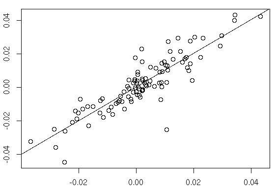
I have an interview soon for a graduate position. I will to do 10-15 presentation. So, I was sent out a regression plot by the recruiter and I have to present how I can make the regression plot more engaging and insightful to the end user.

The regression plot looks simple enough, it's black and white, has straight line and few points plotted. It looks like a plot of housing areas against housing prices. One thing I did notice about the plot is that none of the axis have been named.

So how would I go about making this plot more insightful and engaging to an end user. One thing that I know is a must is to label the axis. Other things I could do is stating what the icons in the plot mean, showing the R (the multiple correlation coefficient), R squared (the coefficient of determination), adjusted R-squared and standard error of the estimate values.

What else could I do?

Edit: Here is an example of what the plot looks like. Regression plot

$\endgroup$
6
  • $\begingroup$ Add confidence intervals - they look really cool and are informative, so that end users can immediately, visually understand the statistical confidence in the model. $\endgroup$ Commented Apr 15, 2018 at 23:49
  • $\begingroup$ Do not use rainbow colors. Use color palettes $\endgroup$ Commented Apr 16, 2018 at 12:55
  • 1
    $\begingroup$ I'd rather see the equation than some of the stuff you mention. An end user should presumably want to know what it means and can it be trusted Does it match sensible limiting behaviour? Showing $R$, $R^2$ and adjusted $R^2$ looks like overkill to me. A "plot of house area to housing prices" is weird wording. If English is not your first language and you're presenting in English, get advice on that too. $\endgroup$
    – Nick Cox
    Commented Apr 16, 2018 at 13:02
  • $\begingroup$ Just to be clear, does regression plot mean the x and y values of 2 dependent variables with the fitted line through the plot? If so, the comment about confidence intervals is a bit off base. Also, who is the end user? If the end users are statisticians or economists, then sure, the equation may be fine, but many people are not all that fond of equations. $\endgroup$
    – Weiwen Ng
    Commented Apr 16, 2018 at 15:33
  • $\begingroup$ I added an example of the plot $\endgroup$
    – cod3min3
    Commented Apr 16, 2018 at 19:18

1 Answer 1

5
$\begingroup$
  • Declutter: remove noise items. Many charts have too many tick marks and unnecessary grid lines and framing lines.
  • Add focus: highlight the interesting part. Make the regression line more prominent than the dots if that's most interesting. Or highlight a few outliers if those are most interesting.
  • Tailor to the audience: Choose a title/subtitle that delivers the message. Is the audience technical enough to care about stats, or do they just need the slope, or just the general trend?

For more specific items, try this interactive data visualization checklist.

$\endgroup$
1
  • $\begingroup$ Hello, thanks for your suggestions. I edited the question to have an example of what the plot looks like. $\endgroup$
    – cod3min3
    Commented Apr 16, 2018 at 19:17

Your Answer

By clicking “Post Your Answer”, you agree to our terms of service and acknowledge you have read our privacy policy.

Not the answer you're looking for? Browse other questions tagged or ask your own question.