My apologies in advance, I wrote a bit of a novel.
tl;dr
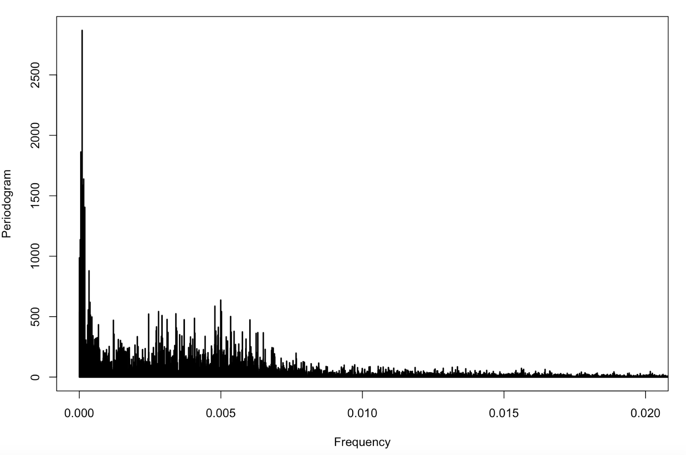
1) Likely there is a mean or trend in the data. This is usually represented at the zero-frequency.
2) Yes, you could say there's a periodic component at this point with a period of 200 time units (seconds).
3) Yes, you can do this, it depends on the method. If you used spec.pgram() then:
    pgram <- spec.pgram(yourDataVector)
    new.df <- data.frame(x = pgram$freq, y = pgram$spec)
But, for the love of unbiased estimators, please don't use the periodogram (there are TONNES of statistically better methods and Rayleigh commented on the poor properties of the periodogram in 1905-ish (side note: spec.pgram doesn't actually calculate the periodogram but gives you a "direct estimate" of the spectrum using a 10% cosine taper - there are still better (in terms of bias and variance) methods)).
Full version:
1) The frequency at f = 0 or in the first frequency bin indicates that your data likely has a trend or mean that has not been removed. Also, the very low frequency signal near f = 0, doesn't actually look like it's at f = 0. It looks to me like there is a big peak off zero that could be interesting. It might be worthwhile just plotting the spectrum in the band f = 0 to f = 0.002 (you'd have to adjust based on what it looks like of course).
2) Yes, you could say that there is a periodic component in your data with a period of 200 seconds that is contributing the most variance to your original time series. This is only really valid for frequencies above f = 0.0015 (ish) as there is certainly some low powered signal here as well. But I think that would be a hard sell as there are many frequencies near f = 0.005 that have similar power a harmonic F-test (below) could help with this.
3) Yes, you can certainly do this except I am unsure of what you are using to calculate the periodogram (spec.pgram() ?).
And now, I would like to advocate for a theoretically and empirically better method if you will allow me. The periodogram is, in practice, a badly biased estimate and is also inconsistent (variance doesn't converge to zero as sample size increases).
Since you are using R already, the multitaper package implements a spectrum estimator that uses a set of orthogonal data tapers that optimally concentrate power in the band (-W, W) around the frequency of interest - in other words, you're actually estimating what you think you're estimating (low bias).
Because you are using multiple tapers, you can average the spectrum estimates from each taper which reduces the variance of your estimate (consistency).
Lastly, the package implements adaptive weighting which provides excellent balance between bias and variance.
Using the multitaper package is exceptionally easy and I will answer question 3) at the same time:
    install.packages("multitaper")
    library(multitaper)
    s <- spec.mtm(yourDataVector, deltat = yourSamplingRate, nw = 6, k = 10, Ftest = TRUE)
    s.df <- data.frame(x = s$freq, y = s$spec)
    plot(s$freq, s$mtm$Ftest, type='l')
NOTE: spec.mtm() will remove a constant mean from the data unless you set the argument centre = "none" .
Okay, so the above is pretty straight forward. "nw" and "k" are the time-bandwidth parameter (setting the band (-W, W)) and the number of tapers respectively. Normally you would set nw somewhere between 3 and 15 - depends on how closely spaced you think modes / periodic components in your data would be. The number of tapers, k, should ALWAYS be an integer with k <= 2*nw (the higher order tapers are undesirable for the most part in this context).
The harmonic F-test (which we plot here) is basically testing whether the variance contributed by a frequency matches the expected under the null hypothesis of a white noise process. It follows an F-distribution with (2, 2*k-2) degrees of freedom. Therefore, you can detect significant frequencies, regardless of their spectral amplitude, using this method. A good "rule of thumb" is to set your confidence level to 1 - 1/N (where N is the number of samples). Or you could just set it to whatever you want. To get the critical value in R:
qf(1-1/N, 2, 2*s$mtm$k - 2) .
Lastly, in my experience, it is usually a good idea to plot your spectra on log-y axis as the high power frequencies will wash out everything else.
plot(s$freq, s$spec, type='l', log = 'y')
for example in base-R graphics.
D. J. Thomson - 1982 - "Spectrum estimation and harmonic analysis" is the seminal paper on this method.

