(This answer responded to a duplicate (now closed) question at Detecting outstanding events, which presented some data in graphical form.)
Outlier detection depends on the nature of the data and on what you are willing to assume about them. General-purpose methods rely on robust statistics. The spirit of this approach is to characterize the bulk of the data in a way that is not influenced by any outliers and then point to any individual values that do not fit within that characterization.
Because this is a time series, it adds the complication of needing to (re)detect outliers on an ongoing basis. If this is to be done as the series unfolds, then we are allowed only to use older data for the detection, not future data! Moreover, as protection against the many repeated tests, we would want to use a method that has a very low false positive rate.
These considerations suggest running a simple, robust moving window outlier test over the data. There are many possibilities, but one simple, easily understood and easily implemented one is based on a running MAD: median absolute deviation from the median. This is a strongly robust measure of variation within the data, akin to a standard deviation. An outlying peak would be several MADs or more greater than the median.
There is still some tuning to be done: how much of a deviation from the bulk of the data should be considered outlying and how far back in time should one look? Let's leave these as parameters for experimentation. Here's an R implementation applied to data $x = (1,2,\ldots,n)$ (with $n=1150$ to emulate the data) with corresponding values $y$:
# Parameters to tune to the circumstances:
window <- 30
threshold <- 5

# An upper threshold ("ut") calculation based on the MAD:
library(zoo) # rollapply()
ut <- function(x) {m = median(x); median(x) + threshold * median(abs(x - m))}
z <- rollapply(zoo(y), window, ut, align="right")
z <- c(rep(z[1], window-1), z) # Use z[1] throughout the initial period
outliers <- y > z

# Graph the data, show the ut() cutoffs, and mark the outliers:
plot(x, y, type="l", lwd=2, col="#E00000", ylim=c(0, 20000))
lines(x, z, col="Gray")
points(x[outliers], y[outliers], pch=19)
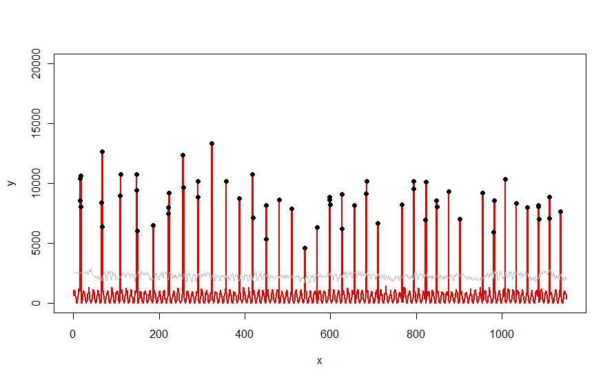
Applied to a dataset like the red curve illustrated in the question, it produces this result:

The data are shown in red, the 30-day window of median+5*MAD thresholds in gray, and the outliers--which are simply those data values above the gray curve--in black.
(The threshold can only be computed beginning at the end of the initial window. For all data within this initial window, the first threshold is used: that's why the gray curve is flat between x=0 and x=30.)
The effects of changing the parameters are (a) increasing the value of window will tend to smooth out the gray curve and (b) increasing threshold will raise the gray curve. Knowing this, one can take an initial segment of the data and quickly identify values of the parameters that best segregate the outlying peaks from the rest of the data. Apply these parameter values to checking the rest of the data. If a plot shows the method is worsening over time, that means the nature of the data are changing and the parameters might need re-tuning.
Notice how little this method assumes about the data: they do not have to be normally distributed; they do not need to exhibit any periodicity; they don't even have to be non-negative. All it assumes is that the data behave in reasonably similar ways over time and that the outlying peaks are visibly higher than the rest of the data.
If anyone would like to experiment (or compare some other solution to the one offered here), here is the code I used to produce data like those shown in the question.
n.length <- 1150
cycle.a <- 11
cycle.b <- 365/12
amp.a <- 800
amp.b <- 8000

set.seed(17)
x <- 1:n.length
baseline <- (1/2) * amp.a * (1 + sin(x * 2*pi / cycle.a)) * rgamma(n.length, 40, scale=1/40)
peaks <- rbinom(n.length, 1,  exp(2*(-1 + sin(((1 + x/2)^(1/5) / (1 + n.length/2)^(1/5))*x * 2*pi / cycle.b))*cycle.b))
y <- peaks * rgamma(n.length, 20, scale=amp.b/20) + baseline

