0
$\begingroup$

Is it possible to fit a quadratic or polynomial model with this type of data?

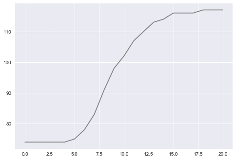
Two inputs, input one is a temperature sensor:

enter image description here

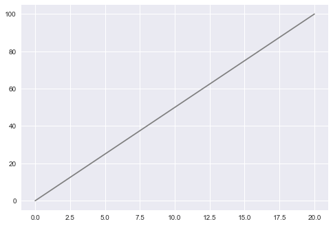
Input two is a valve opening on a scale from 0-100:

enter image description here

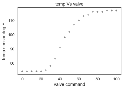
This is a scatter plot of the relationship between the two: enter image description here

Ultimately I am hoping to fit the data to a model about the relationship and then create some sort of a function (using Python) to create some simulated results..

Can someone give me a few tips on how to go about this maybe from a statistics standpoint? I understand regression but I have yet to venture onto logistic regression and beyond to fit data like this. (not a lot of wisdom here) Anything related to a Python package would be helpful too.

$\endgroup$
8
  • 1
    $\begingroup$ "non-normally distributed data" what do you mean by this? What sources of error do you expect? (see some links on the site here 1: what if residuals are normally distributed but y is not 2: where does the misconception that y must be normally distributed come from) $\endgroup$ Commented Jan 9, 2019 at 21:32
  • $\begingroup$ Sorry that maybe a mistake on my end of how I am attempting to describe the data. I don't have a histogram or anything $\endgroup$
    – bbartling
    Commented Jan 9, 2019 at 21:34
  • $\begingroup$ @HenryHub, what Martijn is saying, is that there is no need for your y-values to be normally distributed -- only the residuals in a traditional multiple regression setting. We don't know what you mean by "fitting a model to non-normally distributed" data, since there is no such assumption. $\endgroup$ Commented Jan 9, 2019 at 21:45
  • $\begingroup$ Ill remove that verbiage from the post. Would it also help if I create some residual plots & QQ? $\endgroup$
    – bbartling
    Commented Jan 9, 2019 at 21:52
  • $\begingroup$ I added some more graphical data... Thanks any tips & help $\endgroup$
    – bbartling
    Commented Jan 9, 2019 at 22:05

1 Answer 1

0
$\begingroup$

It looks like you're plotting the opening of a valve over time. As the valve opens, the temperature of something (a fluid in the valve?) increases.

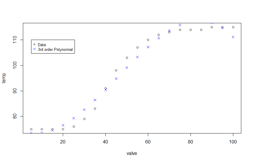
Given that you data follows an s-curve with two bends, I would model the process using a third-order polynomial.

mydata <- data.frame(valve = seq(from = 5, to = 100, by = 5), 
                     temp = c(rep(75, 4), 76, 79, 83, 91, 98, 103, 107, 110, 112, 113, rep(114, 3), rep(115, 3)))


lm <- lm(temp ~ poly(valve,3), data=mydata)
poly3 <- predict(lm, newdata=data.frame(mydata$valve))

plot(mydata)
points(as.data.frame(cbind(mydata$valve,poly3)), pch=4, col='blue')
legend(5, 110, legend=c("Data", "3rd order Polynomial"),
       pch=c(1,4), col=c('black', 'blue'), cex=0.8)

Graph of results below. Plot
Alternatively, you can get a better fit with a spline regression. A spline is a smooth function built out of smaller, component functions.

library(splines)
mydata <- data.frame(valve = seq(from = 5, to = 100, by = 5), 
                     temp = c(rep(75, 4), 76, 79, 83, 91, 98, 103, 
                              107, 110, 112, 113, rep(114, 3), rep(115, 3)))

knots_x <- quantile(mydata$valve, probs=c(0.25, .5, 0.75)) #setting knots at default IQR
bounds_x <- c(20, 80) #assuming no change in temp before valve is 20% open and after 80% closed 
lm2 <- lm(temp ~ ns(mydata$valve, knots=knots_x, Boundary.knots = bounds_x), data = mydata)
spline <- predict(lm2, newdata=data.frame(mydata$valve))

plot(mydata)
points(as.data.frame(cbind(mydata$valve,spline)), pch=4, col='blue')
legend(5, 110, legend=c("Data", "Spline Predictions"),
       pch=c(1,4), col=c('black', 'blue'), cex=0.8)

By limiting the boundary for the knots within the interval that the valve openness affects the temperature, I basically eliminated the over-shooting of the previous polynomial model. Then I put in the knots in the IQR for the data (not adjusted for the bounds).
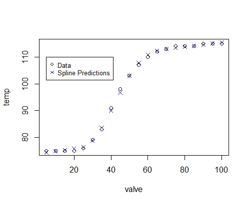
Spline Model

Note that the model can still extrapolate outside of the bounds, but the model fits the data (given the assumptions) much more closely.
$\endgroup$
6
  • $\begingroup$ Wow thanks. Yes it is a hot water valve in an HVAC ducting application and the sensor is reading the air after the hot water coil. What computing language are you using? I’ll have to do some research for this type of model in python. $\endgroup$
    – bbartling
    Commented Jan 10, 2019 at 1:10
  • $\begingroup$ As hinted by the poor fit, especially in the upper right, a polynomial model is a particularly poor choice for these data. The OP would be better served by explaining that and proposing a more suitable one, rather than leading them down a misleading avenue of investigation. $\endgroup$
    – whuber
    Commented Jan 10, 2019 at 17:16
  • $\begingroup$ Henry, the code is written in R. It just a linear regression of the form temp ~ valve + valve^2 + valve ^3. @whuber, I'm not sure what other model would work better. I acknowledge that by definition the model is going to over-estimate at the bounds given the structure of the function. It is an s-type curve so a third order polynomial creates that shape. I'm not aware of another model that can create an s-shaped curve while remaining flat on the lower and upper bounds. $\endgroup$ Commented Jan 10, 2019 at 18:44
  • $\begingroup$ A cubic polynomial does not have the requisite properties of rising from a minimum to a maximum, which (as a reasonable guess) this one must. Physical theory will suggest an appropriate form. Absent theory, if the objective merely is to fit a smooth curve to points, then a spline will do nicely. $\endgroup$
    – whuber
    Commented Jan 10, 2019 at 18:50
  • $\begingroup$ Here is an article about spline regression in python analyticsvidhya.com/blog/2018/03/… $\endgroup$
    – seanv507
    Commented Jan 11, 2019 at 7:19

Your Answer

By clicking “Post Your Answer”, you agree to our terms of service and acknowledge you have read our privacy policy.

Not the answer you're looking for? Browse other questions tagged or ask your own question.