Caveat: I am NOT an expert on climatology, this is not my field. Please bear this in mind. Corrections welcome.
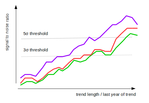
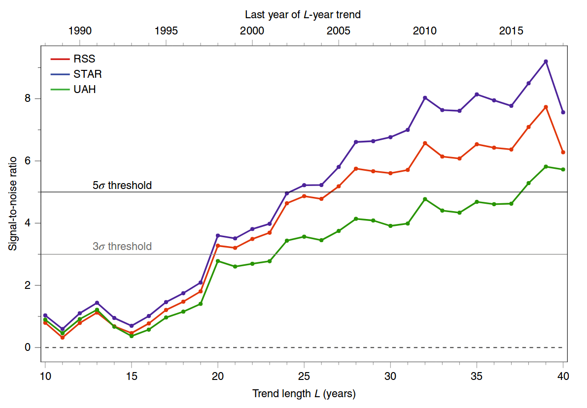
The figure that you are referring to comes from a recent paper Santer et al. 2019, Celebrating the anniversary of three key events in climate change science from Nature Climate Change. It is not a research paper, but a brief comment. This figure is a simplified update of a similar figure from an earlier Science paper of the same authors, Santer et al. 2018, Human influence on the seasonal cycle of tropospheric temperature. Here is the 2019 figure:

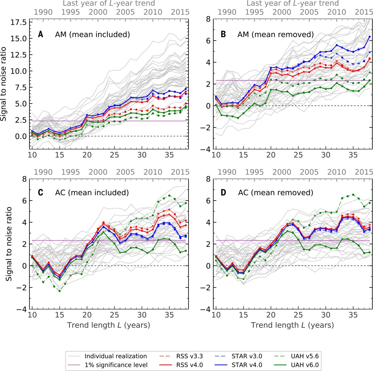
And here is the 2018 figure; panel A corresponds to the 2019 figure:

Here I will try to explain the statistical analysis behind this last figure (all four panels). The Science paper is open access and quite readable; the statistical details are, as usual, hidden in the Supplementary Materials. Before discussing statistics as such, one has to say a few words about the observational data and the simulations (climate models) used here.
1. Data
The abbreviations RSS, UAH, and STAR, refer to reconstructions of the tropospheric temperature from the satellite measurements. Tropospheric temperature has been monitored since 1979 using weather satellites: see Wikipedia on MSU temperature measurements. Unfortunately, the satellites do not directly measure temperature; they measure something else, from which the temperature can be inferred. Moreover, they are known to suffer from various time-dependent biases and calibration problems. This makes reconstructing the actual temperature a difficult problem. Several research groups perform this reconstruction, following somewhat different methodologies, and obtaining somewhat different final results. RSS, UAH, and STAR are these reconstructions. To quote Wikipedia,
Satellites do not measure temperature. They measure radiances in various wavelength bands, which must then be mathematically inverted to obtain indirect inferences of temperature. The resulting temperature profiles depend on details of the methods that are used to obtain temperatures from radiances. As a result, different groups that have analyzed the satellite data have obtained different temperature trends. Among these groups are Remote Sensing Systems (RSS) and the University of Alabama in Huntsville (UAH). The satellite series is not fully homogeneous – the record is constructed from a series of satellites with similar but not identical instrumentation. The sensors deteriorate over time, and corrections are necessary for satellite drift in orbit. Particularly large differences between reconstructed temperature series occur at the few times when there is little temporal overlap between successive satellites, making intercalibration difficult.
There is a lot of debate about which reconstruction is more reliable. Each group updates their algorithms every now and then, changing the whole reconstructed time series. This is why, for example, RSS v3.3 differs from RSS v4.0 in the above figure. Overall, AFAIK it is well accepted in the field that the estimates of the global surface temperature are more precise than the satellite measurements. In any case, what matters for this question, is that there are several available estimates of the spatially-resolved tropospheric temperature, from 1979 until now -- i.e. as as a function of latitude, longitude, and time.
Let us denote such an estimate by $T(\mathbf x, t)$.
2. Models
There are various climate models that can be run to simulate the tropospheric temperature (also as a function of latitude, longitude, and time). These models take CO2 concentration, volcanic activity, solar irradiance, aerosols concentration, and various other external influences as input, and produce temperature as output. These models can be run for the same time period (1979--now), using the actual measured external influences. The outputs can then be averaged, to obtain mean model output.
One can also run these models without inputting the anthropogenic factors (greenhouse gases, aerosols, etc.), to get an idea of non-anthropogenic model predictions. Note that all other factors (solar/volcanic/etc.) fluctuate around their mean values, so the non-anthropogenic model output is stationary by construction. In other words, the models do not allow the climate to change naturally, without any specific external cause.
Let us denote the mean anthropogenic model output by $M(\mathbf x,t)$ and the mean non-anthropogenic model output by $N(\mathbf x, t)$.
3. Fingerprints and $z$-statistics
Now we can start talking about statistics. The general idea is to look at how similar the measured tropospheric temperature $T(\mathbf x, t)$ is to the anthropogenic model output $M(\mathbf x, t)$, compared to the non-anthropogenic model output $N(\mathbf x, t)$. One can quantify the similarity in different ways, corresponding to different "fingerprints" of anthropogenic global warming.
The authors consider four different fingerprints (corresponding to the four panels of the figure above). In each case they convert all three functions defined above into annual values $T(\mathbf x, i)$, $M(\mathbf x, i)$, and $N(\mathbf x, i)$, where $i$ indexes years from 1979 until 2019. Here are the four different annual values that they use:
- Annual mean: simply average temperature over the whole year.
- Annual seasonal cycle: the summer temperature minus the winter temperature.
- Annual mean with global mean subtracted: the same as (1) but subtracting the global average for each year across the globe, i.e. across $\mathbf x$. The result has mean zero for each $i$.
- Annual seasonal cycle with global mean subtracted: the same as (2) but again subtracting the global average.
For each of these four analyses, the authors take the corresponding $M(\mathbf x, i)$, do PCA across time points, and obtain the first eigenvector $F(\mathbf x)$. It is basically a 2D pattern of maximal change of the quantity of interest according to the anthropogenic model.
Then they project the observed values $T(\mathbf x, i)$ onto this pattern $F(\mathbf x)$, i.e. compute $$Z(i) = \sum_\mathbf x T(\mathbf x, i) F(\mathbf x),$$ and find the slope $\beta$ of the resulting time series. It will be the numerator of the $z$-statistic ("signal-to-noise ratio" in the figures).
To compute the denominator, they use non-anthropogenic model instead of the actually observed values, i.e. compute $$W(i) = \sum_\mathbf x N(\mathbf x, i) F(\mathbf x),$$ and again find its slope $\beta_\mathrm{noise}$. To obtain the null distribution of slopes, they run the non-anthropogenic models for 200 years, chop the outputs in 30-year chunks and repeat the analysis. The standard deviation of the $\beta_\mathrm{noise}$ values forms the denominator of the $z$-statistic:
$$z = \frac{\beta}{\operatorname{Var}^{1/2}[\beta_\mathrm{noise}]}.$$
What you see in panels A--D of the figure above are these $z$ values for different end years of the analysis.
The null hypothesis here is that the temperature fluctuates under the influence of stationary solar/volcanic/etc inputs without any drift. The high $z$ values indicate that the observed tropospheric temperatures are not consistent with this null hypothesis.
4. Some comments
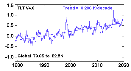
The first fingerprint (panel A) is, IMHO, the most trivial. It simply means that the observed temperatures monotonically grow whereas the temperatures under the null hypothesis do not. I do not think one needs this whole complicated machinery to make this conclusion. The global average lower tropospheric temperature (RSS variant) time series looks like this:

and clearly there is a very significant trend here. I don't think one needs any models to see that.
The fingerprint in panel B is somewhat more interesting. Here the global mean is subtracted, so the $z$-values are not driven by the rising temperature, but instead by the the spatial patterns of the temperature change. Indeed, it is well-known that the Northern hemisphere warms up faster than the Southern one (you can compare the hemispheres here: http://images.remss.com/msu/msu_time_series.html), and this is also what climate models output. The panel B is largely explained by this inter-hemispheric difference.
The fingerprint in panel C is arguably even more interesting, and was the actual focus of the Santer et al. 2018 paper (recall its title: "Human influence on the seasonal cycle of tropospheric temperature", emphasis added). As shown in Figure 2 in the paper, the models predict that the amplitude of the seasonal cycle should increase in mid-latitudes of both hemispheres (and decrease elsewhere, in particular over the Indian monsoon region). This is indeed what happens in the observed data, yielding high $z$-values in panel C. Panel D is similar to C because here the effect is not due to the global increase but due to the specific geographical pattern.
P.S. The specific criticism at judithcurry.com that you linked above looks rather superficial to me. They raise four points. The first is that these plots only show $z$-statistics but not the effect size; however, opening Santer et al. 2018 one will find all other figures clearly displaying the actual slope values which is the effect size of interest. The second I failed to understand; I suspect it is a confusion on their part. The third is about how meaningful the null hypothesis is; this is fair enough (but off-topic on CrossValidated). The last one develops some argument about autocorrelated time series but I do not see how it applies to the above calculation.

