I am trying to create a figure which shows the relationship between viral copies and genome coverage (GCC). This is what my data looks like:
At first, I just plotted a linear regression but my supervisors told me that was incorrect, and to try a sigmoidal curve. So I did this using geom_smooth:
library(scales)
ggplot(scatter_plot_new, aes(x = Copies_per_uL, y = Genome_cov, colour = Virus)) +
    geom_point() +
    scale_x_continuous(trans = log10_trans(), breaks = trans_breaks("log10", function(x) 10^x), labels = trans_format("log10", math_format(10^.x))) +
        geom_smooth(method = "gam", formula = y ~ s(x), se = FALSE, size = 1) +
    theme_bw() +
    theme(legend.position = 'top', legend.text = element_text(size = 10), legend.title = element_text(size = 12), axis.text = element_text(size = 10), axis.title = element_text(size=12), axis.title.y = element_text(margin = margin (r = 10)), axis.title.x = element_text(margin = margin(t = 10))) +
    labs(x = "Virus copies/µL", y = "GCC (%)") +
    scale_y_continuous(breaks=c(25,50,75,100))
However, my supervisors say this is incorrect too because the curves make it look like GCC can go over 100%, which it can't.
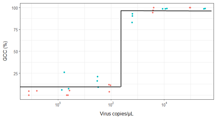
My question is: what is the best way to show the relationship between virus copies and GCC? I want to make it clear that A) low virus copies = low GCC, and that B) after a certain amount of virus copies the GCC plateaus.
I've researched a lot of different methods - GAM, LOESS, logistic, piecewise - but I don't know how to tell what is the best method for my data.
EDIT: this is the data:
>print(scatter_plot_new)
Subsample   Virus   Genome_cov  Copies_per_uL
1   S1.1_RRAV   RRAV    100 92500
2   S1.2_RRAV   RRAV    100 95900
3   S1.3_RRAV   RRAV    100 92900
4   S2.1_RRAV   RRAV    100 4049.54
5   S2.2_RRAV   RRAV    96.9935 3809
6   S2.3_RRAV   RRAV    94.5054 3695.06
7   S3.1_RRAV   RRAV    3.7235  86.37
8   S3.2_RRAV   RRAV    11.8186 84.2
9   S3.3_RRAV   RRAV    11.0929 95.2
10  S4.1_RRAV   RRAV    0   2.12
11  S4.2_RRAV   RRAV    5.0799  2.71
12  S4.3_RRAV   RRAV    0   2.39
13  S5.1_RRAV   RRAV    4.9503  0.16
14  S5.2_RRAV   RRAV    0   0.08
15  S5.3_RRAV   RRAV    4.4147  0.08
16  S1.1_UMAV   UMAV    5.7666  1.38
17  S1.2_UMAV   UMAV    26.0379 1.72
18  S1.3_UMAV   UMAV    7.4128  2.52
19  S2.1_UMAV   UMAV    21.172  31.06
20  S2.2_UMAV   UMAV    16.1663 29.87
21  S2.3_UMAV   UMAV    9.121   32.82
22  S3.1_UMAV   UMAV    92.903  627.24
23  S3.2_UMAV   UMAV    83.0314 615.36
24  S3.3_UMAV   UMAV    90.3458 632.67
25  S4.1_UMAV   UMAV    98.6696 11180
26  S4.2_UMAV   UMAV    98.8405 12720
27  S4.3_UMAV   UMAV    98.7939 8680
28  S5.1_UMAV   UMAV    98.6489 318200
29  S5.2_UMAV   UMAV    99.1303 346100
30  S5.3_UMAV   UMAV    98.8767 345100


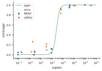
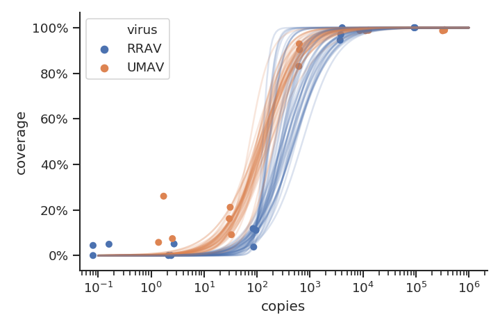


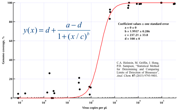
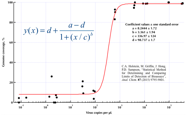
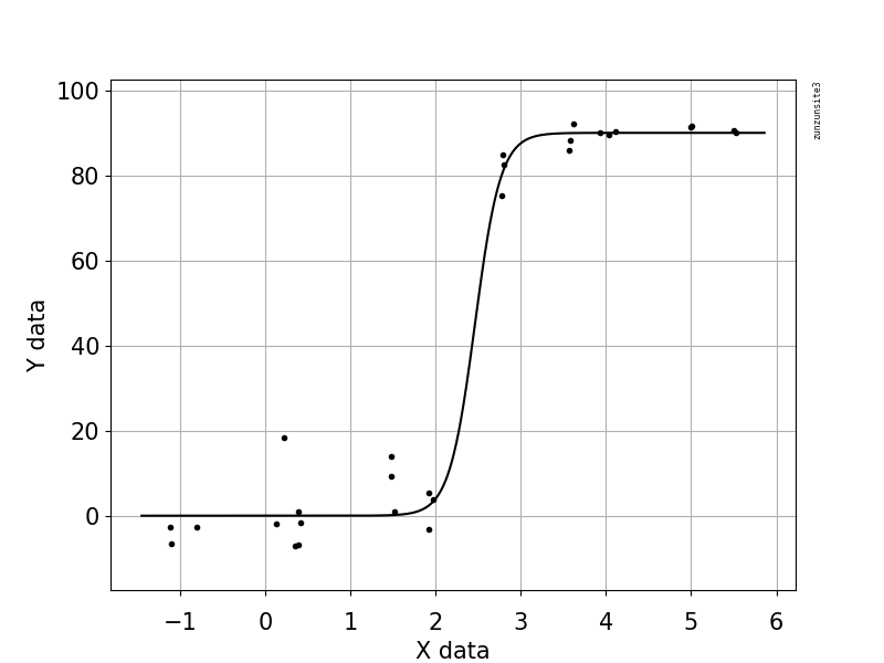
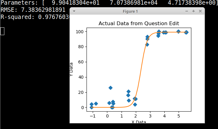
method.args=list(family=quasibinomial))in the arguments togeom_smooth()in your original ggplot code. $\endgroup$se=FALSE. Always nice to show people how large the uncertainty actually is ... $\endgroup$