1
$\begingroup$

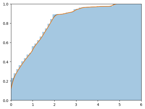
I have a dataset of variable $x$ that has a value between 0 and 6. I would like to have a function that defines empirical CDF of variable $x$. Since $x$ does not have a specific distribution (such as Gaussian, etc.), I need to rely on data values to create this function. Using the following code, I can plot the empirical CDF as:

max_diam = 6
ax = sns.distplot(x, hist_kws=dict(cumulative=True), kde_kws=dict(cumulative=True)).set(xlim=(0, max_diam))
ax = sns.kdeplot(x, bw=.1, cumulative=True).set(xlim=(0, max_diam), ylim=(0, 1.0))#, color="r")
plt.show()

enter image description here

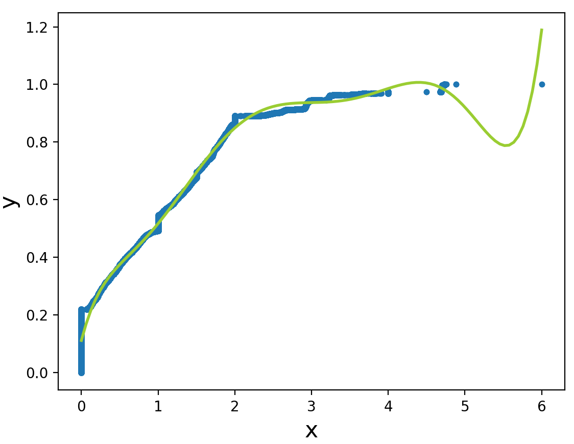
Now I would like to find the function that kdeplot uses to plot CDF. I have tried to do regression, but the quality is not good, as there is only a single point after 4.9 (6.0) which makes the plot overfit for high orders and underfit in low orders

def ecdf(data):
    # Compute ECDF
    x = np.sort(data)
    n = x.size
    y = np.arange(1, n+1) / n
    return(x,y)

x, y = ecdf(x)
degree=7
lw = 2

plt.scatter(x=x, y=y, s=10);
plt.xlabel('x', fontsize=16)
plt.ylabel('y', fontsize=16)

polynomial_features= PolynomialFeatures(degree)
x_poly = polynomial_features.fit_transform(x.reshape(-1, 1))

model = skl.LinearRegression()
model.fit(x_poly, y)

x_test = polynomial_features.fit_transform(x_plot.reshape(-1, 1))
y_test = model.predict(x_test)
plt.plot(x_plot, y_test, color='yellowgreen', linewidth=lw, label="degree %d" % degree)

plt.show()

enter image description here

So my question is:

  1. Is there a way to get the function that kdeplot is using for plotting the orange line?
  2. Is there a way to have a better regression that is accurate and does not over/underfit?
$\endgroup$

1 Answer 1

4
$\begingroup$

The concept of the empirical CDF (ECDF) of a sample is very simple. First, the value of the ECDF below the minimum observation is $0$ and its value above the maximum observation is $1.$ Second, sort the data from smallest to largest. If there are $n$ observations (all distinct), then the ECDF jumps up by $1/n$ at each observation. If there are ties, the jump is $d/n$ for $d$ values tied at the same value.

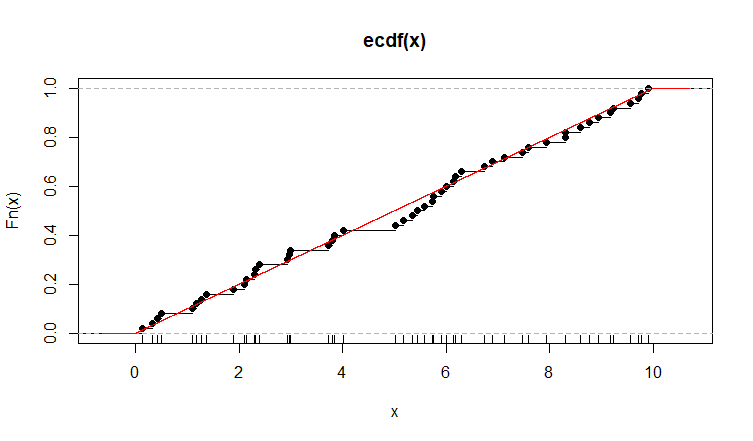
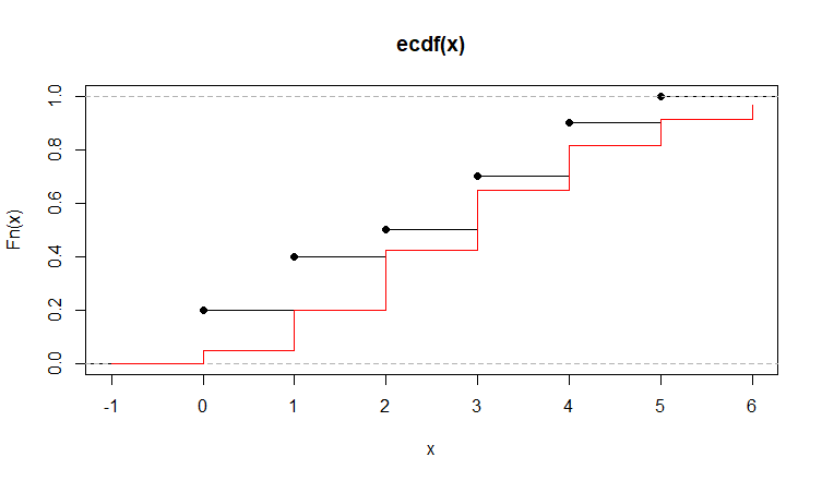
In R, the expression ecdf does the work. (You might want to read the R documentation for ecdf.) For moderate and large sample sizes the ECDF is often a good approximation of the distribution of the population from which the data are randomly sampled (shown in red in the plots below).

Examples (in R):

set.seed(813)
x = runif(50, 0, 10);  plot(ecdf(x));  rug(x)
  curve(punif(x, 0, 10), add=T, col="red", n=10001)

enter image description here

set.seed(2019)
x = rpois(10, 3); plot(ecdf(x))
curve(ppois(x, 3), add=T, col="red", n = 10001)

enter image description here

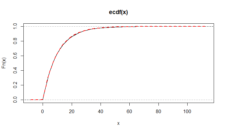
set.seed(1066)
x = rexp(5000, 1/10);  plot(ecdf(x))
curve(pexp(x, 1/10), add-T, col="red")

enter image description here

Note: Q-Q plots (with theoretical and sample quantiles) often amount to ECDF plots with scales suitably distorted so that the population CDF is a straight line.


Addendum per @whuber Comment:

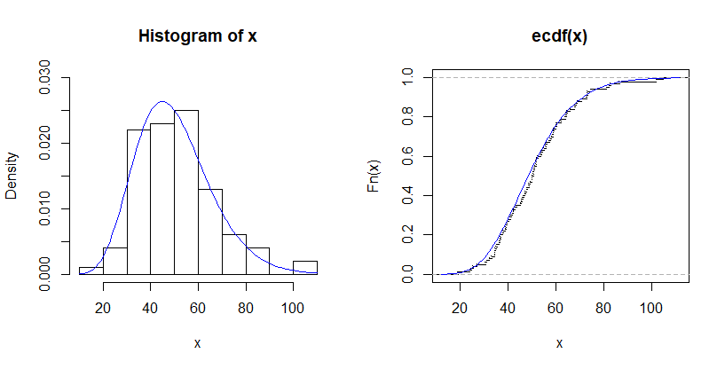
For a small dataset from a gamma distribution, we begin by showing a histogram of the data along with the true density function (left) and an ECDF of the data along with the true CDF (right). For illustration, I chose a small sample so that there will be a clear distinction between exact curves (blue) and estimated ones (red).

set.seed(814)
x = rgamma(100, 10, .2)
par(mfrow=c(1,2))
 hist(x, prob=T, ylim=c(0,.03))
  curve(dgamma(x, 10, .2), add=T, col="blue")
 plot(ecdf(x), pch=".")
  curve(pgamma(x, 10, .2), add=T, col="blue")
par(mfrow=c(1,1))

enter image description here

If the true population distribution is not known, its density function can be estimated by a kernel density estimator (KDE). We use the default KDE in R. The output is two vectors: x-values and y-values for plotting. These vectors are summarized below, and the first six entries in each vector are shown.

density(x)

Call:
        density.default(x = x)

Data: x (100 obs.);     Bandwidth 'bw' = 5.494

       x                 y            
 Min.   :  2.599   Min.   :9.031e-06  
 1st Qu.: 32.251   1st Qu.:9.730e-04  
 Median : 61.902   Median :4.177e-03  
 Mean   : 61.902   Mean   :8.423e-03  
 3rd Qu.: 91.554   3rd Qu.:1.602e-02  
 Max.   :121.205   Max.   :2.527e-02  
head(density(x)$x)
[1] 2.599014 2.831120 3.063227 3.295333 3.527439 3.759546
head(density(x)$y)
[1] 9.030655e-06 1.029092e-05 1.171087e-05 1.327874e-05 1.500377e-05 1.701109e-05

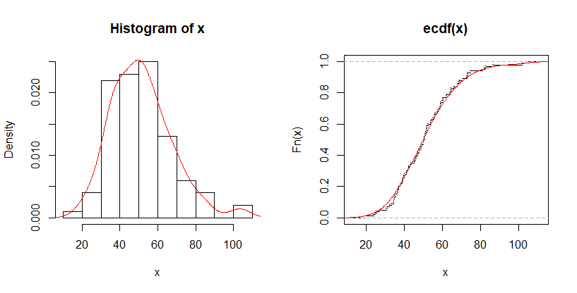
The points in the x-vector are evenly spaced. The points in the y-vector are scaled so that the curve enclosed by the KDE will be (almost exactly) 1. The KDE vectors can be used to estimate the CDF. Plotting points are x.k = ecdf(x)$x a and y.k = cumsum(ecdf(x)$y)/sum(ecdf(x)$y). Here are plots of the histogram of x along with the KDE, and the ECDF along with the CDF as estimated via the KDE.

x.k = density(x)$x
y.k = cumsum(density(x)$y)/sum(density(x)$y)
par(mfrow=c(1,2))
 hist(x, prob=T)
  lines(density(x), col="red")
 plot(ecdf(x), pch=".")
  lines(x.k, y.k, col="red")
par(mfrow=c(1,1))

enter image description here

$\endgroup$
3
  • 2
    $\begingroup$ I believe the question is (in a somewhat disguised way) inquiring about how the CDF based on a KDE is computed and plotted, rather than about plotting an ECDF. $\endgroup$
    – whuber
    Commented Aug 14, 2019 at 12:42
  • 2
    $\begingroup$ @whuber: Thanks. I confess I sill don't understand exactly what OP is trying to do. But your interpretation seems reasonable. Perhaps the Addendum to my answer will help. $\endgroup$
    – BruceET
    Commented Aug 14, 2019 at 19:05
  • 1
    $\begingroup$ @NickCox: Thanks for fixing typos. $\endgroup$
    – BruceET
    Commented Sep 15, 2019 at 22:44

Your Answer

By clicking “Post Your Answer”, you agree to our terms of service and acknowledge you have read our privacy policy.

Not the answer you're looking for? Browse other questions tagged or ask your own question.