9
$\begingroup$

I'm running simulation on a linear model. I get 1000 results and the results are put into a density chart. I do understand that the xaxis is the dependent variable and yaxis represent the kernel density. Yaxis is in decimal numbers like from 0 to 0.15 . How do I explain this to the other users? There is a 15% chance that the simulated values will fall between x1 and x2?

This is my simulation output:

summary(s)

Model:  ls 
Number of simulations:  1000 

Values of X
  (Intercept)  Volume
1           1 1699992
attr(,"assign")
[1] 0 1

Expected Values: E(Y|X) 
    mean    sd    50% 2.5%  97.5%
1 12.305 2.638 12.231 7.03 17.512
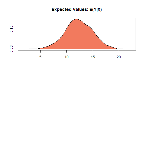
enter image description here

$\endgroup$
1
  • $\begingroup$ How would you explain the height of some other density? (If that's the part you don't know, you seem to be asking the wrong question - you need the more general one; if you know how to explain what a density is, the explanation is the same) $\endgroup$
    – Glen_b
    Commented Aug 9, 2016 at 8:18

2 Answers 2

14
$\begingroup$

You can think of the Kernel Density Estimation as a smoothed histogram. Histograms are limited by the fact that they are inherently discrete (via bins) and are thus more appropriate for displaying data on discrete variables and can be very sensitive to bin size.

What you are actually doing with the Kernel Density Estimation is estimating the probability density function. This makes the interpretation straightforward. So the area under the curve is 1, and the probability of a value being between x1 and x2 is the area under the curve between those two points.

The number of Y values will determine the "resolution" of the curve, so if you assume a straight line between every two adjacent Y points you can calculate an approximation of the area under the curve between those two points.

To determine the probability of an $x$ value $P(x_a<x<x_b)$:

$P(x_a<x<x_b)=y_a+..+y_b$

The result will be more accurate the more $y$ values you have.

$\endgroup$
4
  • $\begingroup$ ok, looking at the above chart what does 0.10 mean? I know what x-axis are. How can I tell this is a good estimation? $\endgroup$ Commented Nov 9, 2012 at 15:30
  • $\begingroup$ looking at the above chart y-axix c(0.00, 0.10) and need to calculate the probability of x-axis beging between 5 and 20, (20-5)*(0.10+0.00)/2=0.75. There is 75% chance that values from simulation will be between 5 and 20. Is this right? $\endgroup$ Commented Nov 9, 2012 at 15:53
  • $\begingroup$ I think I am getting this. But I just have to make sure. y-axix c(0, 0.05, 0.10, 0.15), xaxis c(5,10,15,20), to calculate the cumulative: (20-5)*(0.0+0.05+0.1+0.15)/4=1.125 ( this value is greater than 1, is this right?) $\endgroup$ Commented Nov 9, 2012 at 16:28
  • $\begingroup$ @user1471980 I updated my answer, I am removing my comments to avoid confusion. $\endgroup$
    – Bitwise
    Commented Nov 9, 2012 at 18:17
1
$\begingroup$

Since no reputation to comment on the above post...

The expression $P(x_a < x < x_b) = y_a + ... + y_b$, does not look right. Take for example the uniform density function on the interval [0, 1.0], then according to the above and using only $y_a, y_b$ the probability of any interval would be 2. What I think the poster was trying to refer to was the trapezoid rule.

$\endgroup$

Your Answer

By clicking “Post Your Answer”, you agree to our terms of service and acknowledge you have read our privacy policy.

Not the answer you're looking for? Browse other questions tagged or ask your own question.