I am trying to make an interaction plot for this set of data, but I want to make it with ggplot2. I am trying to predict VP using the predictors G and P, (these are columns in the dataset which I have found to interact with each other, and I have found to have significant impact on VP).
The syntax for ggplot2 has been difficult for me to understand so I am wondering if anyone here finds it easy and is able to create one with my data and show me the code. The last time I tried to teach myself how to make plots with user-defined functions I spent 6 hours debugging. I am hoping someone can simply walk me through the steps so I don't have to go through that again. The model would be VP~G+P+G*P in R.
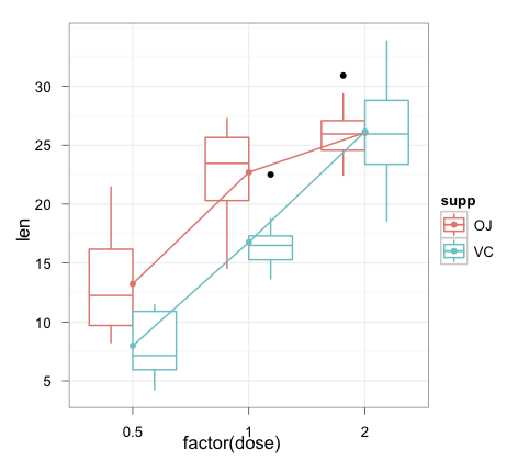
I am hoping to make something like the interaction boxplot found in the answer of this post.

Notes:
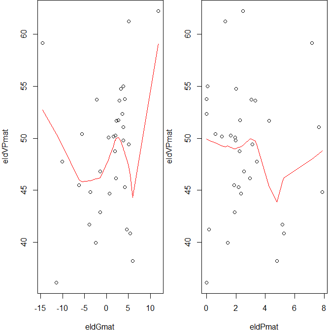
When creating my regression model I had several variables, but I found that G and P had the only significant interaction. So I am trying to create an interaction plot to further dissect the data. Any opinions on the efficacy and logicality of this? Also, opinions on the extremely poor fit of the interaction plot?
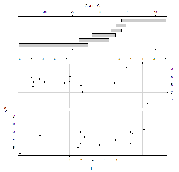
What should I do in this case of a poor fit? Is it safer to say that there is no pattern? For reference, I am trying to predict the vote percentage a candidate gets, VP, based on varying the inflation rate, P, and varying the rate of growth, G. Here is my interaction plot:

Note2:
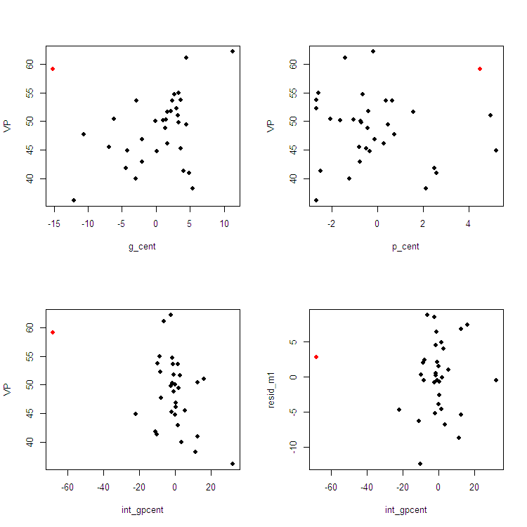
I made my interaction plot with the user defined function found here. The plot they made fit their data well, but my plot doesn't fit my data well. In addition, my plot of the residuals looks almost identical to the interaction plot. On the MIT page, the residual plot vs the interaction plot are very different, plus is easy to see a pattern in.


VP ~ G*P. $\endgroup$effectspackage? See stats.stackexchange.com/questions/18814/… $\endgroup$