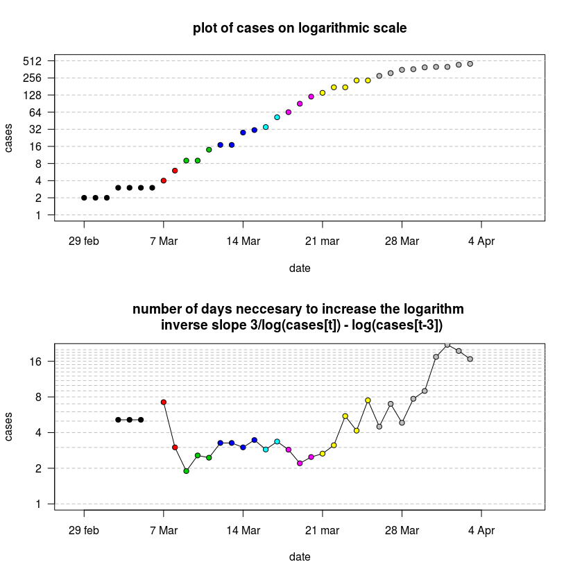
It might be interesting to express the doubling rate as a function of time. It is definitely not a constant.
For this purpose, I plotted the curve on a logarithmic scale. The slope indicates how fast the number doubles.
Below I use the inverse of the slope/rate to determine the number of days that are necessary to double the number of cases
$$\tau_{\text{doubling time}} \approx \frac{\Delta t}{ log_2(N(t+\Delta t))-log_2(N(t))}$$
Where $\tau_{\text{doubling time}}$ is the doubling time-scale, $N(t)$ is the number of cases at time $t$, $\Delta t$ is a small-time difference between which we compare the change.
Instead of using a difference with $\Delta t$ we could use a derivative. The $\Delta t$ is not very precise and does not exactly express the instantaneous growth rate, and instead, it is the growth over the last $\Delta t$ period of time. But to use differentiation you would need to fit a curve to the data, and if this curve is not a good model (ie. biased) then this will introduce error in a different way.

# John Hopkins
dat <- read.csv("https://raw.githubusercontent.com/CSSEGISandData/COVID-19/master/csse_covid_19_data/csse_covid_19_time_series/time_series_covid19_confirmed_global.csv")

# extract country data
y <- as.numeric(dat[dat$Province.State == "Western Australia", -c(1:4)])
d <- 3
tr <- max(which(y<1)):(length(y)-d)  ##trimming data to only the numbers >1

## plot of cases on logarithmic scale
plot(-1,-1, ylim = c(1,512), xlim = c(0,40),
     ylab = "cases", xlab = "date", log = "y",xaxt = "n", yaxt = "n",
     main = "plot of cases on logarithmic scale")

for (i in 0:10) {
  lines(c(-10,100),c(1,1)*2^i, col = "gray", lty=2)
}
axis(2,2^c(0:10), las = 2)
axis(1,at = c(1)+c(0:5)*7, labels = c("29 feb","7 Mar", "14 Mar", "21 mar", "28 Mar", "4 Apr") )

points(y[tr+d], pch = 21, col = 1,  bg =  floor(log(y[tr+d],2)))

# plot the number of days neccesary to increase the logarithm
plot(-1,-1, ylim = c(1,20), xlim = c(0,40),
     ylab = "cases", xlab = "date", log = "y", yaxt = "n", xaxt = "n",
     main= "number of days neccesary to increase the logarithm \n inverse slope 3/log(cases[t]) - log(cases[t-3])")
axis(2,2^c(0:10), las = 2)
axis(1,at = c(1)+c(0:5)*7, labels = c("29 feb","7 Mar", "14 Mar", "21 mar", "28 Mar", "4 Apr") )
for (i in 1:20) {
  lines(c(-10,100),c(1,1)*i, col = "gray", lty=2)
}

lines( d/(log(y[tr+d],2)-log(y[tr],2)))
points( d/(log(y[tr+d],2)-log(y[tr],2)), pch = 21, col = 1,  bg =  floor(log(y[tr+d],2)) )
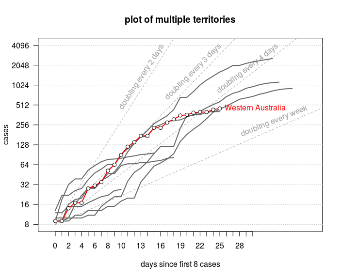
You can see this also in the many plots that go around in the media. Below is an example for Australian provinces. Here the slopes for various doubling rates are plotted explicitly.

## plot of multiple cases on logarithmic scale
plot(-1,-1, ylim = c(8,2^12), xlim = c(0,40),
     ylab = "cases", xlab = "days since first 8 cases", log = "y",xaxt = "n", yaxt = "n",
     main = "plot of multiple territories")

axis(1, 1:31, 0:30)
for (i in 0:12) {
  lines(c(-10,100),c(1,1)*2^i, col = "gray", lty=3)
}
axis(2,2^c(3:12), las = 2)
#axis(1,at = c(1)+c(0:5)*7, labels = c("29 feb","7 Mar", "14 Mar", "21 mar", "28 Mar", "4 Apr") )


lines(c(1,2*14), 8*c(1,2^14), col = "dark gray", lty = 2)
lines(c(1,3*14), 8*c(1,2^14), col = "dark gray", lty = 2)
lines(c(1,4*14), 8*c(1,2^14), col = "dark gray", lty = 2)
lines(c(1,7*14), 8*c(1,2^14), col = "dark gray", lty = 2)

text(log(4096/8,2)*2,4096, "doubling every 2 days", pos = 2, srt = 57, col = "dark gray")
text(log(4096/8,2)*3-0.25,4096, "doubling every 3 days", pos = 2, srt = 45, col = "dark gray")
text(log(4096/8,2)*4-0.5,4096, "doubling every 4 days", pos = 2, srt = 38, col = "dark gray")
text(40,8*2^(40/7)*1.1, "doubling every week", pos = 2, srt = 22, col = "dark gray")

for (province in c("Victoria","Tasmania","South Australia",
                   "Queensland","Northern Territory",
                   "New South Wales", "Australian Capital Territory","Western Australia")){
  # extract country data
  y <- as.numeric(dat[dat$Province.State == province, -c(1:4)])
  tr <- (max(which(y<8))+1):(length(y))  ##trimming data to only the numbers >1

  col = rgb(0.4,0.4,0.4)
  if (province == "Western Australia") {
    col = "red"
  }
  lines(y[tr], pch = 21, col = col,  bg =  floor(log(y[tr+d],2)), lwd = 2)
  if (province == "Western Australia") {
    points(y[tr], pch = 21, col = 1,  bg =  "white")
    text(length(y[tr]), tail(y[tr],1), "Western Australia", col =2, pos = 4)
  }

}
This type of data analysis is just exploratory data analysis. Beware of overinterpreting the differences. There are many potential causes for the differences and the data does not allow us to make strong conclusions about the underlying theories that might explain the differences.
Note that it is possible to make models with the same epidemiological parameters that will turn out different epidemiological curves due to different seeding, distance from the epicenter, random variations, etc.


