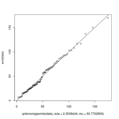
I must have generated at least 5 Q-Q plots until now when trying to fit my data into a known distribution but I just noticed something that I could not understand. In the figure shown below, from what I've read from the wiki, X-axis is supposed to read "Negative Binomial Theoretical Quantiles" and Y-axis is supposed to read "Data quantiles". Agreed that this makes perfect sense. But when I looked at the figure, the X and Y axis go beyond 100 but how can there be quantiles beyond 100? What do they mean if they exist? Or is this graph produced by the qqplot of R totally different? Can someone help me understand this?
The way I was generating this data was using the following script:
library(MASS)

# Define the data
data <- c(67, 81, 93, 65, 18, 44, 31, 103, 64, 19, 27, 57, 63, 25, 22, 150,
          31, 58, 93, 6, 86, 43, 17, 9, 78, 23, 75, 28, 37, 23, 108, 14, 137,
          69, 58, 81, 62, 25, 54, 57, 65, 72, 17, 22, 170, 95, 38, 33, 34, 68,
          38, 117, 28, 17, 19, 25, 24, 15, 103, 31, 33, 77, 38, 8, 48, 32, 48,
          26, 63, 16, 70, 87, 31, 36, 31, 38, 91, 117, 16, 40, 7, 26, 15, 89,
          67, 7, 39, 33, 58)

# Fit the data to a model
params = fitdistr(data, "Negative Binomial")

#using the answer from params create a set of theoretical values
plot(qnbinom(ppoints(data), size=2.3539444, mu=50.7752809), sort(data))
abline(0,1)

