I'm wondering how to interpret interact_plot plots for categorical x continuous interactions. Here's a toy example to illustrate:
df <- data.frame(mtcars)
df$cyl <- as.factor(df$cyl)
fit <- lm(mpg ~ cyl * wt + am, data = df)
summary(fit)
Which gives these coefficient values:
Coefficients:
            Estimate Std. Error t value Pr(>|t|)
(Intercept)  41.4641     4.5358   9.141  1.9e-09 ***
cyl6         -8.6617    10.3634  -0.836 0.411185
cyl8        -16.8621     5.2733  -3.198 0.003738 **
wt           -6.1883     1.6499  -3.751 0.000937 ***
am           -0.9015     1.5145  -0.595 0.557030
cyl6:wt       2.1227     3.3954   0.625 0.537522
cyl8:wt       3.8446     1.7733   2.168 0.039880 *
And here's the interact_plot:
library(interactions)
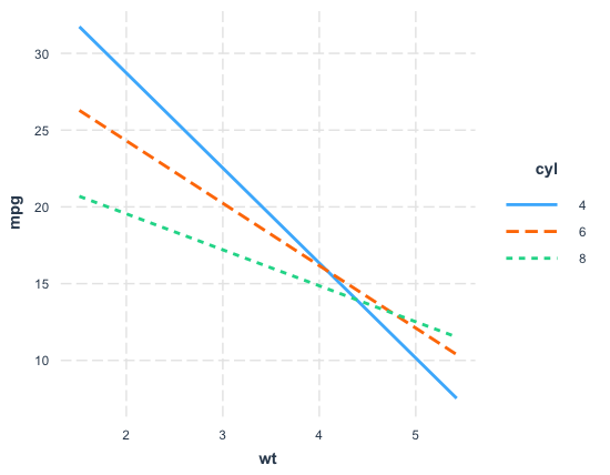
interact_plot(fit, pred = wt, modx = cyl)
Looking at this plot alongside the summary() output above, we can see the following:
# Effect on mpg of moving from 4 to 6 cylinders at 1000 lbs (i.e., wt = 1):
-8.6617 + 2.1227 = -6.539
# Effect on mpg of moving from 4 to 6 cylinders at 5000 lbs (i.e., wt = 5):
-8.6617 + 2.1227 * 5 = 1.9518

# Effect on mpg of moving from 4 to 8 cylinders at 1000 lbs:
-16.8621 + 3.8446 = -13.0175
# Effect on mpg of moving from 4 to 8 cylinders at 5000 lbs:
-16.8621 + 3.8446 * 5 = 2.3609
The non-trivial estimate values for cyl6:wt and cyl8:wt suggest that there is heterogeneity in the effect of cyl on mpg, such that the effect of moving from 4 to 6 cylinders or 4 to 8 cylinders varies depending on the weight of the vehicle. This can be seen from the difference in slope between the cyl = 4 line and the cyl = 6 and cyl = 8 lines, respectively. Moreover, the interaction between moving from 4 to 8 cylinders and weight in particular is significant.
Here are my two questions:
1. How do I interpret interact_plots more generally?
Is the following correct for how to interpret these types of plots generally?
- Parallel lines indicate an absence of heterogeneity/interaction.
- Differently sloped lines indicate heterogeneity. As in the example above, the difference in effect on
mpgfrom different level ofcylvaries for different values ofwt. - Lines that cross over indicate a particular type of heterogeneity whereby the difference in effect "flips" for some values. For example, if you want to reduce mpg, you'd want to go for 6 or 8 cylinder cars if it weighs less than about 4000 lbs, and a 4 cylinder car above that.
Is that correct?
2. How do I interpret confidence bands in interact_plots?
Consider the same plot from above, but this time with confidence intervals:
library(interactions)
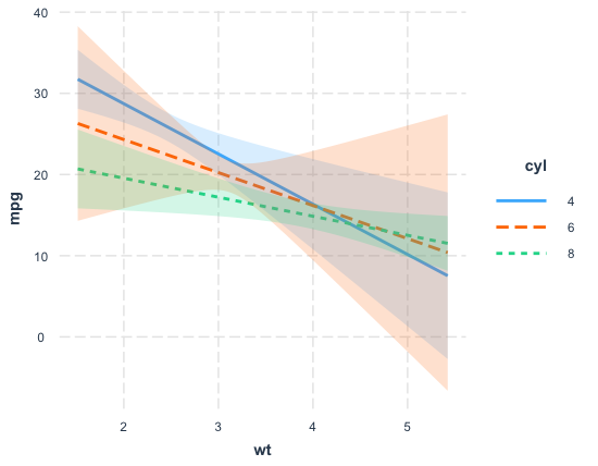
interact_plot(fit, pred = wt, modx = cyl, interval = TRUE)
The documentation makes clear that interval = TRUE gives 95% confidence intervals by default. What I'm not clear on is how to interpret these in the context of the p-values I get from summary() above.
At first I thought that, since there are points (for low wt values) where the green ribbon (cyl = 8) and the blue ribbon do not touch, we can conclude that the corresponding interaction term (cyl8:wt) is significantly different from 0, as per the summary() output above.
But that can't be right, as shown by this example:
df$vs <- as.factor(df$vs)
fit2 <- lm(mpg ~ vs * wt + am + cyl, data = df)
summary(fit2)
Which gives these coefficient values:
Coefficients:
            Estimate Std. Error t value Pr(>|t|)
(Intercept)  30.6802     3.5817   8.566 6.61e-09 ***
vs1          10.1609     4.6323   2.193   0.0378 *
wt           -2.4202     0.9262  -2.613   0.0150 *
am           -0.7796     1.5644  -0.498   0.6226
cyl6         -2.2400     1.6988  -1.319   0.1993
cyl8         -5.7899     2.5499  -2.271   0.0320 *
vs1:wt       -3.4214     1.6386  -2.088   0.0471 *
And the following interact_plot:
library(interactions)
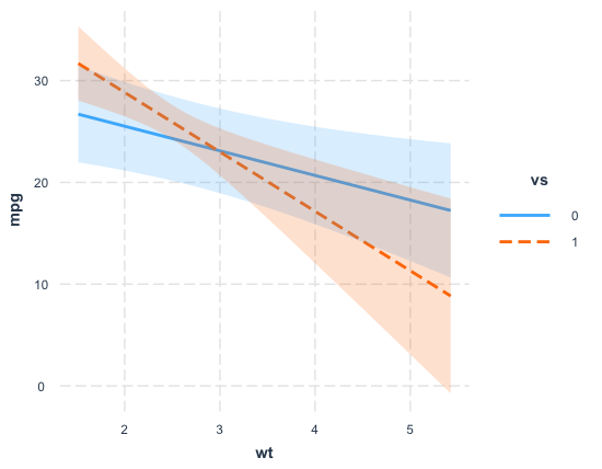
interact_plot(fit2, pred = wt, modx = vs, interval = TRUE)
Here we have a significant interaction term (vs1:wt) but no point at which the two ribbons do not overlap.
So how are these confidence bands to be interpreted?
Thanks in advance for any answers!


