18
$\begingroup$

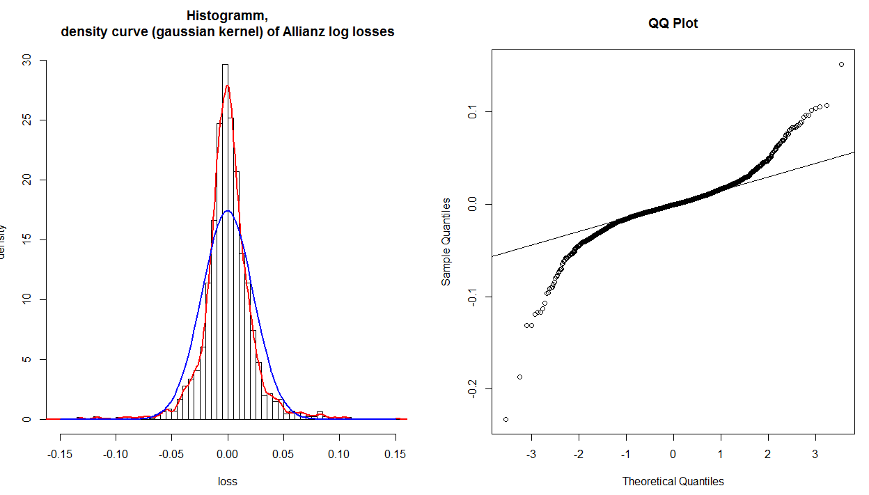
I have a histogram, kernel density and a fitted normal distribution of financial log returns, which are transformed into losses (signs are changed), and a normal QQ plot of these data:

http://tinypic.com/r/34ocwvr/6

The QQ plot shows clearly that the tails are not fitted correctly. But if I have a look at the histogram and the fitted normal distribution (blue), even the values around 0.0 are not fitted correctly. So the QQ plot shows that only the tails are not fitted appropriately, but clearly the whole distribution is not fitted correctly. Why does this not show up in the QQ plot?

$\endgroup$
1
  • 10
    $\begingroup$ The blue curve on the left corresponds to a hypothetical line of "best fit" on the right. The line on the right is not that best fit line: it is one that best fits the middle values in the distribution. If you were to fit a "bell curve" to the middle two-thirds or so of the histogram, instead of to the whole thing, that curve would come close to following the peak and the steeply sloped sides, but then it would be far too low at the shoulders and tails. That's exactly what the line in the qq plot is showing, too: those plots are in perfect agreement; it is the fits that differ. $\endgroup$
    – whuber
    Commented Mar 14, 2013 at 16:00

2 Answers 2

15
$\begingroup$

+1 to @NickSabbe, for 'the plot just tells you that "something is wrong"', which is often the best way to use a qq-plot (as it can be difficult to understand how to interpret them). It is possible to learn how to interpret a qq-plot by thinking about how to make one, however.

You would start by sorting your data, then you would count your way up from the minimum value taking each as an equal percentage. For example, if you had 20 data points, when you counted the first one (the minimum), you would say to yourself, 'I counted 5% of my data'. You would follow this procedure until you got to the end, at which point you would have passed through 100% of your data. These percentage values can then be compared to the same percentage values from the corresponding theoretical normal (i.e., the normal with the same mean and SD).

When you go to plot these, you will discover that you have trouble with the last value, which is 100%, because when you've passed through 100% of a theoretical normal you are 'at' infinity. This problem is dealt with by adding a small constant to the denominator at each point in your data before calculating the percentages. A typical value would be to add 1 to the denominator; for example, you would call your 1st (of 20) data point 1/(20+1)=5%, and your last would be 20/(20+1)=95%. Now if you plot these points against a corresponding theoretical normal, you will have a pp-plot (for plotting probabilities against probabilities). Such a plot would most likely show the deviations between your distribution and a normal in the center of the distribution. This is because 68% of a normal distribution lies within +/- 1 SD, so pp-plots have excellent resolution there, and poor resolution elsewhere. (For more on this point, it may help to read my answer here: PP-plots vs. QQ-plots.)

Often, we are most concerned about what is happening in the tails of our distribution. To get better resolution there (and thus worse resolution in the middle), we can construct a qq-plot instead. We do this by taking our sets of probabilities and passing them through the inverse of the normal distribution's CDF (this is like reading the z-table in the back of a stats book backwards--you read in a probability and read out a z-score). The result of this operation is two sets of quantiles, which can be plotted against each other similarly.

@whuber is right that the reference line is plotted afterwards (typically) by finding the best fitting line through the middle 50% of the points (i.e., from the first quartile to the third). This is done to make the plot easier to read. Using this line, you can interpret the plot as showing you whether the quantiles of your distribution progressively diverge from a true normal as you move into the tails. (Note that the position of points further out from the center are not really independent of those closer in; so the fact that, in your specific histogram, the tails seem to come together after having the 'shoulders' differ does not mean that the quantiles are now the same again.)

You can interpret a qq-plot analytically by considering the values read from the axes compare for a given plotted point. If the data were well described by a normal distribution, the values should be about the same. For example, take the extreme point at the very far left bottom corner: its $x$ value is somewhere past $-3$, but its $y$ value is only a little past $-.2$, so it is much further out than it 'should' be. In general, a simple rubric to interpret a qq-plot is that if a given tail twists off counterclockwise from the reference line, there is more data in that tail of your distribution than in a theoretical normal, and if a tail twists off clockwise there is less data in that tail of your distribution than in a theoretical normal. In other words:

  • if both tails twist counterclockwise you have heavy tails (leptokurtosis),
  • if both tails twist clockwise, you have light tails (platykurtosis),
  • if your right tail twists counterclockwise and your left tail twists clockwise, you have right skew
  • if your left tail twists counterclockwise and your right tail twists clockwise, you have left skew
$\endgroup$
3
  • 1
    $\begingroup$ I find such rubrics less than satisfactory. One is that they have no direct connection with the principles behind the plot: they have to be memorized separately (and can be completely confused by a faulty memory). Another (in this case) is that it's too complicated to be reliably useful. Yet another is that a lack of standardization in how such plots are drawn can make this method incorrect when applied to a qq plot made by a different procedure. But qq plots are easy to interpret: see my attempt at an explanation halfway down quantdec.com/envstats/notes/class_03/probability.htm. $\endgroup$
    – whuber
    Commented Mar 14, 2013 at 17:15
  • 1
    $\begingroup$ @whuber, After eight years your link has rotted away. Are your notes available elsewhere? Thanks. $\endgroup$ Commented May 13, 2021 at 15:00
  • $\begingroup$ for anyone needing a link that works, here's the archived webpage: web.archive.org/web/20160324094105/www.quantdec.com/envstats/… $\endgroup$
    – Joe
    Commented Aug 16, 2023 at 23:39
6
$\begingroup$

Simply put: the QQ-plot shows the ranking in the empirical distribution as compared to the expected distribution. In your case (and this is actually quite often the case; always with symmetrical distributions), the ranks near the middle will be similar between expected and empirical, hence, the QQ-plot is close to the line there.

It is not so straightforward to actually identify the "strange" observations based on their position in a QQ-plot: the plot just tells you that "something is wrong", and if you know more about the data/distributions, you may find out where the issues are.

$\endgroup$
3
  • 1
    $\begingroup$ I would maintain the opposite conclusion, Nick: the qq plot makes it much easier to identify and evaluate "strange" results compared to the body of data, while the histogram tends to obscure much that the qq plot reveals. The issue here is not whether the qq plot is close to a line: it concerns what line was chosen by the software as a reference for the plot! (I suspect R bases its fit on some moderate percentiles, such as quartiles, while evidently the fit to the histogram was based on matching moments.) $\endgroup$
    – whuber
    Commented Mar 14, 2013 at 16:37
  • 2
    $\begingroup$ @whuber: Personally, I like to see both if possible (mostly since I "read" histograms easier than QQ-plots). But you are right and I stand corrected. $\endgroup$
    – Nick Sabbe
    Commented Mar 14, 2013 at 16:53
  • 3
    $\begingroup$ And you are quite correct that the two techniques are complementary. For instance, bimodality tends to be easier to detect (and quantify) in a histogram than in a qq plot. I believe that with practice, both histograms and qq plots become easy to read. QQ plots might take a little longer to learn only because they do not have a standard form of presentation: you always have to check which axis is the value and which the quantile, and sometimes the quantiles are converted to "equivalent values" (instead of being standardized). $\endgroup$
    – whuber
    Commented Mar 14, 2013 at 17:09

Your Answer

By clicking “Post Your Answer”, you agree to our terms of service and acknowledge you have read our privacy policy.

Not the answer you're looking for? Browse other questions tagged or ask your own question.