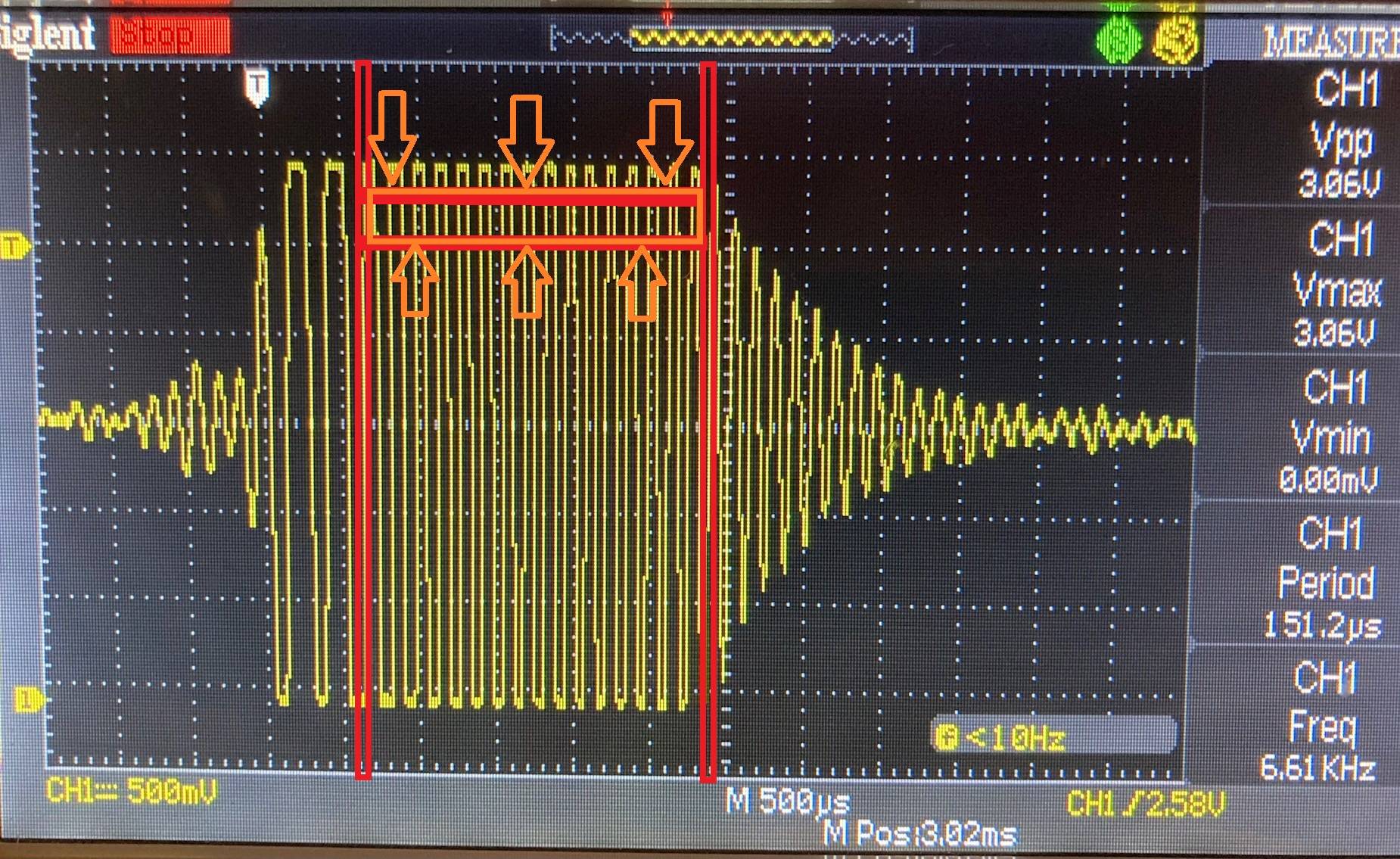
EDIT 3: added below picture of raw readings of oscope from doppler data showing "periods" of sine waves before processed sine signal into square pulses.

EDIT 1: These numbers on the left are period time values in micro seconds (us) in the "time domain" and they need to be converted to the "frequency domain" Sampling rate was 76800 hz and the total length of sampling was 23682500us or 0.00236825 seconds. The actual frequency I am seeking is 6660.984 Hz (or close to it) which is 150.1279us period.
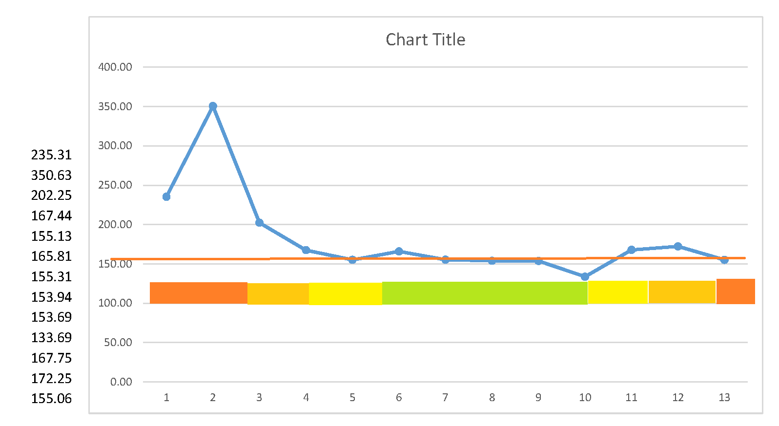
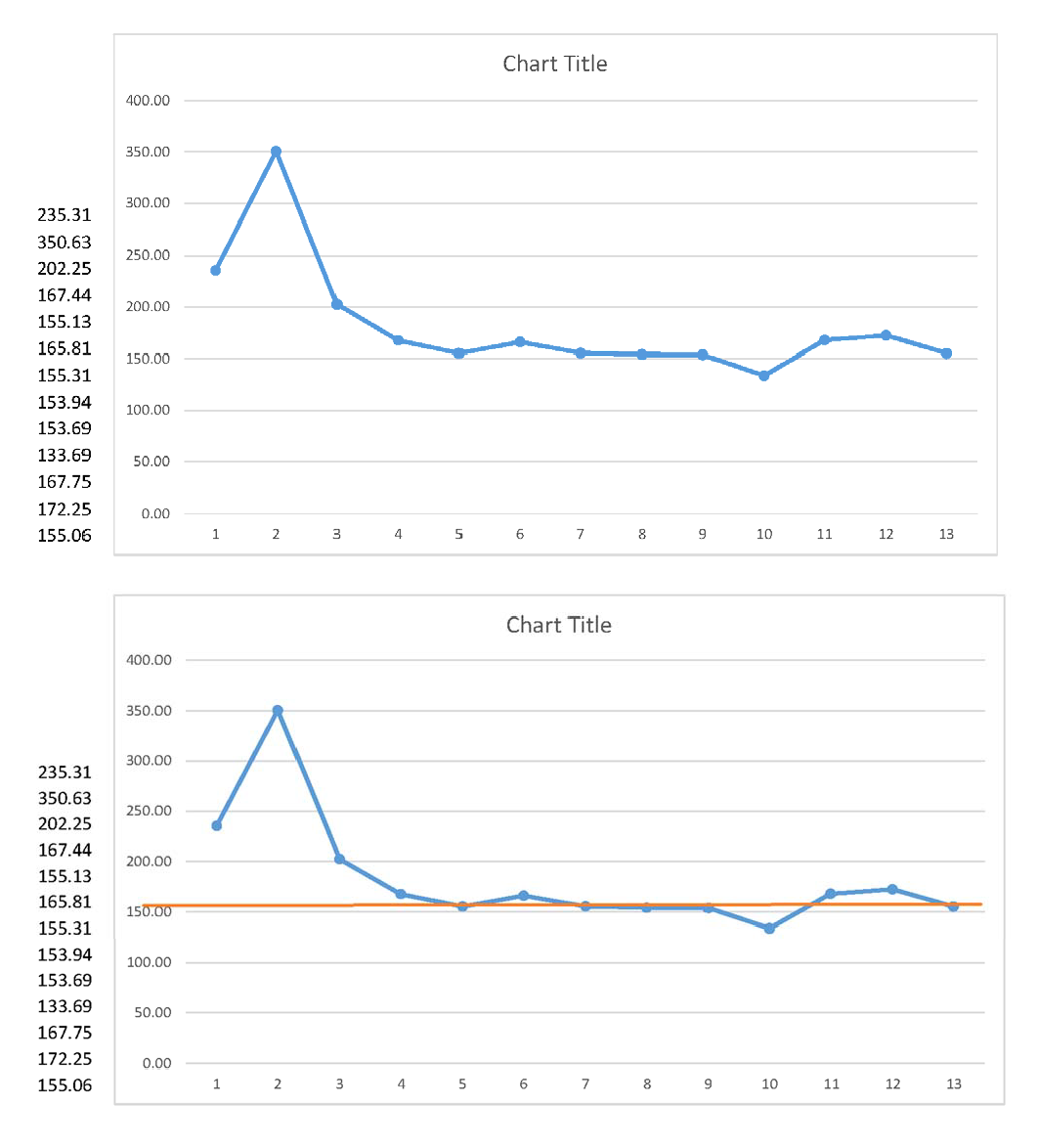
This is the result of a doppler reading of time values that will be converted to frequencies. The numbers are listed on the left side of the graph.
Would like to find the dominant value. I think FFT/FHT may be the solution, but do not think there are enough data points.
Want to arrive to as near as possible to the solution: i.e. the Actual Number the red line in the graph.
What numbers to expect in the string?:
The number of data points will be between 5 and 20. (in the vast majority of cases between 10 and 20 data points)
The will be long integers (for example: 1359375) that I will convert into fractional with up to 5 decimal spaces (like 135.9375).
The data line string will always start with values (2 to 6 data points) that are about 10-30% higher than the Actual Number and will progressively decrease and settle into a horizontal level line.
The Actual Number’s value will be very close to the values of the data points that are located from the 50% (middle) to 80% part (near the end).
There will be at least 2 to 6 data points in that area that will be within 5-10% from each other and also very close to the Actual Number.
The data points will never exactly match each other because they contain up to 5 more fractional digits. So MEAN averaging would not work unless able to “round” them up first.
I believe weighed moving average would work best. But that’s because I’m not familiar with other statistics options.
EDIT 2: added color chart of areas where the numbers are most likely to be closest to the actual value I am seeking. 

