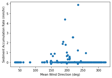
I have plotted this data, and to me there appears to be a clear relationship between the variables (sediment accumulates when wind direction is between 150 and 250 degrees). Is there a appropriate method to quantify this non-linear relationship? Perhaps some kind of distance correlation? And is there a good way to visualize that relationship besides simply the scatter plot?
EDIT: Ok after reading about circular-statistics, it seems like I need to calculate a circular-linear correlation coefficient. A method for this is described here: https://jdblischak.github.io/fucci-seq/circ-simulation-correlation.html . The same method is used in the circular statistics toolbox in Matlab.
I have tried to recreate this method in python below, and got the following results:
[0.19274636, 0.84823636]
Does this method seem appropriate for what I'm trying to do? I would interpret those results to mean that there is no statistically significant correlation between my two variables, which I find hard to believe.
rate = df.accumulation_rate # list of sediment accumulation rates
wind = df.wind_direction * (3.14159/180) # list of wind directions (in
radians)

rxc = np.array(sp.stats.pearsonr(rate,np.cos(wind)))
rxs = np.array(sp.stats.pearsonr(rate,np.sin(wind)))
rcs = np.array(sp.stats.pearsonr(np.cos(wind),np.sin(wind)))

rho = np.sqrt(((rxc)**2 + (rxs)**2 - (rxc)*(rxs)*(rcs)) / (1 - (rcs)**2))
print(rho)

