I am not sure the title is easy to understand, but this is because I'm struggling to find out if my question is machine-learning related, or just correlation-related, or anything else.
Context: I have a categorical variable that can take three values. And 75 samples, 25 per category. On top of knowing what the category is, I have continuous variables for each sample. The goal is not to build a predictor; the goal is to determine if there is correlation between the categorical variable and one of the continuous variables because there are good (non mathematical ones) reasons to believe that there is a causation effect (the continuous variable causing the categorical one, I'm not sure if it is useful to know the direction of the causation effect when conducting such a correlation analysis but I'm including it just in case - I'll happily read anything on that matter as I'm very eager to fully understand what I'm doing). Finally, I should add that it would make more sense that we only choose one continuous variable to predict the categorical one (they all represent the same physical stuff but just from different machines for example - although I guess using the outputs of several machines could in theory help, I think the sample size is too low to see this and I fear overfitting).
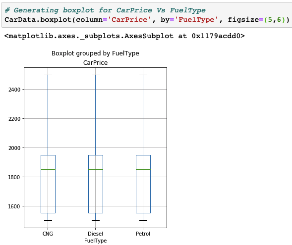
My first idea was to plot boxplots (c.f. below, not my data, but 3 categories and a continuous variable on the plot as I do) for each continuous variable (so I'll end with dozens of boxplots). And then pick the one variable that would lead to boxplots being the most different (the example I've given is an example of a "bad continuous variable"). But I don't really have a "metric" when it comes to measuring "the difference" of boxplots. Is there one? I've googled some stuff and just found "rules of thumbs" on how to "compare boxplots with the eye" e.g.:
- Compare the respective medians, to compare location.
- Compare the interquartile ranges (that is, the box lengths), to compare dispersion.
- Look at the overall spread as shown by the adjacent values. (This is another aspect of dispersion.)
- Look for signs of skewness. If the data do not appear to be symmetric, does each batch show the same kind of asymmetry?
- Look for potential outliers. This doesn't seem very rigorous because I, the human, would have to make the final decision as to what variable makes the 3 most different boxplots.
Furthermore, all of this looks a bit flawed because I'm not considering the fact that several continuous variables together might help predicting the categorical one. However, my variables being pretty correlated, my sample size pretty low and the predicted variable being quite subject to variability (as in, I'm expecting one continuous variable to be just a little bit helpful at distinguishing what category the sample is in, meaning, I don't have a problem where I will end up with high accuracy), I figured that doing some sort of machine learning stuff (random forest + cross-validation + feature importance) was not going to be the best path.

