2
$\begingroup$

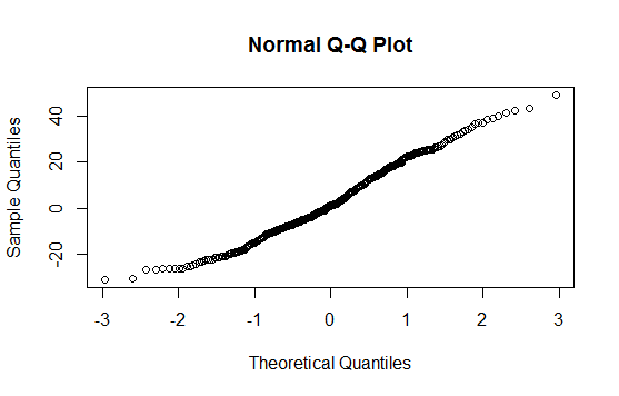
I have a simple question about QQ plots in simple linear regression, but I am a bit confused about the plot: depending where i look the y axis is different: it can be either 1) residuals 2) standardized residuals 3) the actual independent variable. I wonder which one is better to use? I know that we are checking the assumption of normality: that errors are normally distributed (so residuals ). Does it imply that my independent variable is also normally distributed? and what should be a proper y-axis?

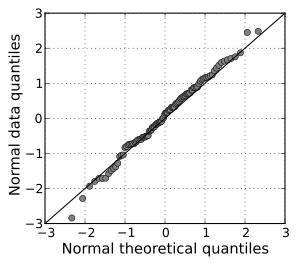
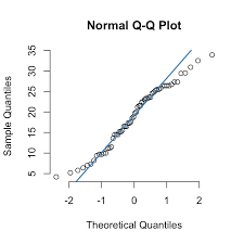
enter image description here enter image description here enter image description here

I got a response in one of the chat: They are all identical for the purpose of normality checking. If the residual, epsilon, is normally distributed then Y = XB + epsilon is normally distributed. .... But the technical condition necessary for inference (p-values) is that the residuals are normally distributed. This is called called the conditional distribution of Y, conditioned on all the X's.

I am not exactly sure I understand the explanation (except the part about residuals and standardized residuals)

$\endgroup$
4
  • $\begingroup$ Is your question about how to interpret a Q-Q plot, which type of Q-Q plot you should use (i.e., what variable to include on the y-axis), or which assumption of normality is required for exact inference in linear regression? Please clarify, since the title, text, and final question seem to be about different things. $\endgroup$
    – Noah
    Commented May 11, 2022 at 2:38
  • $\begingroup$ i think both. My first question is which type of Q-Q plot you should use? and my second question is basically related to the first one: if we (for example do not do Y variable on y axis) I wonder why $\endgroup$
    – yuliaUU
    Commented May 11, 2022 at 2:51
  • 1
    $\begingroup$ @BruceET, just to make sure i got it write: you are saying that putting either standardized residuals or the just residuals is OK ( or you also mean that I can also put my Y variable on y-axis). cause the title "sample" does not really tell me much whether we use residuals or actual y-values $\endgroup$
    – yuliaUU
    Commented May 11, 2022 at 3:48
  • $\begingroup$ Sorry for delay. Had to leave the computer for a while. Either method is correct. I have deleted by comment above because I have expanded into a formal Answer, with graphs. // "Sample" refers to data. "Theoretical: refers to population CDFs $\endgroup$
    – BruceET
    Commented May 11, 2022 at 5:03

1 Answer 1

2
$\begingroup$

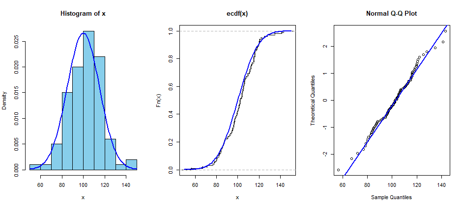
Both styles of Q-Q plots are considered correct and both are in common use. The default in R is to put the 'data' or 'sample' quantiles on the vertical axis; parameter datax=T puts the theoretical quantiles on the vertical axis. . If you're showing the Q-Q plot along with a histogram or an ECDF plot, the latter style seems natural.

set.seed(2022)
x = rnorm(100, 100, 15)
par(mfrow=c(1,3))
 hist(x, prob=T, col="skyblue")
  curve(dnorm(x, 100, 15), add=T, col="blue", lwd=2)
 plot(ecdf(x))
  curve(pnorm(x, 100, 15), add=T, col="blue", lwd=2)
 qqnorm(x, datax=T)
  qqline(x, datax=T, col="blue", lwd=2)
 par(mfrow=c(1,1))

enter image description here

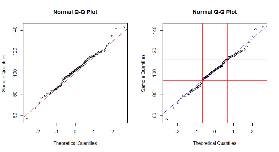
However, if you want to draw a line around which points of a normal sample might fall, that's easier to do with the default style of Q-Q plot: $y=μ+σx.$ The default reference line in R (with qqline) connects sample and theoretical quartiles.

This default method in R seems to be used more often outside of North America. However, you should feel free to use whichever style of Q-Q plot you prefer. (The only exception might be if you're submitting to a journal that insists that one of the styles must always be used.)

In the figure below, (left) the line $y=\mu + \sigma x = 100 + 15x$ is shown in brown. The blue reference line (right) connects quartiles (red).

par(mfrow=c(1,2))
 qqnorm(x)
  abline(a = 100, b = 15, col="brown")
 qqnorm(x)
  qqline(x, col="blue")
   abline(h = quantile(x, c(.25,.75)), col="red")
   abline(v = qnorm(c(.25,.75)), col="red")
par(mfrow=c(1,1))

enter image description here

Addendum: Mentioned Shapiro-Wilk test in Comment. Results of S-W test for sample x used above are shown below. Sample would be considered consistent with sampling from some normal population because the P-value of the test exceeds 5%.

shapiro.test(x)

        Shapiro-Wilk normality test

data:  x
W = 0.99017, p-value = 0.678
$\endgroup$
6
  • $\begingroup$ why both are acceptable? i thought we testing assumption that errors are normally distributed, not a response variable? $\endgroup$
    – yuliaUU
    Commented May 11, 2022 at 6:24
  • 1
    $\begingroup$ The two styles show the same information. Most people get familiar with one of the two for personal convenience. // Strictly speaking, neither provides a formal test of normality, but Q-Q plots are often used informally to judge normality, especially for small samples where formal tests may not have good power. $\endgroup$
    – BruceET
    Commented May 11, 2022 at 14:08
  • $\begingroup$ in your example, x represent the dependent or independent variable? $\endgroup$
    – yuliaUU
    Commented May 11, 2022 at 17:14
  • $\begingroup$ In a Q-Q plot there is only one variable 'x' and we wonder whether it was randomly sampled from a normal distribution. For a sample of size $n=100,$ one might use the Shapiro-Wilk normality test $(H_0: Normal).$ But for various reasons, the S-W test may not give useful results for very small or very large samples. Many statisticians prefer to look at a Q-Q plot and conclude sample likely normal if points on Q-Q plot fall 'nearly' in a straight line (not being too fussy about a few 'nonlinear' points in the tails of x. // In a regression or ANOVA one expects residuals from model to be normal $\endgroup$
    – BruceET
    Commented May 11, 2022 at 17:23
  • $\begingroup$ Soory, I think I was not very clear in my question. In a context of SLR, lets say in data cars : lm(dist~speed), when i do QQ plot, what is x variable is? am I correct that I can calculate standardized residuals and plot it against the theoretical quantiles (using qqnorm() ) OR I can take the response variable (dist) and plot it against theoretical quantile? $\endgroup$
    – yuliaUU
    Commented May 11, 2022 at 18:13

Your Answer

By clicking “Post Your Answer”, you agree to our terms of service and acknowledge you have read our privacy policy.

Not the answer you're looking for? Browse other questions tagged or ask your own question.