0
$\begingroup$

So, I have been analyzing audio data. I used the librosa package and used its .stft() function to calculate the Fourier transform of my audio data. I did the following-

aud,sr=librosa.load(os.path.join(path,'genres_original',i,f'{i}.00001.wav'))
aud_ft= np.abs(librosa.stft(aud, n_fft = n_fft, hop_length = hop_length,win_length=win_length)) 
plt.figure(figsize=(12,4))
plt.plot(aud_ft)

The shape of the aud_ft is (1025,1309). The plot represents frequency on the y-axis and time on the x-axis and also represents the power/amplitude of each frequency at each time sample using color.

My doubt is how does a 2d array stores frequency as well as power values?

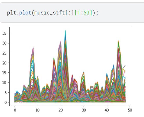
In addition to that, I noticed some weird outputs of the plot() function. enter image description here
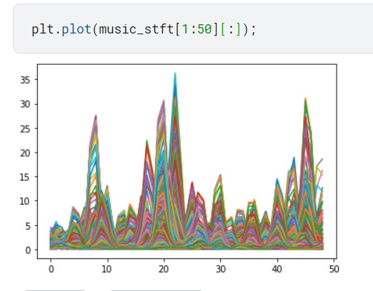
THE PLOTS AND CODE

Why does the plot remain the same for both the cases, how do I explain this?

Any help is highly appreciated. Thank you in advance.

$\endgroup$
2
  • $\begingroup$ Stackoverflow could be a better venue to ask this. $\endgroup$ Commented Jun 13, 2022 at 21:30
  • $\begingroup$ Okay, thanks for the info. $\endgroup$
    – dhananjaya
    Commented Jun 14, 2022 at 8:51

1 Answer 1

0
$\begingroup$

A spectrogram is a multi-variate time-series. When using matplotlib plot() to plot it, you just get each independent time-frame or frequency-band, which throws away the time/frequency relation in the signal. Instead plot the 2d structure as a heatmap. This is easiest done using using librosa.display.specshow.

$\endgroup$

Your Answer

By clicking “Post Your Answer”, you agree to our terms of service and acknowledge you have read our privacy policy.

Not the answer you're looking for? Browse other questions tagged or ask your own question.