What R implementations (should) do is for developers and users of that software. I wish to comment more broadly on limitations of box plots.
This overlaps a little with points made in other answers, and I am happy to note agreements. But at the risk of some repetition I wanted this answer to seem coherent, at least to me.
Box plots as known at present owe most to a re-invention by J.W. Tukey in the 1970s (most visibly in Exploratory Data Analysis, 1977) of dispersion diagrams used by geographers routinely from the 1930s, which in turn were channelling an idea stretching back through A.L. Bowley to Francis Galton that (in modern terms) plots, or more generally reports on data, that were based on particular quantiles could give useful summaries and helpful detail as well.
This history is poorly understood, partly because few non-geographers are well read in geographical literature, although Tukey himself was aware of it. The meme that Tukey invented box plots is at best supplemented by an unhistorical mention of Marion E. Spear on range-bar plots. Spear herself was using but not citing earlier work by Kenneth W. Haemer, which itself ignored geographical predecessors, and Bowley, and Galton. But no one can be expected to know about all previous uses of statistical graphics anywhere.
The precursors of box plots in many cases showed much more detail than bare box plots do, often all data points. In contrast, the focus of Tukey's work on box plots was whatever could be done quickly with pen and paper alone, with some expectation that a user was able and willing to do some simple calculations, such as averaging two numbers or multiplying by 1.5. As someone aged 25 in 1977, I still benefit from years of schooling in "mental arithmetic" (no workings on paper allowed, let alone slide rules or calculators or any other aid) as well as "mechanical arithmetic" (working on paper allowed). This is almost never anyone's routine situation with data analysis 50 years later.
Further, the aim of a box plot was mostly exploratory, for example to identify data points that need thinking about, and possibly some action such as a transformation.
Tukey himself would never have defended the box plot as fit for all kinds of data. Problem areas include, and are not limited to,
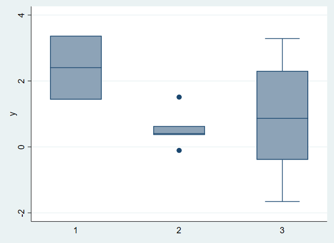
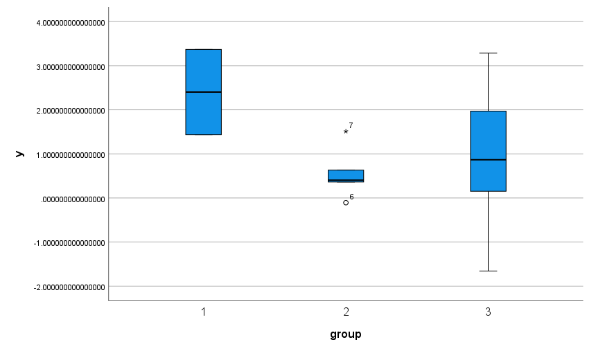
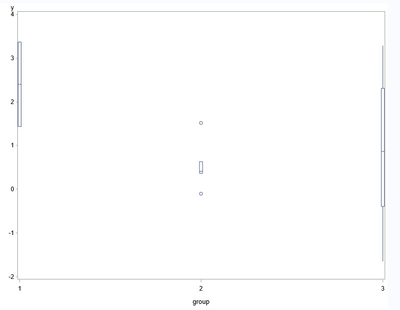
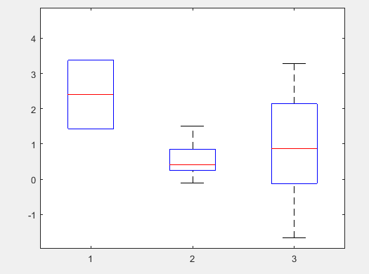
Very small samples, as in the question.
Discrete outcomes (e.g. counted or categorical data). For example, there are many threads here arising from puzzlement when either whisker is not shown or some other element of a box plot is apparently missing. The data don't have to be pathological or bizarre to produce a weird-looking box plot that is hard for many newcomers to decode. For example, suppose 60% of values are 0, 30% of values are 1, 10% of values are 2. Then the minimum, lower quartile and median coincide, the IQR is 1 and the 2s just show implicitly at the end of one whisker. Now suppose 80% of values are 0.....
U-shaped distributions. Tukey gave an example of Rayleigh's data (which led to the discovery of argon) which fall in two clumps, so that the box is long and the whiskers short. Beyond that, long boxes and short whiskers are often misinterpreted as distributions with short thin tails too, people forgetting that if 50% of the distribution is inside the box, then 50% is outside, and the average density outside the box can be (much) higher.
In all these cases, there are simple ripostes, to use something else instead or to think a little harder (or to provide a better story).
As far as the question is concerned:
Programmers (me too in other contexts) need to think about what is the default behaviour of their programs. I wouldn't recommend a threshold sample size below which the box plot is ignored and something else is done. I might recommend an option to do that.
As above, most of the difficulties are avoided by plotting box plots routinely with some other representation juxtaposed or superimposed, either a dot or strip plot or a quantile plot (or occasionally a histogram). There are many variants of this idea already. The most popular seem based on jittering otherwise identical data points apart. I favour stacking in some sense, as jittering isn't so easy to decode in terms of a local density.
Here is an example in the same spirit as the question.
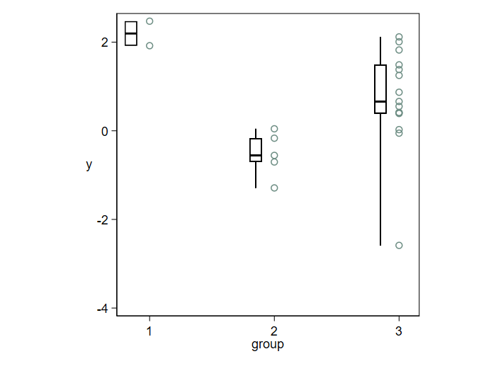
So long as data points are shown directly, it becomes trivial to decode puzzling box plots, or to ignore them as unhelpful. With larger samples, not the question but clearly important too, you can use most of the space for direct representation of the data and let the box plots be thin summaries.
Detail: If you show all the data, the need to follow rules like "Plot data points individually whenever any is more than 1.5 IQR from the nearer quartile" diminishes, if it doesn't disappear. Such rules are in any case routinely not well explained, not well understood, or both. So, the whiskers can just extend to the extremes, or (as is quite often done) you can just have the whiskers extend to say the 5% and 95% points, so long as you explain your convention.
The stark contrast between thick box and thin whiskers that is conventional overstates the importance of quartiles as thresholds or even as summaries. Naturally, this is familiar to anyone preferring a density plot or even a histogram.
With this style there is no need to vary box width, as different group sizes are shown by the number of data points. It is often helpful in any case to add text of the form $ n = 15$ at some convenient place.
As a further signal of possibilities, consider this design for a larger dataset in which tied data values make essential either stacking (as here) or jittering (if you prefer) if you want to see the detail of all data points. The box plot here is a box plot without a box and based on a 1983 suggestion by Edward R. Tufte. He called the design a quartile plot. Others have used the term midgap plot. The name is unimportant except for Googling mentions. Tufte's original goal seems most of all a minimal display using as little ink as possible. I too like its minimalism, but suggest a more statistical motive: it helpfully shifts emphasis from middles to tails. Often, if not most often, what is going on in the tails is as or more important to track as is what is going on in the middles of distributions. I use a marker or point symbol for the median that is more prominent than the point symbols used by Tufte. Minimalism like almost any other virtue can be carried to excess.
Ironically, or otherwise, in his 2020 book Tufte comes out against this earlier design and enjoins showing the data in detail. But as I do that too with this hybrid design I feel no guilt on that score.




variable~condin the linked post, and found it highly non-trivial to force it to plot raw points. Is this new behavior in R? On the other hand, I don't know whether this "question for discussion" is on-topic here. $\endgroup$