5
$\begingroup$

I am trying to find the best way to visualize the following data:

I have values for 3 different times/dates, each time/date has the same 20 species. For each species I have the average height and standard deviation (that was obtained from n observations). I don't have the observations from where the average and standard deviation was obtained.

This is how the data looks like. Species are numerated from 1 to 20.

t1 = cbind(seq(1,20,1),runif(20,0.5,5.0),runif(20,0,1.0))
t2 = cbind(seq(1,20,1),runif(20,0.9,6.0),runif(20,0.2,1.5))
t3 = cbind(seq(1,20,1),runif(20,0.1,8.5),runif(20,0.4,1.0))

Can anyone give any advice on what would be the best plot/graphic to use? I want to show the evolution of the average and standard deviation in time, however I don't want to do a line plot, and for a heat map I have a small dataset.

$\endgroup$
2
  • $\begingroup$ What's the objection to line plots? $\endgroup$
    – xan
    Commented May 13, 2013 at 17:15
  • $\begingroup$ all the data into one plot using lines will not give much info. by lines i refer to something like the first example given by @Penguin_Knight. $\endgroup$
    – Gago-Silva
    Commented May 13, 2013 at 17:24

2 Answers 2

7
$\begingroup$

Why not a line plot? A line plot seems pretty fitting if you'd like to show general trends in mean and SD provided individual specie is not the focal point.


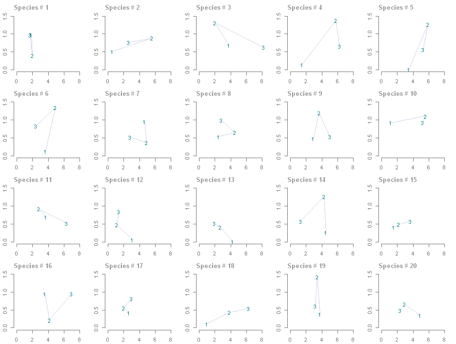
Anyway, here is an alternative, which strictly speaking is still a line plot but time is not one of the axes. It is also good for discussing individual species. x-axis is your variable 1 (I guessed that's mean), y-axis is the variable 2 (SD).

enter image description here


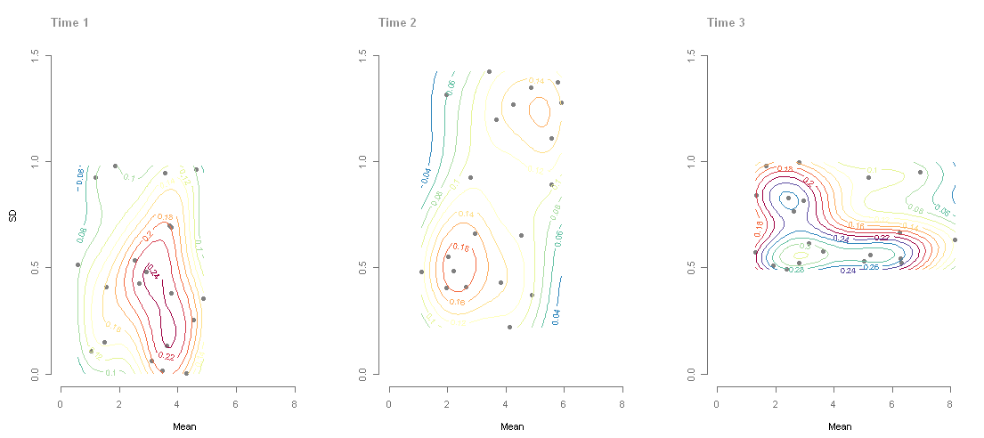
And yes, heat map maybe too much, but I think it's worth a try to show 3D kernel density if you can provide the actual data as well. Codes are taken from this thread.

enter image description here


Another possibility is to make three plots:

  1. t1 SD vs. mean, use black symbol
  2. t1 SD vs. mean, but this time the symbol turned to light grey; overlay t2 SD vs. mean, use black symbol. Connect each species pair with an arrow.
  3. t2 SD vs. mean, but this time the symbol turned to light grey; overlay t3 SD vs. mean, use symbol. Connect each species pair with an arrow.
$\endgroup$
10
$\begingroup$

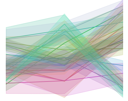
You mean you don't want a line plot like this? :)

enter image description here

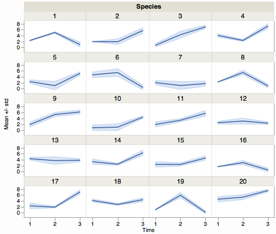
Time is a natural for the X axis and line plots. Here's a better view using a small multiples approach.

enter image description here

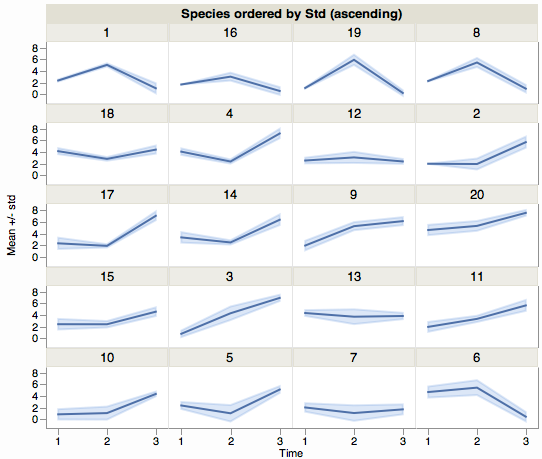
Sometimes it helps to order the panels by something analytical. Here's an example ordered by average std:

enter image description here

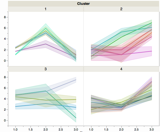
With so many category levels (20), another technique is to cluster similar levels and overlay those together. Here's an example with 4 clusters. (Not bothering with obvious but addressable deficiencies in coloring and labeling.)

enter image description here

$\endgroup$
0

Your Answer

By clicking “Post Your Answer”, you agree to our terms of service and acknowledge you have read our privacy policy.

Not the answer you're looking for? Browse other questions tagged or ask your own question.