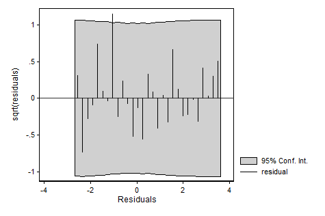
Lets consider your null hypothesis: Your variable is normally distributed, but the mean may differ across sub-samples. If you apply a linear regression with indicator variables for all subsamples to this problem, then the residual will be the distribution of the dependent variable with the differences in means "filtered out". In this case (an indicator variable for each subsample except for the reference sample) the residual is literally equivalent to computing a new variable which is your old variable minus the relevant sub-sample mean, thus removing the differences in means across subsamples (all these subsample means are now 0). If the variances are the same in the different subsamples, then the distribution of this residual will be the usual bell shaped Gaussian (some say normal) distribution. This has the advantage of pooling the results from your different subsamples which tend to be too small to meaningfully assess the degree of Gaussianity.
I prefer to assess the degree of Gaussianity visually, as a distribution can deviate from Gaussianity in many different ways. This matters in the sense that that determines whether it is a problem at all (regardless of "significance"), what the source might be, and what the solution might be. None of that information can be obtained by staring at a p-value. Others disagree; some find staring at graphs too subjective. It really depends on why you want to test for Gaussianity and who you are trying to convince.
Below is an example of multiple types of graphs you could look at using two subsamples (using Stata). In the first 4 graphs I look at the distribution of the residuals in the pooled dataset. In the last 4 graphs I look at the distribution of the dependent variable, but instead of comparing it to a simple normal distribution I compare it with the implied mixture of normal distributions where each sub-sample has a different mean. Both are ways of assessing your null hypothesis.
clear all
set seed 12345
set obs 1000

// first 500 observations get subsamp = 0
// last 500 observations get subsamp = 1
gen subsamp = ( _n <= 500 )

// y is normally distributed for
// each subsample, but mean = 0
// for subsamp == 0 and mean = 4
// for subsamp == 1
gen y = 4*subsamp + rnormal()

// run linear regression
reg y subsamp

// inspect normality of residuals
predict resid, resid
qnorm resid

// you can add conficence bands to this plot
qenvnormal resid, gen(lb ub) overall reps(20000)
qplot resid lb ub,                                 ///
      ms(oh none ..) c(. l l )  lc(gs10 ..)        ///
      ytitle("residual") xtitle(Normal quantiles)  ///
      trscale(`e(rmse)' * invnormal(@))            ///
      legend(off)

// if you are more into histograms then you may
// like hanging rootograms
hangroot resid, ci

// or its complement, the suspended rootogram
hangroot resid, ci notheor susp

// you can also compare the marginal distribution of
// y with the implied mixture of (in this case) two
// normals:
margdistfit, qq

margdistfit, pp

margdistfit, cumul

margdistfit, hangroot


