This is what various distribution plots are for. Standard plots include histograms and boxplots. I like kernel density estimation (KDE) plots, too. Briefly, KDE can be thought of as a continuous histogram.
Let's simulate some data and look at the distributions.
library(ggplot2)
set.seed(2023)
N <- 100
x <- sample(c("Cat", "Dog", "Elephant"), N, replace = T)
y <- rnorm(N)
d <- data.frame(
  Species = x,
  Weight = y
)
ggplot(d, aes(y = Weight, fill = Species)) +
  geom_boxplot(alpha = 1.0)

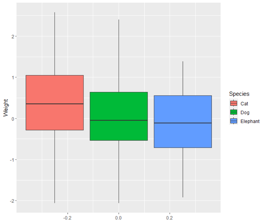
The plots show the groups not to be so different, consistent with the simulation setup that creates the weight without regard for the species. If you increase the sample size to 1000, the differences becomes even less.
If you see something like this, then you have some evidence that the distributions are not so different for the thre species.
Even better, however, is to visualize the entire distribution, since boxplots ignore a lot of information (such as multi-modality). The common way to do this is with a histogam, though I would prefer to look at the empirical CDFs or KDE plots.
library(ggplot2)
set.seed(2023)
N <- 1000
x <- sample(c("Cat", "Dog", "Elephant"), N, replace = T)
y <- rnorm(N)
d <- data.frame(
  Species = x,
  Weight = y
)
ggplot(d, aes(x = Weight, fill = Species)) +
  geom_density(alpha = 0.3)
d0 <- data.frame(
  Weight = y[x == "Cat"],
  Quantile = ecdf(y[x == "Cat"])(y[x == "Cat"]),
  Species = "Cat"
)
d1 <- data.frame(
  Weight = y[x == "Dog"],
  Quantile = ecdf(y[x == "Dog"])(y[x == "Dog"]),
  Species = "Dog"
)
d2 <- data.frame(
  Weight = y[x == "Elephant"],
  Quantile = ecdf(y[x == "Elephant"])(y[x == "Elephant"]),
  Species = "Elephant"
)
d <- rbind(d0, d1, d2)
ggplot(d, aes(x = Weight, y = Quantile, col = Species)) +
  geom_line(size = 1.5)
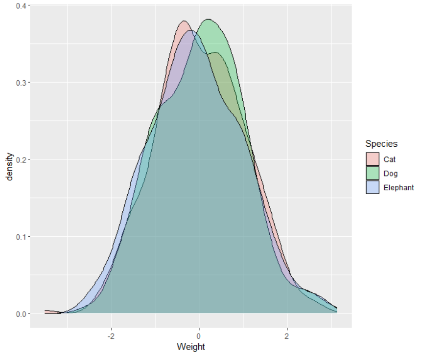
The KDE for the three species are all about on top of each other.

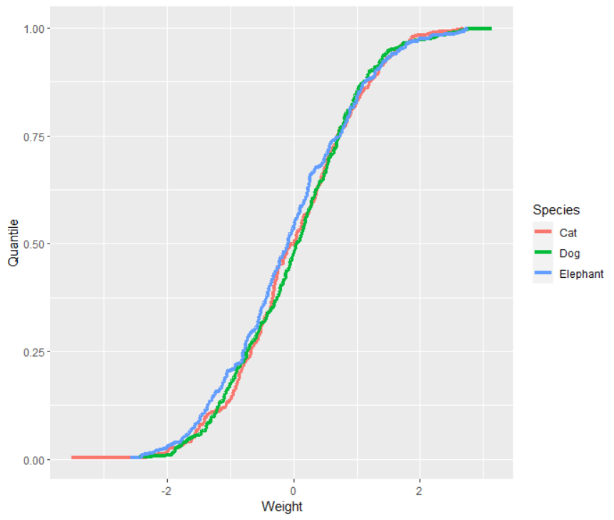
The empirical CDFs for the three species are all about on top of each other.

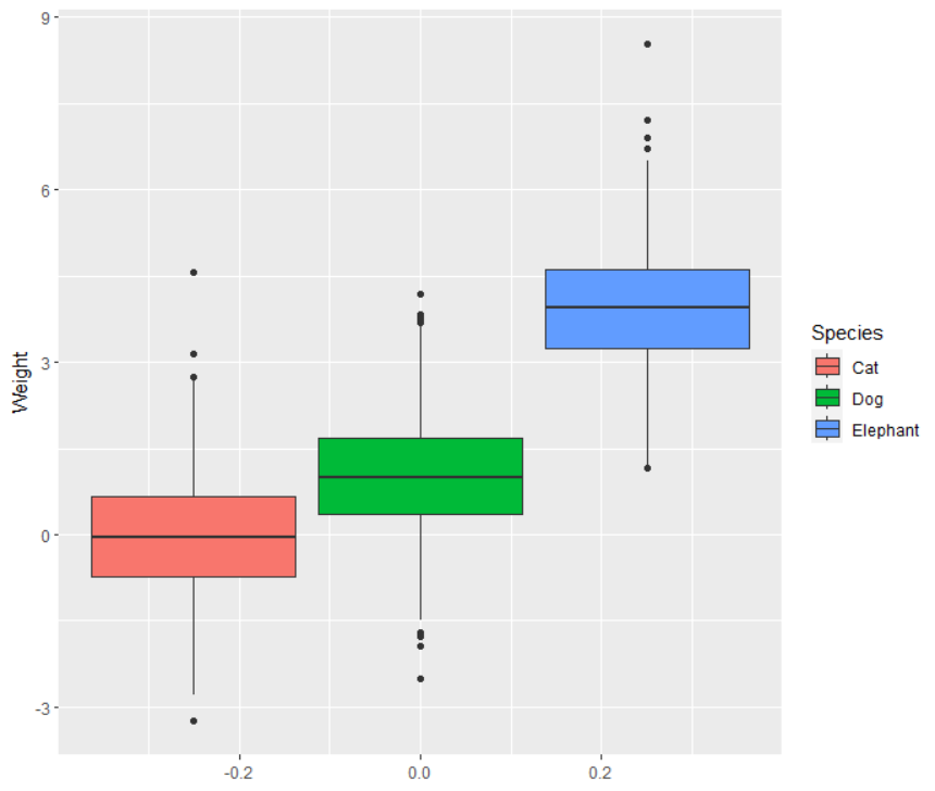
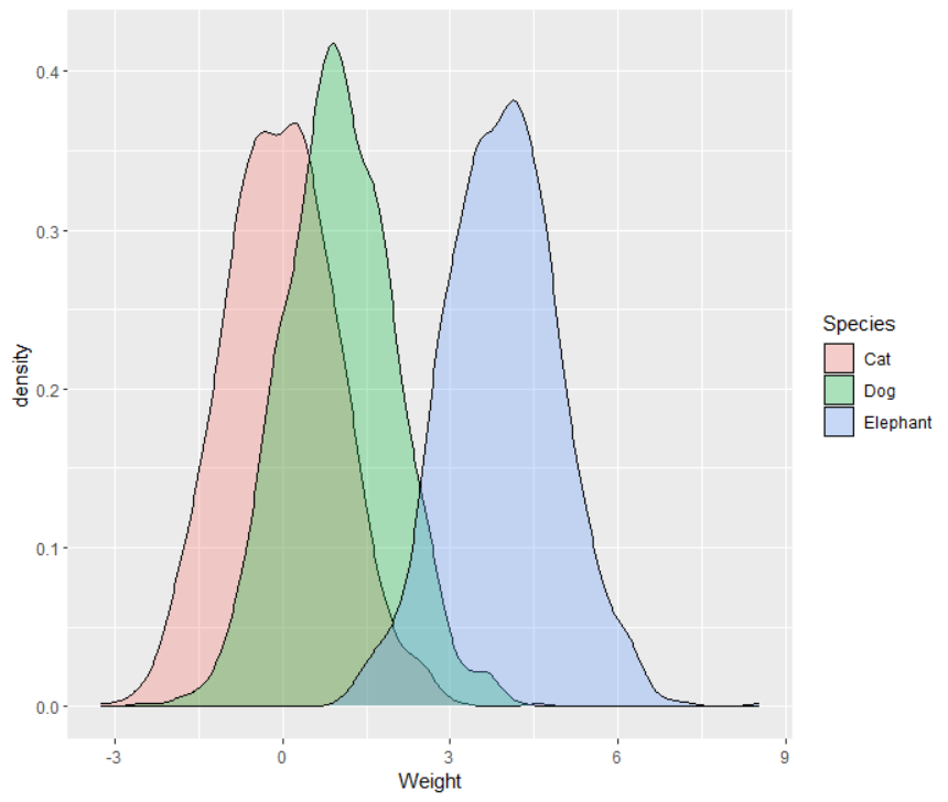
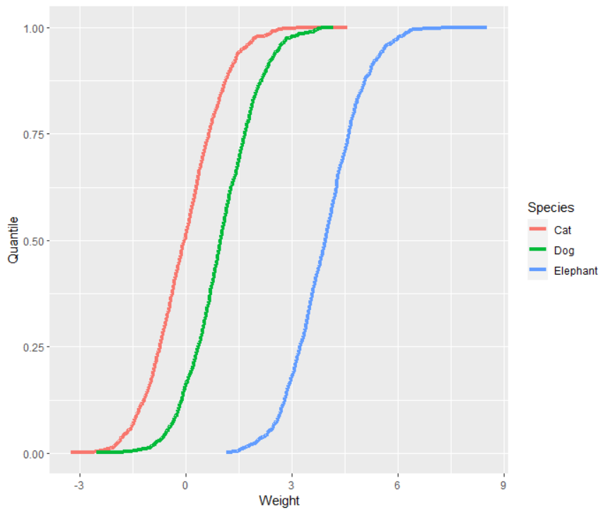
Next, let's look at linear differences. To me, this would mean that the distributions are the same except for a linear shift, such as $N(0, 1)$, $N(1, 1)$, and $N(4, 1)$.
library(ggplot2)
set.seed(2023)
N <- 1000
x <- c(
  rep("Cat", N),
  rep("Dog", N),
  rep("Elephant", N)
)
y <- c(
  rnorm(N, 0, 1),
  rnorm(N, 1, 1),
  rnorm(N, 4, 1)
)
d <- data.frame(
  Species = x,
  Weight = y
)
ggplot(d, aes(y = Weight, fill = Species)) +
  geom_boxplot()

ggplot(d, aes(x = Weight, fill = Species)) +
  geom_density(alpha = 0.3)
d0 <- data.frame(
  Weight = y[x == "Cat"],
  Quantile = ecdf(y[x == "Cat"])(y[x == "Cat"]),
  Species = "Cat"
)
d1 <- data.frame(
  Weight = y[x == "Dog"],
  Quantile = ecdf(y[x == "Dog"])(y[x == "Dog"]),
  Species = "Dog"
)
d2 <- data.frame(
  Weight = y[x == "Elephant"],
  Quantile = ecdf(y[x == "Elephant"])(y[x == "Elephant"]),
  Species = "Elephant"
)
d <- rbind(d0, d1, d2)
ggplot(d, aes(x = Weight, y = Quantile, col = Species)) +
  geom_line(size = 1.5)


All three of these visualizations suggest that the difference in the distribution for each of the three animals is just in shifting up or down.
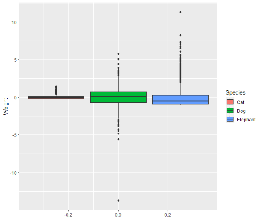
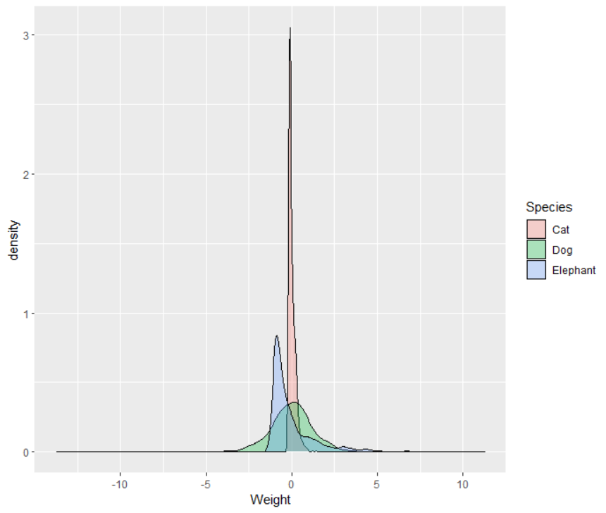
Finally, let's consider nonlinear differences. This one is a bit iffy, because the conditional mean is either shifted up, shifted down, or not changed, so the relationship between a categorical feature and the conditional mean is necessarily linear. However, the entire distribution does not have to shift the same way, and this can suggest alternative modeling, such as generalized linear models.
library(ggplot2)
set.seed(2023)
N <- 1000
x <- c(
  rep("Cat", N),
  rep("Dog", N),
  rep("Elephant", N)
)
y <- c(
  rexp(N, 5) - 1/5,
  rt(N, 5),
  rchisq(N, 1) - 1
)
d <- data.frame(
  Species = x,
  Weight = y
)
ggplot(d, aes(y = Weight, fill = Species)) +
  geom_boxplot()

ggplot(d, aes(x = Weight, fill = Species)) +
  geom_density(alpha = 0.3)
d0 <- data.frame(
  Weight = y[x == "Cat"],
  Quantile = ecdf(y[x == "Cat"])(y[x == "Cat"]),
  Species = "Cat"
)
d1 <- data.frame(
  Weight = y[x == "Dog"],
  Quantile = ecdf(y[x == "Dog"])(y[x == "Dog"]),
  Species = "Dog"
)
d2 <- data.frame(
  Weight = y[x == "Elephant"],
  Quantile = ecdf(y[x == "Elephant"])(y[x == "Elephant"]),
  Species = "Elephant"
)
d <- rbind(d0, d1, d2)
ggplot(d, aes(x = Weight, y = Quantile, col = Species)) +
  geom_line(size = 1.5)


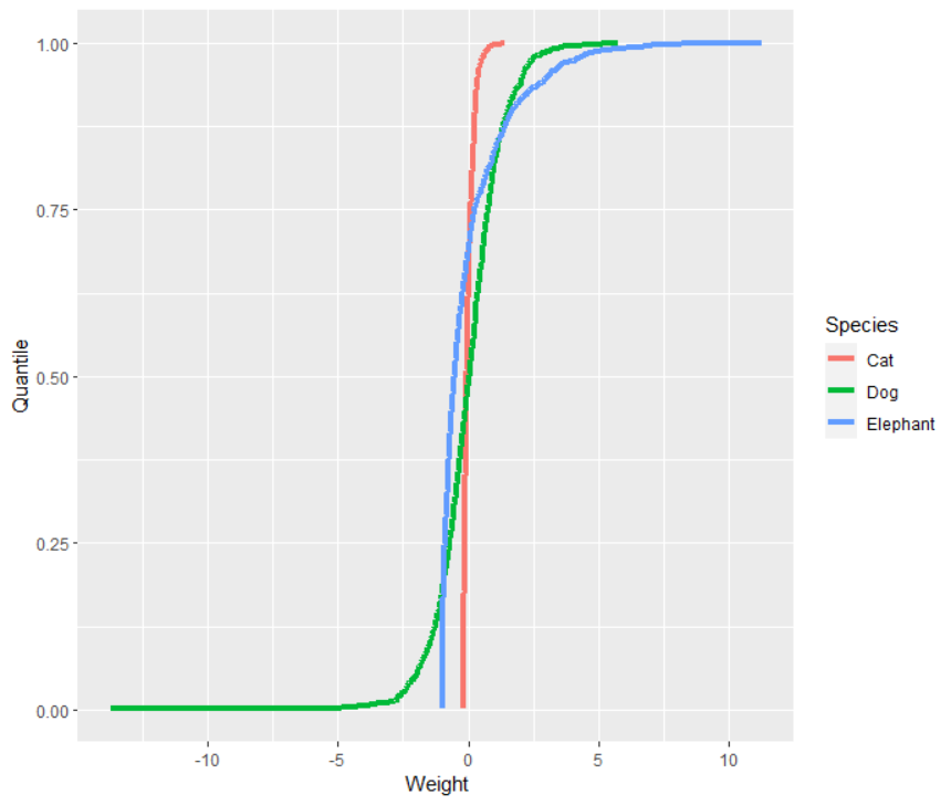
These three plots show that there is much more to the difference between the three distributions than just sliding up and down the real line. They have different skewnesses. They have different variances. (They actually have equal means.)
Depending on what you are modeling, you might be quite interested in these differences.
If you want to quantify the strength of a relationship between a categorical variable and a continuous outcome, an analogous statistic to Pearson correlation between a continuous feature and a categorical outcome would be to use regression and take the square root of the $R^2$. If you do this for a continuous feature, you get the (magnitude of) the Pearson correlation, so this seems like a reasonable generalization. I will demonstrate below.
set.seed(2023)
x <- c(
  rep("Cat", N),
  rep("Dog", N),
  rep("Elephant", N)
)
y <- c(
  rnorm(N, 1, 1),
  rnorm(N, 2, 1),
  rnorm(N, 3, 1)
)
L <- lm(y ~ x)
sqrt(summary(L)$r.squared)
I get a fairly strong "correlation" of $0.6278021$.
Since the feature is categorical, there is not really a notion of direction, so the sign does not matter, though I would go with the positive square root out of convenience.
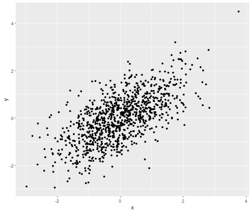
If you need to convey the strength of this relationship, you can use the boxplots, KDEs, and CDFs above (maybe histograms, too), but another option, which I confess I have not used (but I do like the idea), is to simulate some contnuous data with that calculated "correlation". For instance, the "correlation" between the outcome $y$ and categorical feature is $0.6278021$. Simulate some data with that correlation and graph that bivariate data, such as below.
library(MASS)
set.seed(2023)
X <- MASS::mvrnorm(N, c(0, 0), matrix(c(
  1, sqrt(summary(L)$r.squared),
  sqrt(summary(L)$r.squared), 1
), 2, 2))
d <- data.frame(
  x = X[, 1],
  y = X[, 2]
)
ggplot(d, aes(x = x, y = y)) +
  geom_point()

To me, this demonstrates the fairly strong relationship between the categorical feature and continuous outcome, and it does it in way that should be familiar and comfortable to stakeholders.

