3
$\begingroup$

This is not homework. This is simple self-learning from real data.

I am fitting a logistic regression model as follows:

$$\text{logit}(p_i) = \beta_0 + \beta_1 race_{i} + \beta_2 x_{2i} + \beta_3 x_{3i} + \beta_4 x_{4i}$$

where $p_i$ is represents the probability of the event in the i-th person.

$race_i$ is a binary variable indicating the race of the i-th observation (with 1 representing black and 0 representing white)

$x_{2,i}$, $x_{3,i}$ are continuous covariates and

$x_{4,i}$ is a categorical covariate with 4 levels (0,1,2,3; coded via 3 dummies)

The results of this model suggest that the white race has a significantly higher odds of experiencing the event, compared to the black race. However, when I examined the data separately for each level of $x_{4}$, I found that within each level (all of them), the black race had a significantly higher risk of experiencing the outcome compared to the white race.

My questions are:

  1. Would this be an example of Simpson's paradox?
  2. Is there a better approach available besides analyzing the data separately by each level of $x_4$ and meta-analyzing the results to obtain an overall estimate of the relationship between race and the outcome?
$\endgroup$
1

1 Answer 1

1
$\begingroup$

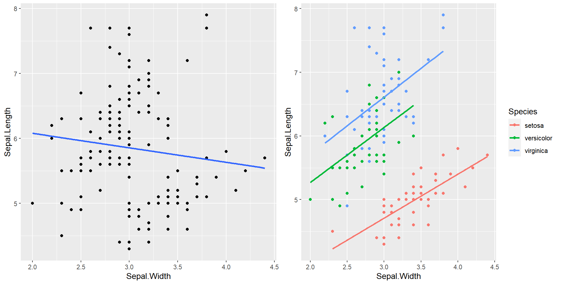
The main thing you have to ask yourself is simply this: what does the data actually look like? Without looking at how the predictors look like on the outcome, it's impossible to really know if Simpson's Paradox is going on. A classic example can be found with the iris data in R. The left plot is a Gaussian regression with no by-group comparison and the right plot is the same regression but split by group of flowers.

enter image description here

To check if this is true of your data, simply look at the data! I have simulated what you describe below in R to try and show you what I mean.

#### Load Libraries ####
library(tidyverse)

#### Simulate Data ####
set.seed(123)

race <- factor(rbinom(n=1000,
               size=1,
               prob=.5),
               labels = c("Caucasion","African-American"))

x2 <- rnorm(n=1000)

x3 <- rnorm(n=1000)

x4 <- factor(rbinom(n=1000,
                    size=3,
                    prob=.5),
             labels = c("Dummy1","Dummy2","Dummy3","Dummy4"))

y <- rbinom(n=1000,
            size=1,
            prob=.5)

df <- data.frame(race,x2,x3,x4,y)

#### Plot ####
df %>% 
  ggplot(aes(x=x2,
             y=y,
             color=factor(round(x3))))+
  geom_point(alpha = .4)+
  stat_smooth(
    method = "glm",
    se=F,
    method.args = list(family = binomial)
  )+
  facet_wrap(x4~race,
             nrow = 2)+
  labs(color = "X3 Values",
       title = "Simpson Check")

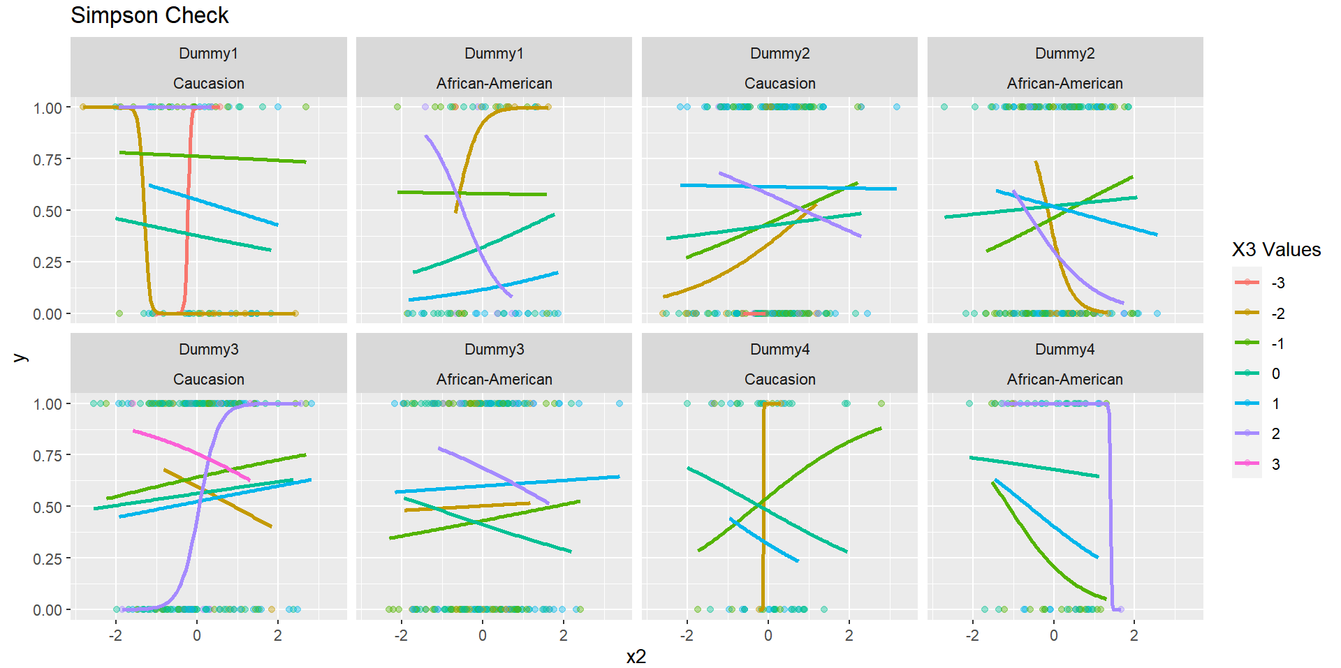
By plotting all of the potential covariates, we can see what potential pattern arises:

enter image description here

It is not immediately clear if there are some major flaws with the data, but you can at least see that the general effect of the regression certainly varies by each predictor (this is a bit artificial given I rounded the X3 values, but this is just to simplify the example). You can check your data in a similar fashion and see if any weird patterns arise.

$\endgroup$

Your Answer

By clicking “Post Your Answer”, you agree to our terms of service and acknowledge you have read our privacy policy.

Not the answer you're looking for? Browse other questions tagged or ask your own question.