5
$\begingroup$

I work in biology and I´ve done an experiment exposing an invertebrate to a pesticide at different temperatures. One of my endpoints is hatching success of their eggs. The animals lay clutches of eggs, usually 10-30 eggs. My impression is that I shouldn’t model the data using proportions as datapoints (e.g., 0.7 proportion of the eggs in one clutch hatched), but rather use raw data (1/0 for hatched/not hatched, per egg). Then I need to add “clutch-ID” as a random factor. I, therefore, plan to use a generalized linear mixed model (glmer() from the lme4 package) with binomial family link = "logit".

My model:

glmer(hatchingsuccess ~ Temperature + Pesticide + (1 | clutch.id), 
      data = eggdata, family = binomial(link = "logit"))

The sample size is approx. 8000 eggs (in about 500 clutches). I also first included an interaction term with Temperature * Pesticide, but then nothing was significant, so I eliminated that.

Summary:

Generalized linear mixed model fit by maximum likelihood (Laplace Approximation) ['glmerMod']
 Family: binomial ( logit )
Formula: hatchingsuccess ~ Temperature + Pesticide + (1 | clutch.id)
   Data: eggdata

     AIC      BIC   logLik deviance df.resid 
  6879.3   6914.3  -3434.6   6869.3     8139 

Scaled residuals: 
    Min      1Q  Median      3Q     Max 
-5.2772 -0.2007  0.2111  0.4408  3.7051 

Random effects:
 Groups   Name        Variance Std.Dev.
 Batch.id (Intercept) 5.121    2.263   
Number of obs: 8144, groups:  Batch.id, 560

Fixed effects:
                 Estimate Std. Error z value Pr(>|z|)   
(Intercept)       0.62213    0.43920   1.416  0.15663   
Temperature       0.08385    0.02709   3.096  0.00196 **
lowPesticide -0.29740    0.25770  -1.154  0.24847   
highPesticide -0.50853    0.26549  -1.915  0.05543 . 
---
Signif. codes:  0 ‘***’ 0.001 ‘**’ 0.01 ‘*’ 0.05 ‘.’ 0.1 ‘ ’ 1
optimizer (Nelder_Mead) convergence code: 0 (OK)
Model failed to converge with max|grad| = 0.0023972 (tol = 0.002, component 1)

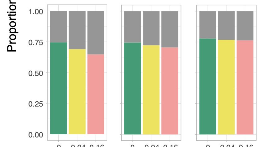
The proportions of eggs hatched look like this (the different colours represent pesticide treatments, and the three plots are for three different temperatures.

enter image description here

These are diagnostic plots using the package DHARMa:

enter image description here

  1. Does this R output from the model and diagnostics look ok? I got an answer about the converge problem and will look into that.

  2. Is it ok to present these proportion plots and refer to model statistics, or do I need to plot single datapoints on the y-axis and a line for the model? I think these proportion plots more clearly show the data/results, but I need to have some stats to refer to.

$\endgroup$
12
  • 4
    $\begingroup$ Greetings and welcome to CV! I would edit your question to whatever is your "big problem". Questions get closed here if they get jam-packed full of things for people to answer. You increase the likelihood of getting an answer when your question is straightforward to provide a solution to. $\endgroup$ Commented Jun 12, 2023 at 13:06
  • 1
    $\begingroup$ Btw your DHARMA plots look more than reasonable. One of your categories looks wonky but that's not really the end of the world in my opinion. It would be different if it had several problematic boxplots. $\endgroup$ Commented Jun 12, 2023 at 13:07
  • 2
    $\begingroup$ I'm a bit worried about the failure to converge in fitting the model, although it came close. You might try altering the control settings for glmer. Also, you can fit a binomial model in a situation like this, without having to use a random effect, by specifying the outcome for each clutch as "a two-column integer matrix: the first column gives the number of successes and the second the number of failures" (Help page for family in R). Maybe try that. $\endgroup$
    – EdM
    Commented Jun 12, 2023 at 13:20
  • 1
    $\begingroup$ Always pay attention to warnings. In this case, the default setting was to consider the fit complete when the magnitude of a gradient was less than 0.002; yours came close, at 0.0024, so it might not be a big deal. You can specify different optimizers, numbers of iterations, etc. to glmer() to deal with difficult fits. You should learn about that if you are going to do a lot of mixed-modeling. I suspect that the 2-column approach will avoid the problem completely in this case. $\endgroup$
    – EdM
    Commented Jun 12, 2023 at 15:04
  • 1
    $\begingroup$ Is it ok to present these proportion-plots and refer to model statistics, or do I need to plot single datapoints on the y axis and a line for the model? What specifically do you mean here? Are you asking if you should produce a scatterplot with the fitted regression line on it? I would say more information is always better than less information in the stats world. $\endgroup$ Commented Jun 12, 2023 at 16:03

1 Answer 1

2
$\begingroup$

Regarding your second question, Is it ok to present these proportion plots, I would say yes, this is ok, but your plot is missing error bars. As you may know, most journal editors now ask for a measure of precision in plots, such as 95% confidence intervals.

In your case, it is straightforward to have a plot with 95% confidence interval if you use analysis of proportions library of mine ANOPA.

To illustrate, I will suppose that you have the data in a data.frame() called dta with 0s and 1s and also that your factors are called pesticide (three levels, say A, B, and C) and temperature (with three levels as well, say cold, warm and hot). The beginning of the data frame could be, e.g.,

head(dta)
#    id pesticide temperature s
# 1   1         A        cold 1
# 2   2         A        cold 1
# 3   3         A        cold 1
# 4   4         A        cold 0
# 5   5         A        cold 1
# 6   6         A        cold 1

From there, you can do:

library(ANOPA)
w <- anopa( s ~ pesticide + temperature, dta)
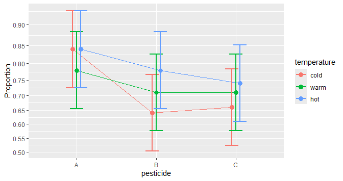
anopaPlot(w)

from which you get

proportions with 95% CI

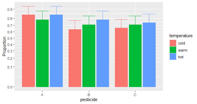
of if you prefer bars:

anopaPlot(w, plotStyle="bar"

proportions with 95% CI

This plot is a ggplot so it can be followed with any ggplot attributes, e.g.,

library(ggplot2)
anopaPlot(w, plotStyle="bar" ) + theme_bw()

BTW, if you want to know if there are effects in the simulated data that were illustrated above, simply run

summary(w)

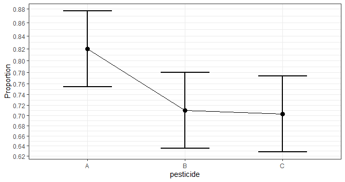
In the present example, the sample sizes of the data that I simulated were moderately large (100 per group, for a total of 900 simulated success or failures, 0s or 1s). Here, as was hinted by the plot, the effect of pesticide is significant ($F(2, \infty) = 7.08$, $p = .0008$), as seen in the ANOPA table:

                            MS  df        F   pvalue correction    Fcorr pvalcorr
pesticide             0.017643   2 7.092461 0.000831   1.002222 7.076735 0.000845
temperature           0.005343   2 2.147827 0.116738   1.002222 2.143065 0.117295
pesticide:temperature 0.002202   4 0.885204 0.471699   1.033333 0.856649 0.489127
Error(between)        0.002488 Inf                      

You can request a simple effect plot of the factor pesticide alone with

 anopaPlot(w, ~ pesticide) + theme_bw()

which shows

proportions with 95% CI

$\endgroup$

Your Answer

By clicking “Post Your Answer”, you agree to our terms of service and acknowledge you have read our privacy policy.

Not the answer you're looking for? Browse other questions tagged or ask your own question.