3
$\begingroup$

Note: for the sake of readability, this question was heavily shortened. Parts based on a humane mistake were removed, and the focus was put again on the biased mixed models.

Please correct me if I have understood or made something wrong. The question is, why the mixed models of the lme4 and nlme packages of R do seem to bias towards small deviating clusters, opposing the objective of partial pooling. Below is the longer explanation.

In various sources of the mixed-model theory, it is said that the purpose of the partial pooling is to avoid giving too much weight for small unreliable clusters when the models are fitted. For example, in the page 254 of "Data analysis using regression and multilevel/hierarchial models" book (Gelman and Hill, 2006) it is clearly stated that:

"Averages from counties [the clusters in the example] with smaller sample sizes carry less information, and the weighting pulls the multilevel estimates closer to the overall state [all data] average..." "Averages from counties with larger sample sizes carry more information, and the corresponding multilevel estimates are close to the county averages..."

On the page 253, there is the formula 12.1 that defines the strength of the pull of clusters in partial pooling. The individual cluster sizes are in directly proportional relationship with the weight given for the clusters' own inherent averages. Thus, the smaller the cluster size is the stronger the pull towards the completely-pooled overall average estimate should be. The book also refers to the use of lme4::lmer(), and at least I didn't spot any mentioned expectations regarding the objective. The same principles with similar formula are also lectured in the video below:

https://youtu.be/cs-t0Xitr8k?feature=shared

Even though the partial pooling of the clusters would seem to be correct, the fitted mixed models can sometimes be oddly biased towards the smaller clusters. I have run linear completely-pooling and partially-pooling mixed-model fits many times with simulated data, and it seems that the lme4::lmer() models can give too much weight for the small clusters, which is totally opposite of the objective. To exclude possible installation issues, I have observed this behavior repeatedly with different installations and versions of R on two different computers. In this discussion, @GeorgeSavva kindly helped me to find the partial-pooled cluster means using the predict(mmodel) (though, if I have time, I would still like to calculate the same manually, to gain deeper understanding by seeing the elemental steps). Using the code below, we can see that the clusters move only slightly, and the smallest clusters are affected the most as expected regarding the theory. However, still in these picked-up scenarios the mixed models are oddly strongly biased toward the small clusters. I need to further digest the responses in this discussion, do they provide justified explanation for these anomalies that seem to counteract the purpose. If the clusters move so little, why the mixed models seem to bias disproportionately much.

library(lme4)
library(ggplot2)

set.seed(824523)

#Create different-sized clusters
clustersizes <- c(2,10,10,10,2,10,10,10)
clusters <- c(1:length(clustersizes))

#Generate 1-level measurements
nmeas <- sum(clustersizes)
data <- rnorm(nmeas, 0, 1)

#Generate predictor
predictor <- c(rep("control", sum(clustersizes[1:(max(clusters)/2)])),
              rep("intervention", sum(clustersizes[((max(clusters)/2) + 1):max(clusters)])))

#Generate and add random effects
randomeffects <- rnorm(max(clusters), 0, 3)
data <- data + rep(randomeffects, times = clustersizes)

#Combine the data into dataframe
df <- data.frame(dependent = data,
                predictor = predictor,
                cluster = rep(clusters, times = clustersizes)


)

#Add fixed effect
df[(predictor == "intervention"),]$dependent <- df[(predictor == "intervention"),]$dependent + 5

#Inspect data if necessary
boxplot(dependent ~ cluster, df)

#Make linear complete-pool second-level-ignorant model
linear <- lm(dependent ~ predictor, df)
cpoolinterc <- linear[["coefficients"]][["(Intercept)"]]
cpoolslope <- linear[["coefficients"]][["predictorintervention"]]

#Make partial-pooling mixed model
mmodel <- lmer(dependent ~ predictor + (1|cluster), data = df)
ppoolinterc <- fixef(mmodel)[["(Intercept)"]]
ppoolslope <- fixef(mmodel)[["predictorintervention"]]

#Visualize the usual and mixed-model lines with cluster means before and after the partial pooling
df$ppclustermean <- predict(mmodel)

plotmodelmeans <- ggplot() +
geom_abline(intercept = cpoolinterc - cpoolslope, slope = cpoolslope, size = 2, linetype = "solid") +
geom_abline(intercept = ppoolinterc - ppoolslope, slope = ppoolslope, size = 2, linetype = "dashed") +
#Slopes are removed from the intercepts due to 0 -> 1 x remapping of the dotplot caused by the factor()
coord_cartesian(ylim = c(-15, 15)) +
theme_void() +
stat_summary(data = df, aes(x = factor(predictor), y = dependent, group = factor(cluster)), fun = mean, geom = "crossbar", width = 0.7) +
stat_summary(data = df, aes(x = factor(predictor), y = ppclustermean, group = factor(cluster)), fun = mean, geom = "crossbar", width = 0.7, colour = "red")

plotmodelmeans

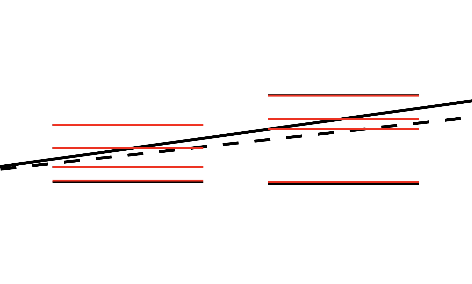
The solid line is the lm() model, the dashed line represents the lmer() mixed model. On the left and right sides there are the control and intervention groups, respectively. Individual measurements are not shown, only the pre-partial-pooling (black) and post-partial-pooling (red) cluster means as horizontal lines. The two smallest clusters happened to be also the lowest ones, towards which the mixed model is biasing to.

enter image description here

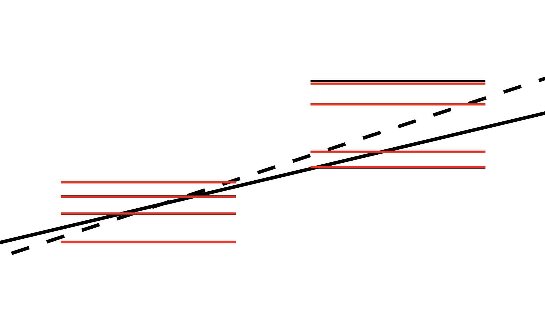
And here is the figure with the following modifications:

set.seed(1324523)

#Create different-sized clusters
clustersizes <- c(2,10,10,10,2,10,10,100)

This time, the smallest intervention cluster was the highest one. Notice that despite the lower huge cluster, the mixed model is turning absurdly strong towards the little cluster.

enter image description here

Hopefully I haven't done something stupid. Here is my attempt to draw all the data points after the partial pooling, I got the random effects using the predict() function. Sorry about the big chunks of code, I want to favor complete pieces to avoid accidents if someone copies and tries these.

library(lme4)
library(ggplot2)

set.seed(1324523)

#Create different-sized clusters
clustersizes <- c(2,10,10,10,2,10,10,10)
clusters <- c(1:length(clustersizes))

#Generate 1-level measurements
nmeas <- sum(clustersizes)
data <- rnorm(nmeas, 0, 1)

#Generate predictor
predictor <- c(rep("control", sum(clustersizes[1:(max(clusters)/2)])),
              rep("intervention", sum(clustersizes[((max(clusters)/2) + 1):max(clusters)])))

#Generate and add random effects
randomeffects <- rnorm(max(clusters), 0, 1)
data <- data + rep(randomeffects, times = clustersizes)

#Combine the data into dataframe
df <- data.frame(dependent = data,
                predictor = predictor,
                cluster = rep(clusters, times = clustersizes)


)

#Add fixed effect
df[(predictor == "intervention"),]$dependent <- df[(predictor == "intervention"),]$dependent + 1

#Inspect data if necessary
boxplot(dependent ~ cluster, df)

#Make linear complete-pool second-level-ignorant model
linear <- lm(dependent ~ predictor, df)
cpoolinterc <- linear[["coefficients"]][["(Intercept)"]]
cpoolslope <- linear[["coefficients"]][["predictorintervention"]]

#Make partial-pooling mixed model
mmodel <- lmer(dependent ~ predictor + (1|cluster), data = df)
ppoolinterc <- fixef(mmodel)[["(Intercept)"]]
ppoolslope <- fixef(mmodel)[["predictorintervention"]]

#Reposition the clusters according to the partial pooling and fit lm() again
df$ppclustermean <- predict(mmodel)
df$ppdata <- df$dependent

for (i in 1:length(clusters)) {
clustermean <- mean(df[(df$cluster == i),]$dependent)
ppclustermean <- df[(df$cluster == i),]$ppclustermean[1] #All the values are the same, pick up the first one
df[(df$cluster == i),]$ppdata <- df[(df$cluster == i),]$ppdata - clustermean + ppclustermean
}

linear <- lm(ppdata ~ predictor, df)
ppdatainterc <- linear[["coefficients"]][["(Intercept)"]]
ppdataslope <- linear[["coefficients"]][["predictorintervention"]]

#Visualize the usual and mixed-model lines with cluster means before and after the partial pooling
plotmodelmeans <- ggplot() +
geom_abline(intercept = cpoolinterc - cpoolslope, slope = cpoolslope, size = 2, linetype = "solid") +
geom_abline(intercept = ppoolinterc - ppoolslope, slope = ppoolslope, size = 2, linetype = "dashed") +
geom_abline(intercept = ppdatainterc - ppdataslope, slope = ppdataslope, size = 2, linetype = "dashed", colour = "red") +
#Slopes are removed from the intercepts due to 0 -> 1 x remapping of the dotplot caused by the factor()
coord_cartesian(ylim = c(-4, 4)) +
theme_void() +
geom_dotplot(data = df, aes(x = factor(predictor), y = dependent, fill = factor(cluster)), binaxis = "y", stackdir = "center", binwidth = 0.3, alpha = 0.5) +
geom_dotplot(data = df, aes(x = factor(predictor), y = ppdata, fill = factor(cluster)), binaxis = "y", stackdir = "center", binwidth = 0.3, alpha = 1.0) +
scale_fill_brewer(palette="Set1") +
stat_summary(data = df, aes(x = factor(predictor), y = dependent, group = factor(cluster)), fun = mean, geom = "crossbar", width = 0.7) +
stat_summary(data = df, aes(x = factor(predictor), y = ppclustermean, group = factor(cluster)), fun = mean, geom = "crossbar", width = 0.7, colour = "red")

plotmodelmeans

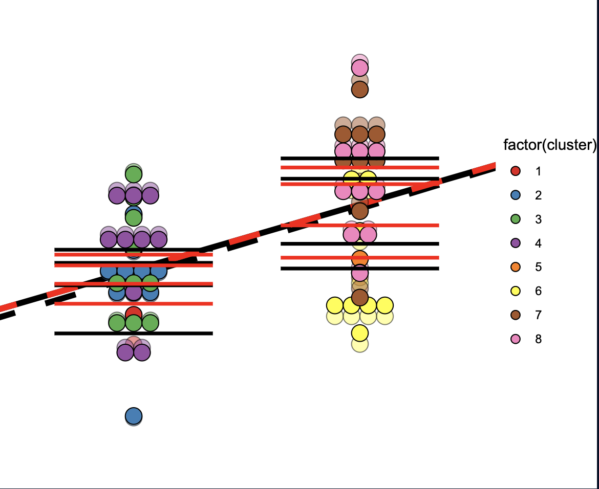
The above code produces the image below. For this data I decreased the ICC to get stronger partial pooling. Again, the solid black line is the lm() model fitted on the initial simulated data (transparent dots), the dashed black line is the lmer() mixed model. The new dashed red line is another lm() model fitted on the (hopefully properly) partially-pooled data (opaque dots). The black horizontal lines are the cluster means before the partial pooling, the red ones are after. Notice that despite the prominent movements of the clusters, the both lm() models align almost perfectly. And once again, the mixed model is going after the smaller clusters 1 and 5, which happened to be negatively biased.

enter image description here

I have made similar observations also with the nlme package.

$\endgroup$
14
  • $\begingroup$ I'm not completely sure what you're doing, but if you add the residuals to fixed predictors aren't you excluding the random effects from your 'partial pooling' plots? This would explain the apparent lack of random effects in the images, and why every group seems to be pulled completely toward the grand mean. I think the predicted group means under the mixed model should be those given by predict.merMod() with re.form=NULL $\endgroup$ Commented Nov 6, 2023 at 9:08
  • $\begingroup$ Thank you @GeorgeSavva, I am glad that someone can help me with this. 1) Why the mixed-model values, obtained by the fixef(mmodel), have the tendency of turning more towards the small clusters than the second-level ignorant model? Even if I have made something wrong regarding other stuff, this contradiction with the very motives of the mixed modeling baffles me. $\endgroup$
    – Imsa
    Commented Nov 6, 2023 at 12:49
  • $\begingroup$ @GeorgeSavva 2) To my best understanding, and citing the code examples above, the clusters are not completely pulled to the grand mean, some of them are pulled even over it. Assuming that my residual movements were correct. According to a general 2-level formula, I wanted to use the elemental steps to put the residuals around the partially-pooled averages of the cluster means. To find all the new values for each yij measurement, I used the formulas 1 and 2 from here: pubmed.ncbi.nlm.nih.gov/32279536 What is wrong with this approach? Notice that the new cluster averages are not same. $\endgroup$
    – Imsa
    Commented Nov 6, 2023 at 12:49
  • $\begingroup$ @GeorgeSavva 3) I try to comprehend the predict() function, the explanation in the documentation is slim. At least the two first values given by predict(mmodel, re.form=NULL) do not correspond to my pre and post partially-pooled averages of the cluster 1. $\endgroup$
    – Imsa
    Commented Nov 6, 2023 at 12:50
  • $\begingroup$ I will take a proper look tonight. $\endgroup$ Commented Nov 6, 2023 at 13:40

2 Answers 2

4
$\begingroup$

There are a couple of different questions here I think, first on what should happen to the cluster mean estimates when a mixed effects model is used, and second what should happen to the estimates for the treatment group averages. I think you might be confusing these two things which is where your problem is?


First, on the shrinkage of individual cluster means: you can measure the degree of shrinkage toward the grand mean and compare this across clusters.

Here I found the predictions for each cluster under each model, and compared it with the mean of the observed data. You can see the amount of shrinkage between the observed data and the partial pooled model is much larger for the smaller clusters, as you'd expect. (I used seed 824523).

I couldn't reproduce your numbers, but note that your residuals.mmodel. ignores the estimated random effect, since it simply adds the group mean estimates (not the cluster means) to the residuals. I do not know if that has any meaningful interpretation. Your 'cluster specific averages' are just the group mean estimates plus some tiny amount of noise. I used predict instead to get the estimated cluster means.

 library(data.table)
 df$predictionLMER <- predict(mmodel)
 df$predictionLM <- predict(linear)
 
 df2 <- df[, .(
   .N,
   Observed = mean(dependent),
   `Partial pooled` = mean(predictionLMER) ,
   `Completely pooled` = mean(predictionLM)
 ),
 by = cluster][, `Shrinkage` := `Partial pooled` - `Observed`][]
> df2
   cluster  N   Observed Partial pooled Completely pooled    Shrinkage
1:       1  2 -1.6627715     -1.5512698          1.589832  0.111501716
2:       2 10  1.6791197      1.6728082          1.589832 -0.006311447
3:       3 10  3.9517399      3.9254377          1.589832 -0.026302204
4:       4 10 -0.2108414     -0.2005281          1.589832  0.010313308
5:       5  2 -1.8870846     -1.6663288          4.552558  0.220755812
6:       6 10  6.8700476      6.8387214          4.552558 -0.031326140
7:       7 10  3.5376612      3.5356479          4.552558 -0.002013311
8:       8 10  4.5378946      4.5270829          4.552558 -0.010811712

This corresponds to your Gelman and Hill quote.


Second, on where the estimates for the treatment group means ought to be:

The fixed effects (complete pooling) model will weight each observation equally. So the smallest clusters will have much less weight in the calculation.

The random effects model assumes that the four clusters under each treatment are random samples from the population of clusters, and so the estimate for the group means will be closer to the average of the cluster means than the average of the observations. This means that the observations from the smaller clusters have a greater influence under the mixed effects model than they would under the fixed effects model.

Since in your model the between cluster variance is very much higher than the within cluster variance (ICC is 90%), we can say the cluster means are estimated very well. The estimated cluster means are very close to the true cluster means, and the true mean within treatment groups is very close to the mean of the cluster means.

So..

The fixed effect predictions are the unweighted means:

> emmeans::emmeans(linear, ~predictor)
 predictor    emmean    SE df lower.CL upper.CL
 control        1.59 0.391 62    0.808     2.37
 intervention   4.55 0.391 62    3.771     5.33

> aggregate(data=df , dependent ~ predictor , mean)
     predictor dependent
1      control  1.589832
2 intervention  4.552558

But the mixed effects model predictions are very close to the mean of cluster means. The clusters are weighted almost equally, and so the small cluster has much more weight under this model, as it should:

> emmeans::emmeans(mmodel, ~predictor)
 predictor    emmean   SE df lower.CL upper.CL
 control       0.962 1.55  6   -2.832     4.76
 intervention  3.309 1.55  6   -0.485     7.10

> aggregate(data=df , dependent ~ cluster+predictor , mean) |> aggregate(dependent ~ predictor, mean)
     predictor dependent
1      control 0.9393116
2 intervention 3.2646297

I hope that helps. I'll admit I don't fully understand your interpretation of the model outputs so please ask in the comments if you want to look at it further.

$\endgroup$
1
  • $\begingroup$ I approved the answer, and also added my own. Note also for @BenBolker. If you guys have time to check my new thoughts and find something to comment, let me know. I hope I correctly figured out the "deeper objective" of the mixed models this time. This has been very educative. $\endgroup$
    – Imsa
    Commented Nov 14, 2023 at 10:39
0
$\begingroup$

My thoughts after approving the answer of @GeorgeSavva:

To help others also trying to figure out the details of the mixed models, I want to elaborate what confused me, and what are now clear thanks to this discussion, sources, and some experimenting.

  1. The partial-pooling formula, which defines the strength of the repositioning of clusters, clearly shows the inverse relationship between the cluster size and amount of movement. This obvious relationship, enhanced by expressions such as "avoiding giving too much weight for the smaller clusters", is important, but only part of the objectives in mixed models. What is not so clear, and not emphasized enough in some sources in my opinion, is that the amount of repositioning is also the function of the distance of the original cluster to the initial general trend. In other words, the farther away a cluster is from the general trend the stronger the pull tends to be (accounting also the other factors). In some sources the latter relation is mentioned clearly and even demonstrated, for example in the two sources below. And especially in the first video lecture, the motivation to compensate for possible (cluster) outliers is stated better. In my view, this motivation should be emphasized more widely and clearly, because even a big cluster having intuitively a lot of "good" evidence can be entirely biased and misleading. The second-level variation affects all the within-cluster measurements systematically, and now the worse problem can be the big clusters, totally opposite of managing the smaller clusters!

https://youtu.be/cs-t0Xitr8k?feature=shared

https://www.tjmahr.com/plotting-partial-pooling-in-mixed-effects-models/

  1. Statements such as "the mixed model is fitted on the data after the partial pooling" can be misleading. More definite description is that the linear mixed models are just ordinary linear regressions, which are not fitted on the original data, or not on the partially-pooled data, but on the new means of the partially-pooled clusters. Using code examples similar to above, I have verified that the intercept and slope estimates of the mixed and lm() models (the latter ones fitted on the partially-pooled cluster means obtained from the mixed models with predict()) gave TRUE with all.equal (FALSE with identical(), indicating some insignificant floating-point deviations). In line with the point 1. this mechanism can also compensate against the cluster outliers, and opposite to the initial intuition the effect is highlighted with bigger clusters in heterogeneous data. To elaborate this I use an extreme example. Let us have cluster sizes of 100, 10, 10, and 10 in very heterogeneous data (the partial pooling does barely nothing). If a linear model is fitted on this data, it is obvious how much weight it will give for the first big cluster. If the cluster happens to be an outlier considering the second-level variation, the model will be especially biased away from the underlying truth. However, as the number of measurements is reduced into four cluster means, on which the linear model is fitted, now the representation of the first cluster is only 1/4 of the data. In this process, the bigger clusters lose more weight than the smaller clusters can, and especially with heterogeneous data this can be the only significant factor affecting the repositioning of the (mixed) model.

Part of the confusion was very likely due to me, as in a hurry I made seemingly-sound assumptions while skimmed the literature. But the compensation for the possible outlier clusters, i.e. bunch of systematically biased groups of measurements, is so important objective that it should be emphasized so early in the introductions and so well that it cannot be bypassed. In my opinion. On the other hand, I do understand how complex and multifaceted the mixed models are, causing challenges for both the users trying to comprehend these methods deeply, and also for the lecturers trying to deliver the information about the methods.

Thanks for everyone, I am happy with my new better and deeper understanding about the mixed models.

$\endgroup$

Your Answer

By clicking “Post Your Answer”, you agree to our terms of service and acknowledge you have read our privacy policy.

Not the answer you're looking for? Browse other questions tagged or ask your own question.