3
$\begingroup$

I am trying to plot fixed effects of $X_1$ and $X_2$ from my lmer model. I'm having trouble understanding the theory behind it:

Model_n_1 <- lmer(logRT ~ Frequency + Response.number + X1 +  X2 + 
    (1|Response.number/Cue.number) + (1|Ps.number), data=df, 
    REML=FALSE, control=lmerControl(optimizer="bobyqa"))

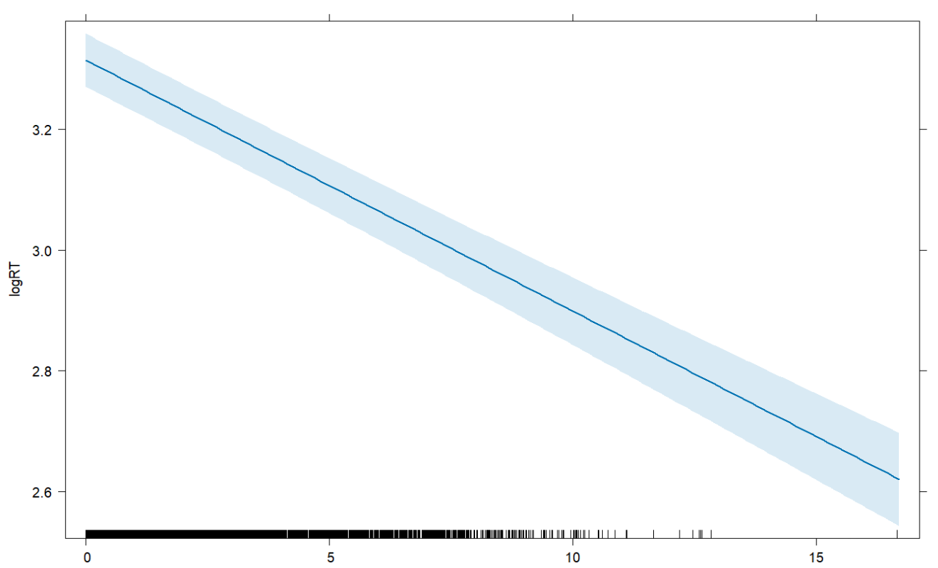
I use the following code for the plot, which gives me a sort of regression line, which I assume represents the coefficient of $X_1$, taken from the model above ($X_1$ on the x-axis):

est <- predictorEffect("X1", Model_n_1)
plot(est)

Resulting plot, with X1 on the x-axis

But it's not clear to me whether the plot is showing what I want. For example, what is happening with the other variables? Are they held at $0$, because that happens in the lmer (I think)? Or is it some more complicated math? And is this considering only the other fixed effects, or random effects as well (again, since the coefficient is calculated by taking into account all of them)? Finally, can this regression line simply be expressed as $r=-0.4$ (that's roughly the coefficient of $X_1$), or is that a different thing?

$\endgroup$

2 Answers 2

4
$\begingroup$

There is a predictor effects graphics gallery by Fox and Weisberg that has extensive explanations and examples of how predictoreffects works. In particular, section 1.3 says:

Suppose that you select a focal predictor for which you want to draw a predictor effect plot. The predictorEffect() function divides the predictors in a model formula into three groups:

  1. The focal predictor.
  2. The conditioning group, consisting of all predictors with at least one interaction in common with the focal predictor.
  3. The fixed group, consisting of all other predictors, that is, those with no interactions in common with the focal predictor. For simplicity, let’s assume for the moment that all of the fixed predictors are numeric. The predictors in the fixed group are all evaluated at typical values, usually their means, effectively averaging out the influence of these predictors on the fitted value. Fitted values are computed for all combinations of levels of the focal predictor and the predictors in the conditioning group, with each numeric predictor in the conditioning group replaced by a few discrete values spanning the range of the predictor, for example, replacing years of education by a discrete variable with the values 8, 12, and 16 years.

and goes on from there to parts that did not paste well.

The above ought to apply regardless of whether you are using lm or lmer.

If this does not answer your question, please edit your question to say why it does not.

$\endgroup$
4
$\begingroup$

One can test this by hand-coding it in R and comparing to the package. First, I'll use the iris data by fitting a model with lmer and plotting with the effects package. For simplicity I just include two fixed effects and a random intercept for species.

#### Load Library ####
library(lmerTest)
library(effects)

#### Fit Model ####
fit <- lmer(
  Sepal.Length 
  ~ Sepal.Width
  + Petal.Width
  + (1|Species),
  data=iris
  )

#### Quick Plot ####
est <- predictorEffect("Sepal.Width", fit)
plot(est)

This gives the following plot:
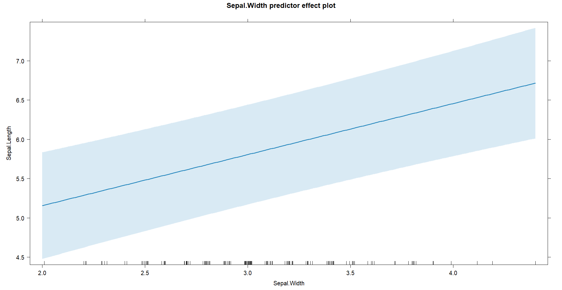
enter image description here

We could just plot the model using the fixed intercept and slope directly from the saved summary(fit):

#### Get Fixed Intercept and Slope ####
s <- summary(fit)
a <- s$coefficients[1]
b <- s$coefficients[2]
se <- s$coefficients[2,2]

#### Plot Main Effect ####
plot(iris$Sepal.Width, # predictor
     iris$Sepal.Length, # response
     main="Sepal Dimensions",
     xlab="Width", 
     ylab="Length") # labels

#### Add Rug ####
rug(jitter(iris$Sepal.Width))

#### Plot Regression Line with SE ####
abline(
  a,b, # intercept/slope
  col="red", # color of line
  lwd=3 # size of line
  )

But this doesn't look close at all to the plot we just looked at, as the intercept is at a much lower location:
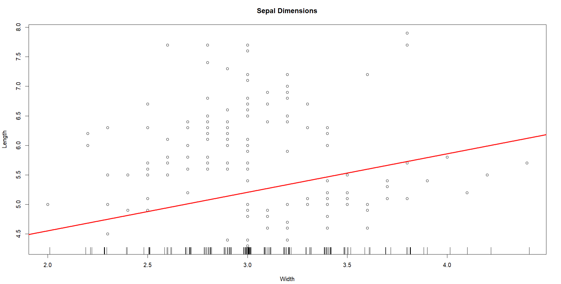
enter image description here

Instead, we can just code the predictions ourselves, setting the predictor of interest to an arbitrary range of values between its minimum and maximum, then set the other predictor to its mean, and then get predictions from this data. Note that unless you specify re.form = NA, the predict function will force you to also include the random effects, which is only useful if you want by-species predictions:

#### Get Prediction Data ####
newdata <- data.frame(
  Sepal.Width = seq(
    min(iris$Sepal.Width),
    max(iris$Sepal.Width),
    length.out=200
  ),
  Petal.Width = mean(iris$Petal.Width)
)

pred <- predict(
  fit,
  newdata=newdata,
  re.form=NA,
  se.fit=T
  )

From there we plot again and now use the lines from the predictions we created:

#### Plot Again ####
plot(iris$Sepal.Width, # predictor
     iris$Sepal.Length, # response
     main="Sepal Dimensions",
     xlab="Width", 
     ylab="Length") # labels

#### Add Rug Again ####
rug(jitter(iris$Sepal.Width))

#### Add Predictions ####
lines(newdata$Sepal.Width,
      pred,
      lwd=3,
      col="darkred")

Now our plot matches that from the effects package, as the intercept is now above 5:
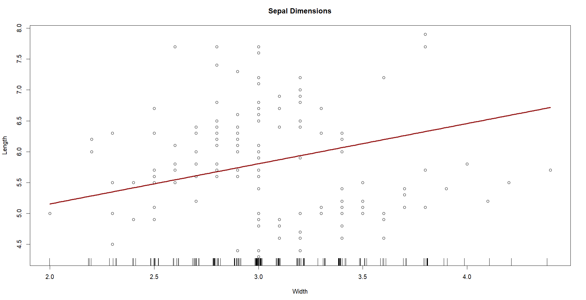
enter image description here

So in short to answer your questions:

  • It appears that the plot from the effects package indeed sets the other predictors to their mean values by default, then generates a line based off that fitting.
  • It does this by "toggling off" the random effects, otherwise it would draw a line for each random intercept.
  • The correlation between $X$ and $Y$ here is not captured by this relationship, so I'm not sure where you got the $r = -.40$ from. The coefficient isn't the correlation and is a partial effect (the effect after controlling for the other predictors).
$\endgroup$

Your Answer

By clicking “Post Your Answer”, you agree to our terms of service and acknowledge you have read our privacy policy.

Not the answer you're looking for? Browse other questions tagged or ask your own question.