8
$\begingroup$

I have a data set that looks like this, in reality there are about twenty categories with a count of 1:

Things Count
Cars 500
Trucks 250
Jeeps 17
Planes 2
Foot 1
Oranges 1
Plasters 1
Grapes 1
Tablets 1
Pillows 1

I have tried plotting:

  • Pie charts (too many low frequency entries - with a second zoomed in one on the low counts this looks silly as they all have counts of one).

  • Bar charts: Not a nice aesthetic with lots of 1 counts in the tail.

  • Treemaps (using treemapify) - again too many low frequency tiles to many don't have their name within them.

I would like to know how people visualize such data in a presentable way. Online searches don't yield many helpful responses. Maybe I'll just stick with a table?

This is a toy example, in reality I am trying to visualize patients that have been given a genetic diagnosis for a set disease to the "things" are genes and then their counts. Many people have a rare gene, hence the low counts, but a few genes make up a larger proportion of the diagnoses. I want to tell this story in the most visually appealing way possible. I have been on the R Gallery, but none of the plots really seemed to deal with count data with such a broad range.

$\endgroup$
9
  • 5
    $\begingroup$ A log scale for counts may work. For appropriate values of "work"... Possibly cut your dataset into two, one for "high" and one for "low" counts, then have two plots that are at least comparable "internally". (Or even more than two.) $\endgroup$ Commented Jan 23 at 16:43
  • 2
    $\begingroup$ What is the nature of the data? Is each of these a separate variable, or is this one variable with many possibilities? Eg, can a patient have gene cars & gene pillows, or is there one gene, and the patient could have the cars version of it or the pillows version of it? $\endgroup$ Commented Jan 23 at 16:52
  • $\begingroup$ @gung-ReinstateMonica each patient just has one gene, so would be one of pillows or cars etc. $\endgroup$
    – tacrolimus
    Commented Jan 23 at 16:55
  • $\begingroup$ @StephanKolassa That's a good suggestion, I need to try and keep the plots to a minimum as it is part of an academic paper and there are already a fair few figures! $\endgroup$
    – tacrolimus
    Commented Jan 23 at 16:56
  • 1
    $\begingroup$ Also, regarding "I want to tell this story...", can you clarify the substantive / scientific story you want to illustrate? Is it that there are lots of patients with rare variants but that they are all different variants, or is it that these variants, given that they are rare, are probably not that important, or something else? $\endgroup$ Commented Jan 23 at 19:19

2 Answers 2

8
$\begingroup$

After playing with this for a bit I think 'just use a table' might be the best approach, but I tried a few of R's methods for showing this kind of information so I'm including as an answer in case it's useful.

Here's the data in R (data.table package)

library(data.table)
dat <- fread(text="Cars 500
Trucks 250
Jeeps 17
Planes 2
Foot 1
Oranges 1
Plasters 1
Grapes 1
Tablets 1
Pillows 1", header=FALSE) |> setNames(c("Category", "Frequency"))

Edit: you can add labels directly onto a waffle plot by extracting the locations of the plotted tiles. So:

# create a waffle plot
library(waffle)
library(data.table)
w1 <- ggplot(dat[sample(nrow(dat)),], aes(fill=Category, values=Frequency)) + 
  geom_waffle(n_rows=50, col=NA) + 
  theme_void() + 
  scale_fill_brewer(palette="Paired") + 
  theme(legend.position = "none")

# extract the locations of the plotted tiles
d1 <- ggplot_build(w1)$data |> as.data.table()

# take the average position for each group
# (relies on each group having a different fill colour)
regiondata <- d1[, .(x=mean(x), y=mean(y)), by=fill]

# now draw the plot, and add the labels 
w1 + geom_text(aes(
  label = Category,
  x = regiondata$x,
  y = regiondata$y,
  size = Frequency
)) +
  scale_size_binned()
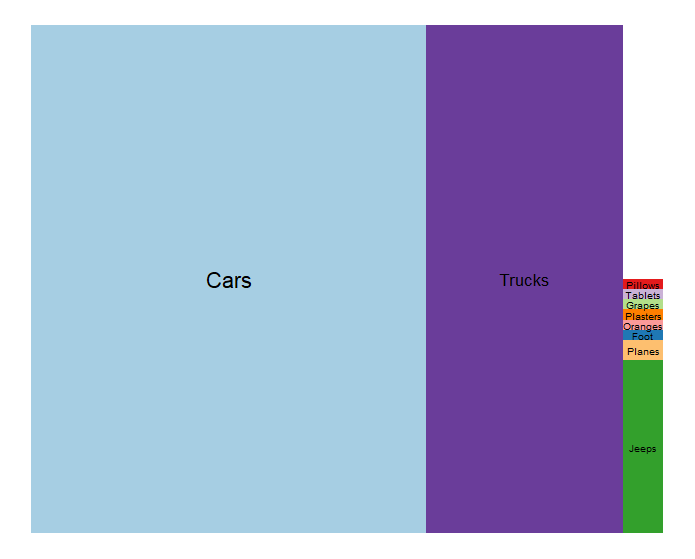
enter image description here

You can play with the size scale or maybe with ggrepel to get better sizing and placement of the labels.

Be careful that the labels are plotted in the right order, this relies on the order in the ggplot data being the same as the order the waffle plot is built in. So far this seems to be the case but it's worth checking.


First I tried the waffle and treemapify (as you did) R packages:

library(waffle)
ggplot(dat, aes(fill=Category, values=Frequency)) + 
  geom_waffle(n_rows=50, col=NA) + theme_void()
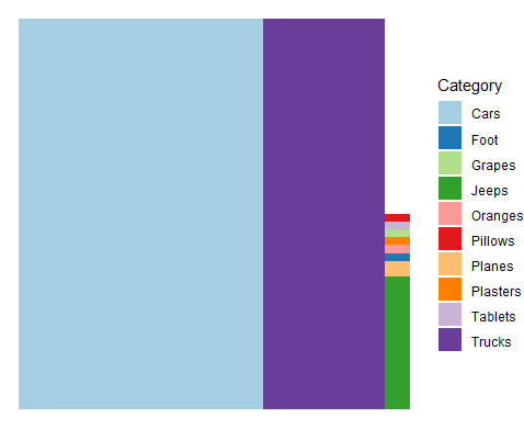
enter image description here

ggplot(dat, aes(area = Frequency, fill = Category, label = Category)) +
  geom_treemap(layout="srow") +
  geom_treemap_text(layout="srow")+ 
  scale_fill_brewer(palette="Paired")
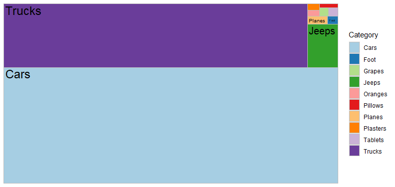
enter image description here

Neither of these works great when the distributions are so skewed, but they do convey the sense of area pretty well. If you can figure out how to label the waffle plot without using a legend it might work well.

I looked at facet_zoom from ggforce but I don't think it works in this case. So I tried to re-implement it as a pair of stacked bar charts with varying widths. Again not sure if it works particularly to convey your message, but it's possible you could adapt it.

This works by duplicating the dataset, with one part only having the low frequencies, then plotting two stacked bars side by side with some annotation to indicate the zooming and variable widths to make the relative areas correct:

dat[, prop:=Frequency/sum(Frequency)]
datlong=rbindlist(list(full=dat,zoomed=dat[Frequency<100]), idcol="part")
datlong[, sum:=sum(Frequency), by=part]
datlong[, grandsum:=sum(Frequency)]

ggplot(datlong) + aes(x=part, y=Frequency, fill=reorder(Category, Frequency)) + 
  geom_col(position="fill",width=width,col="black",aes(width=sum/grandsum)) + 
  geom_text(aes(label=sprintf("%s (%d)",Category,Frequency)), 
            position = position_fill(vjust=0.5),
            data=datlong[(part=="full" & Frequency>100)]) + 
  geom_text(aes(label=sprintf("%s (%d)",Category,Frequency)), 
            position = position_fill(vjust=0.5),hjust=-0.1,
            data=datlong[(part=="zoomed")]) + 
  theme_minimal()+
  theme(legend.position = "none",
        axis.text = element_blank()) + 
  annotate(x=1.5,xend=1.99, 
           y=1-sum(datlong[part=="zoomed", prop]),
           yend=0, geom="segment", lty="dashed")+
  annotate(x=1.5,xend=2.0, 
           y=1,yend=1, geom="segment", lty="dashed")+ 
  labs(x=NULL, y=NULL) 
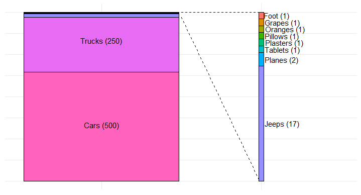
enter image description here

But I don't honestly think it's better than a table or a description in text would be.

$\endgroup$
2
  • 3
    $\begingroup$ (+1) I think the last plot works much better than the others. In general, a legend is at best a necessary evil if only because it obliges mental back and forth between legend and plot. In this case and often, it's important to wonder how any design will fare with several more categories. Getting about 30 colours that remain easily distinguishable is hard work for most people. $\endgroup$
    – Nick Cox
    Commented Jan 24 at 9:58
  • $\begingroup$ @NickCox I completely agree. This is an interesting question so if I get time I might think about how to make the waffle plot with direct labelling. $\endgroup$ Commented Jan 24 at 10:07
11
$\begingroup$

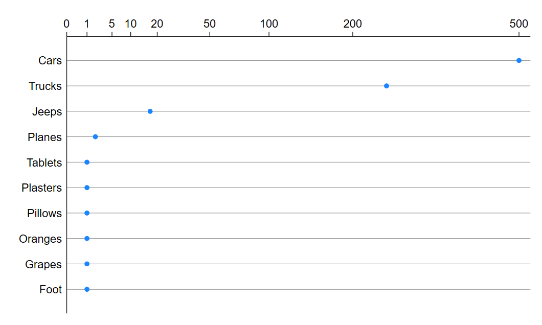
Two simple variations on the suggestion of logarithmic scale by @Stephan Kolassa are

  • square root scale (some history as a first aid transformation for counts)

  • log(count + 1) scale implemented directly in many environments as a function log1p(). Several examples using this scale can be found in Tukey, J.W. 1977. Exploratory Data Analysis. Reading, MA: Addison-Wesley.

(A third suggestion, logit scale, comes towards the end of this answer.)

Some moderately major and moderately minor points:

  1. Being able to show zero does no harm and may seem a real bonus. At the same time pulling in the highest values and keeping the lowest values discernible are both needed.

  2. Showing axis labels (tick labels) on the original scale is important. Few people want to be obliged to back-transform from either transformed scale.

  3. Dot charts rather than bar charts are meant to undermine a mental habit of taking bar height or length literally, which would be fair enough with the usual convention.

  4. Horizontal alignment is vital to ensure legible categorical labels. The toy example has 10 categories, and the implication is that there are several more in the real data.

  5. When a graph has table flavour, I often put the horizontal axis at the top. This is personal preference, but note that table conventions of using headers for columns clash with graph conventions of horizontal axis and text (titles or labels or tick labels, whatever you call them) at the bottom.

  6. More explanation could and perhaps should be added on the unusual scales.

  7. You might or might not want to show the counts next to each dot.

  8. The “dots” could be any point symbol you prefer.

  9. One or at most a few categories of particular interest or concern could be distinguished by a different symbol or colour. (Different symbols or colours for each category would be a bad idea for this kind of plot, although made necessary by some other designs.)

There is no free lunch. With either scale, you'll need to explain more than usual. Some readers will decide immediately that the idea is so weird that they won't play. You might have trouble getting either idea past reviewers. Just use a table! is to me too an understandable view.

Square root scale

enter image description here

log(count + 1) scale

enter image description here

I ignored "in R" as contrary to the best ecumenical spirit of CV. If R is as good as people say, you should have no problem in emulating or improving on my Stata script (below for the record).

clear 
input str8 Things Count
Cars 500
Trucks 250
Jeeps 17
Planes 2
Foot 1
Oranges 1
Plasters 1
Grapes 1
Tablets 1
Pillows 1
end 

gen Toshow = sqrt(Count)
mylabels 500 200 100 50 20 10 5 1 0, myscale(sqrt(@)) local(yla)
graph dot (asis) Toshow, over(Things, sort(1) descending) linetype(line) lines(lc(gs8) lw(vthin)) ysc(alt) yla(`yla') name(G1, replace)

replace Toshow = log1p(Count)
mylabels 500 200 100 50 20 10 5 1 0, myscale(log1p(@)) local(yla)
graph dot (asis) Toshow, over(Things, sort(1) descending) linetype(line) lines(lc(gs8) lw(vthin)) ysc(alt) yla(`yla') name(G2, replace)

Yet another variation, logit scale: You know the total number of patients, say 1000. Then frequencies of genes that occur can be shown as logit (count / total). That scale makes it impossible to show genes that don't occur (which doesn't sound an issue) or genes that always occur (I guess not an issue).

As before, the scale shown on axis labels shouldn't be logit but could be count or probability.

Recalling that for probabilities $p$, $\text{logit}\ p = \ln\ [ p / (1 - p)] = \ln\ p - \ln\ (1 - p)$, note that

  • for very small $p$ near $0$, $\text{logit}\ p \approx \ln\ p$ because $\ln\ (1 - p) \approx \ln\ 1 = 0$

  • for very large $p$ near $1$, $\text{logit}\ p \approx -\ln\ (1 - p)$ because $\ln \ p \approx \ln\ 1 = 0$.

So the scale is logarithmic in different ways in each tail, which is either what you want or not a problem.

All these devices could be called ad hoc, which I translate positively as "fit for purpose".

$\endgroup$

Your Answer

By clicking “Post Your Answer”, you agree to our terms of service and acknowledge you have read our privacy policy.

Not the answer you're looking for? Browse other questions tagged or ask your own question.