3
$\begingroup$

I'd like to illustrate the importance of accounting for the dependency between mean and variance in inference with linear models. Is my example below a good one? Do you agree with my comments on it?


Here I simulated count data from a negative binomial distribution for 4 groups with different means and same dispersion parameter. I fitted the same model using ordinary linear regression (lm) and a generalised linear model with negative binomial error distribution (glm). One can see that:

  • The ordinary linear model returns the same error estimates for each of the four groups (and therefore the same width of confidence intervals, CI). This is because lm assumes constant variance. The glm instead adapts the error to the mean. (Note that the error estimates depend also on the group size, which is the same for all groups here).

  • Consequently, lm underestimates the error in groups with large mean (i.e. A) and overestimates in groups with small mean (C and D). In fact, the 95% CI for group A just misses the true of value of 50 and visually the CI for C and D doesn't feel right.

  • The CI from lm contain negative values which are unphysical for count data.

enter image description here

So, how does glm adapt the variance (and therefore error estimates and CI) to the mean? This is in the choice of error distribution. For count data we could choose Poisson distribution were the variance is equal to the mean. Poisson often underestimates the variance since you would assume that different observations are identical in everything and the only source of variation is due to random sampling (the urn model). If you count parasite eggs from different animals it is unlikely that Poisson fits well since animals will differ in many aspects such as exposure to infection and response to infection.

The negative binomial allows extra variation via the dispersion parameter. Like the mean, the dispersion is estimated from the data in such way that the likelihood of the data is maximised for the given mean and dispersion (in fact all glms are fitted via maximum likelihood).


R code to reproduce

library(data.table)
library(ggplot2)
library(ggbeeswarm)
library(emmeans)
library(MASS)
library(RColorBrewer)

set.seed(12345)

a <- 4
b <- 4
c <- 4
d <- 4
count <- list(
    A=rnbinom(n=a, mu=50, size=10),
    B=rnbinom(n=b, mu=30, size=10),
    C=rnbinom(n=c, mu=5, size=10),
    D=rnbinom(n=d, mu=0.5, size=10)
)
dat <- data.table(
    count=unlist(count),
    cnd=rep(names(count), c(a, b, c, d))
)

norm <- lm(count ~ cnd, data=dat)
emm <- as.data.table(emmeans(norm, 'cnd'))

negbin <- glm.nb(count ~ cnd, data=dat)
emm2 <- as.data.table(emmeans(negbin, 'cnd', type='response'))

cc <- brewer.pal(3, 'Dark2')
cols <- c('lm'=cc[1], 'glm'=cc[2])
gg <- ggplot(data=dat, aes(x=cnd, y=count)) +
    geom_quasirandom(colour='grey20', width=0.1) +
    geom_hline(yintercept=0, colour='grey60', linetype='dashed') +
    geom_segment(data=emm2, aes(x=as.numeric(cnd) - 0.1, y=asymp.LCL,
    yend=asymp.UCL, colour='glm'), linewidth=0.5) +
    geom_point(data=emm2, aes(x=as.numeric(cnd) - 0.1, y=response, 
    colour='glm'), pch=4, size=2) +
    geom_segment(data=emm, aes(x=as.numeric(cnd) + 0.1, y=lower.CL, 
    yend=upper.CL, colour='lm'), linewidth=0.5) +
    geom_point(data=emm, aes(x=as.numeric(cnd) + 0.1, y=emmean, 
    colour='lm'), pch=4, size=2) +
    scale_colour_manual(name="95% CI from:", values=cols) +
    ggtitle('Data simulated from negative binomial distributions') + 
    theme_light() +
    theme(axis.title.x=element_blank())
ggsave('error.pdf', width=12, height=10, units='cm')
$\endgroup$
1

2 Answers 2

2
$\begingroup$

I like the idea of showing the consequences of not respecting the mean-variance relationship. However, I would say that there are more issues than just that if you attempt to model counts with an ordinary linear model.

To somewhat isolate the issue, how about a continuous outcome? That way, at least someone may have initially thought that their approach made sense.

Example with Continuous Values

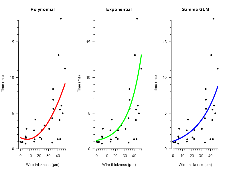
Suppose we run a current through a wire and it lights up. We then measure the time until the wire breaks, depending on the thickness of the wire. The idea being that thicker wires take longer to burn out, but may still burn out fast, occasionally.

We'll assume diagnostics are not used, lest the non-constant variance would have been picked up.

These are the data:

Gamma data

Blissfully ignorant of heteroscedasticity, I ponder how to best model this. Eventually I try:

  • A second degree polynomial with a linear model;
  • An exponential effect with a linear model.

My colleague dariober then points out that while the average trend may be reasonably captured by these models, they do not respect the mean-variance relationship in the way that, say a gamma GLM would. And so, reluctantly, I add a third option:

  • Gamma GLM.

These are the results:

results

After seeing these, I email: "Hi dariober, thanks for your suggestion, however, my supervisor told me readers may not be familiar with gamma GLMs and since the results don't differ much, we decided to use the exponential fit instead."

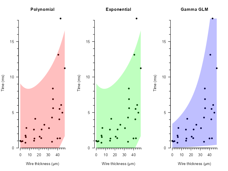
To convince me of the benefit of the third option, I get an email back that shows the uncertainty each model predicts, in the form of a $95\%$ prediction interval:

PI95

Clearly the approaches using an ordinary linear model do not capture the non-constant variance. As a result, I strongly overestimate the spread near $0$, and underestimate it for large values of $x$! The gamma GLM on the other end, captures both the change in average time, but also in the variance of time until failure, as the wire becomes thicker. With this convincing evidence, I manage to convince my supervisor to use a gamma GLM (hopefully).


Code used for the data:

set.seed(2024)
n <- 30
x <- runif(n, 0, 50)
y <- rgamma(n, shape = 3, scale = exp(1/25 * x) / 3)
DF <- data.frame(x, y)

LM1  <- lm(y ~ poly(x, 2), DF)
LM2  <- lm(y ~ exp(scale(x)), DF)
GLM <- glm(y ~ x, DF, family = Gamma(link = "log"))

Code used for the plots:

require("MASS")
require("sfsmisc")
plot(y ~ x, bty = "n", las = 1, axes = FALSE, pch = 16,
     xlim = c(0, max(x)), ylim = c(0, max(y)), yaxs = "i", xpd = TRUE,
     xlab = "Wire thickness (µm)", ylab = "Time (ms)")
eaxis(1)
eaxis(2)

par(mfrow = c(1, 3))

plot(y ~ x, bty = "n", las = 1, axes = FALSE, pch = 16,
     xlim = c(0, max(x)), ylim = c(0, max(y)), yaxs = "i", xpd = TRUE,
     xlab = "Wire thickness (µm)", ylab = "Time (ms)", main = "Polynomial")
eaxis(1)
eaxis(2)

newX  <- data.frame(x = seq(0, max(x), 0.01)) 
newY  <- data.frame(y = predict(LM1, newX))
newDF <- cbind(newX, newY)
lines(y ~ x, newDF, col = rgb(1, 0, 0), lwd = 3)

plot(y ~ x, bty = "n", las = 1, axes = FALSE, pch = 16,
     xlim = c(0, max(x)), ylim = c(0, max(y)), yaxs = "i", xpd = TRUE,
     xlab = "Wire thickness (µm)", ylab = "Time (ms)", main = "Exponential")
eaxis(1)
eaxis(2)

newY  <- data.frame(y = predict(LM2, newX))
newDF <- cbind(newX, newY)
lines(y ~ x, newDF, col = rgb(0, 1, 0), lwd = 3)

plot(y ~ x, bty = "n", las = 1, axes = FALSE, pch = 16,
     xlim = c(0, max(x)), ylim = c(0, max(y)), yaxs = "i", xpd = TRUE,
     xlab = "Wire thickness (µm)", ylab = "Time (ms)", main = "Gamma GLM")
eaxis(1)
eaxis(2)

newY  <- data.frame(y = predict(GLM, newX, type = "response"))
newDF <- cbind(newX, newY)
lines(y ~ x, newDF, col = rgb(0, 0, 1), lwd = 3)

###

par(mfrow = c(1, 3))

plot(y ~ x, bty = "n", las = 1, axes = FALSE, pch = 16,
     xlim = c(0, max(x)), ylim = c(0, max(y)), yaxs = "i", xpd = TRUE,
     xlab = "Wire thickness (µm)", ylab = "Time (ms)", main = "Polynomial")
eaxis(1)
eaxis(2)

newY  <- data.frame(predict(LM1, newX, interval = "predict"))
newDF <- cbind(newX, newY)

polygon(x = c(newDF$x, max(newDF$x), rev(newDF$x), min(newDF$x)),
        y = c(newDF$lwr, min(newDF$upr), rev(newDF$upr), min(newDF$lwr)), 
        border = rgb(0,0,0,0), col = rgb(1, 0, 0, 0.25))

plot(y ~ x, bty = "n", las = 1, axes = FALSE, pch = 16,
     xlim = c(0, max(x)), ylim = c(0, max(y)), yaxs = "i", xpd = TRUE,
     xlab = "Wire thickness (µm)", ylab = "Time (ms)", main = "Exponential")
eaxis(1)
eaxis(2)

newY  <- data.frame(predict(LM1, newX, interval = "predict"))
newDF <- cbind(newX, newY)

polygon(x = c(newDF$x, max(newDF$x), rev(newDF$x), min(newDF$x)),
        y = c(newDF$lwr, min(newDF$upr), rev(newDF$upr), min(newDF$lwr)), 
        border = rgb(0,0,0,0), col = rgb(0, 1, 0, 0.25))

plot(y ~ x, bty = "n", las = 1, axes = FALSE, pch = 16,
     xlim = c(0, max(x)), ylim = c(0, max(y)), yaxs = "i", xpd = TRUE,
     xlab = "Wire thickness (µm)", ylab = "Time (ms)", main = "Gamma GLM")
eaxis(1)
eaxis(2)

S        <- gamma.shape(GLM)
newY     <- data.frame(predict(GLM, newX, type = "link", se.fit = TRUE))
newY$lwr <- qgamma(
  p     = 0.025,
  shape = (S$alpha + qnorm(0.025) * S$SE),
  scale = exp(newY$fit + qnorm(0.025) * newY$se.fit) / (S$alpha + qnorm(0.025) * S$SE)
)
newY$upr <- qgamma(
  p     = 0.975,
  shape = (S$alpha + qnorm(0.975) * S$SE),
  scale = exp(newY$fit + qnorm(0.975) * newY$se.fit) / (S$alpha + qnorm(0.975) * S$SE)
)
newDF <- cbind(newX, newY)

polygon(x = c(newDF$x, max(newDF$x), rev(newDF$x), min(newDF$x)),
        y = c(newDF$lwr, min(newDF$upr), rev(newDF$upr), min(newDF$lwr)), 
        border = rgb(0,0,0,0), col = rgb(0, 0, 1, 0.25))
$\endgroup$
1
$\begingroup$

There is a technical issue with your plot. You show the means being compared to a reference value of zero. However, since the data are simulated counts, it is impossible for a mean count to be zero or less unless all the counts are equal to zero. It doesn't even make sense to test whether a mean count is equal to zero unless there is an application-specific reason to posit that the count distribution is degenerate at zero.

Some of the CIs based on lm() do cross zero, but that's because it's a seriously incorrect model. The CIs for the nb.glm() are on the log scale originally, and the back-transformation via the exp() function forces both the lower and upper confidence limits to be non-negative, no matter what; so you will never see those CIs crossing zero. The same would be true of a Poisson model. And that's because these models are appropriate for count data.

For these reasons, I think the didactic example would be better if the null-hypothesized mean is some positive value.

$\endgroup$
2
  • 1
    $\begingroup$ "You show the means being compared to a reference value of zero" where do you see this comparison? Is it the horizontal axis? $\endgroup$ Commented Jun 19 at 6:45
  • 2
    $\begingroup$ I'm not explicitly testing any hypothesis here. I'm just presenting means and their CI. Other than that, I agree with everything you say and it is acknowledged in bullet point 3. Remember that the point of my post is to illustrate the importance of mean-variance dependency and to ask whether I'm presenting it right. I like to think that my illustration is very clear but I've never seen it presented like that, so I wonder whether I'm missing something. $\endgroup$
    – dariober
    Commented Jun 19 at 8:24

Your Answer

By clicking “Post Your Answer”, you agree to our terms of service and acknowledge you have read our privacy policy.

Not the answer you're looking for? Browse other questions tagged or ask your own question.