5
$\begingroup$

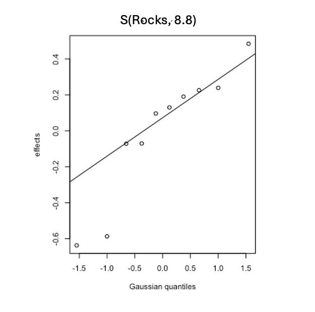
Model runs are fine. Interpreting effects is easier for factors. What is not straight forward are the outputs/plots for variables with factor levels assigned a random effect. The plots I am trying to interpret includes factor levels as dots, effects on the y-axis, and gaussian quantiles on the x-axis. There is a straight line going through the dots that looks linear-positive.

How to interpret these plots for factor variables? What does the line through the dots mean? And what does 8.8 in the top of plot mean? Would greatly appreciate any help with interpretation.plot.gam() output for a random effect (or factor) variable

ModRun <- gam(Flies~ s(log(LENGTH+1))+
                              s(GRADIENT)+#
                              s(ROCKS,bs="re")+
                              s(MILES),
                                       
                              data=dat,
                              family=nb(link = "log"),
                              method="ML",optimizer="efs")
$\endgroup$
2
  • $\begingroup$ I think, but don't quote me on this, that whatever your factor is - this plot says some levels of your factor have higher values of the response than others. For example, if your factor was "Year" and your response was abundance, then this would indicate some years had higher abundance than other years. The line through the dots is, I think, like a qqplot. The random effects (dots) are assumed normal. $\endgroup$
    – Nate
    Commented Aug 26 at 0:33
  • $\begingroup$ 8.8 might be the edf for that smoother (effective degrees of freedom). $\endgroup$
    – Nate
    Commented Aug 26 at 0:37

2 Answers 2

6
$\begingroup$

The equivalence of penalized splines and random effects comes from both of these having the form of a Gaussian random field. The specific random effects that are considered here are Gaussian random effects, which are draws from a Gaussian distribution. Hence a QQ-plot is often used to compare the "estimates" for the random effects with a reference Gaussian. The line in the QQ-plot is passes through the first and third quartiles of the values on the two axes. The idea would be that that if the "estimates" of the random effects followed a Gaussian distribution, they would line up roughly about the line.

This kind of plot is typically used as a diagnostic plot for a mixed effect model, where we might be placing some weight on the fact that we fit the model assuming the random effects are distributed Gaussian. If they are far from Gaussian, something about the model could be wrong in terms of what it assumes about the data.

If we're coming from the school of "new style" random effects, then we might not be so worried about deviations from the assumed Gaussian distribution as we're just using the random effect to get penalised/shrunken estimates for individuals. If so, this plot is also just a convenient way to show the "estimates" of the random effects.

The 8.8 is the effective degrees of freedom of the term. You had 10 levels in the factor Rocks, so without shrinkage to the model constant term (penalization) the term would use 10 degrees of freedom. Instead, the "estimates' have been shrunk towards the constant term in the model (the intercept), some more than others, resulting in a term that uses fewer degrees of freedom than the 10 if we'd fitted as a fixed effect.

In the random effect form of the model, the software would probably suggest that this random effect term took up 1 extra degree of freedom (for the variance parameter that is what is actually estimated there). In the fixed effects world we'd be using 10 (or 9) extra parameters to estimates the effects. In the penalized spline world, we're somewhere between these two numbers; we'd be closer to 1 if there was a lot of shrinkage, and close to the fixed effects number if there was little shrinkage. How many degrees of freedom a random effect term uses is not a decided thing in statistics; it's why lme4 won't give you p values for lmer() model terms, for example. All three values are reasonable, but suffer in some respects. mgcv just treats this as a penalized spline and reports that as the EDF of the term, which seems good to me.

$\endgroup$
3
  • $\begingroup$ Thank you @Gavin I understand that the log link function does not impact factor variables. The log link function only impacts the response variable, such as counts being run as log of counts as the Y, is this correct? $\endgroup$
    – frog_dan
    Commented Aug 26 at 22:10
  • 2
    $\begingroup$ No; it affects everything. You aren’t modelling $log(y_i)$ (I.e. the log-transformed data) you are modelling $log(\mathbb{E[y_i]})$. So all tge estimates effects, including the estimates of the random effects would be on the log scale if you fitted with a model using a log link. In GLMs and GAMs we typically don’t transform the response, but we model its expected value using a link function. As you didn’t show your model code, we don’t know what you did however. $\endgroup$ Commented Aug 27 at 5:05
  • $\begingroup$ Thank you. Code added to original posting, see link=log used in code. $\endgroup$
    – frog_dan
    Commented Aug 27 at 5:41
4
$\begingroup$

Agree with Gavin's answer. This type of plot produced by mgcv is useful for quickly inspecting whether a Gaussian assumption for the hierarchical effects (random intercepts in this case) is appropriate. If you find big outliers, then perhaps something like a Student's T distribution might be more appropriate. But given that you cannot use a T distribution with s(..., bs = 're'), it is probably more useful to rely on this plot to inspect shrinkage.

But you may find it more helpful to actually see which factor level each effect corresponds to, and you will probably want to inspect uncertainty in those estimates. The marginaleffects package is your friend here. Below I show how you can use this package to plot your random effect estimates on both the link scale and the log scale, which will hopefully be more useful to you as you diagnose and critique your model.

library(mgcv)
#> Loading required package: nlme
#> This is mgcv 1.8-42. For overview type 'help("mgcv-package")'.
library(marginaleffects)
library(ggplot2); theme_set(theme_classic())
#> Warning: package 'ggplot2' was built under R version 4.3.3

# Simulate some hierarchical data
set.seed(0)
N <- 30
sites <- letters[1:6]
N_sites <- length(sites)
hyper_mu <- 0.5
hyper_sigma <- 1
dat <- do.call(rbind, lapply(1:N_sites, function(site){
  # Sample the site-specific random intercept from the population
  # distribution
  site_mu <- rnorm(1, hyper_mu, hyper_sigma)
  
  # Sample count observations for this specific site
  data.frame(y = rpois(N, exp(site_mu)),
             site = sites[site])
}))
dat$site <- as.factor(dat$site)

head(dat, 12)
#>     y site
#> 1   5    a
#> 2   6    a
#> 3   9    a
#> 4   4    a
#> 5   9    a
#> 6  10    a
#> 7   7    a
#> 8   6    a
#> 9   2    a
#> 10  4    a
#> 11  4    a
#> 12  7    a
tail(dat, 12)
#>     y site
#> 169 2    f
#> 170 0    f
#> 171 0    f
#> 172 2    f
#> 173 1    f
#> 174 2    f
#> 175 0    f
#> 176 1    f
#> 177 1    f
#> 178 2    f
#> 179 1    f
#> 180 1    f

# Fit a model that uses a random effect basis for hierarhical
# intercepts
mod <- gam(y ~ s(site, bs = 're'),
           family = poisson(),
           data = dat)

# Typical Gaussian quantiles plot of random intercepts
plot(mod)

# Now make a more useful plot using marginaleffects::plot_predictions();
# first plot random intercepts on the link (log) scale
plot_predictions(mod, 
                 condition = 'site',
                 type = 'link') +
  labs(y = 'log(mu)')

# And now plot them on the outcome scale
plot_predictions(mod, 
                 condition = 'site') +
  labs(y = 'mu')

Created on 2024-08-27 with reprex v2.1.0
$\endgroup$
1
  • $\begingroup$ Thank you @Nicholas $\endgroup$
    – frog_dan
    Commented Sep 3 at 18:58

Your Answer

By clicking “Post Your Answer”, you agree to our terms of service and acknowledge you have read our privacy policy.

Not the answer you're looking for? Browse other questions tagged or ask your own question.