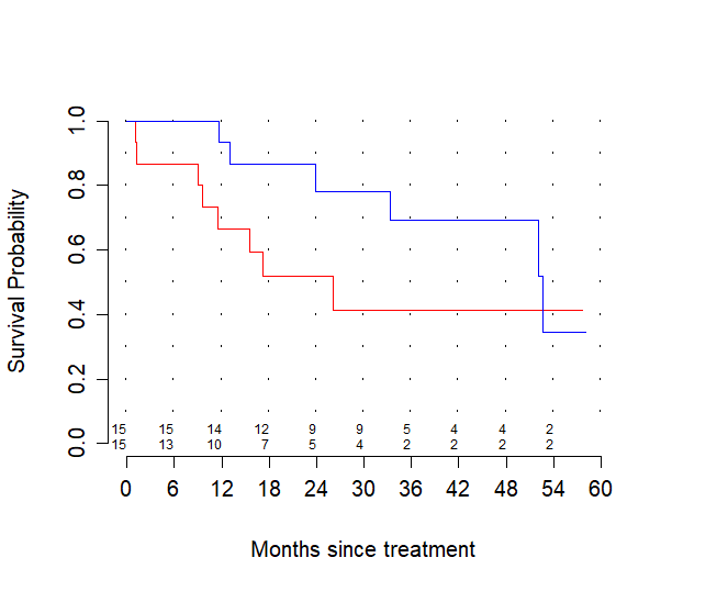
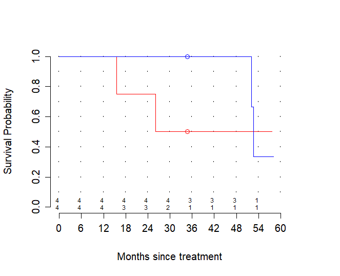
Here is a picture from a small set of lung cancer patients. The blue curve represent overall survival: time from radiotherapy to death of any cause. The red line represents disease free survival: time from radiotherapy to recurrence of disease or death ("whatever comes first", as people tend to write). Both are made with the Kaplan-Meier method, censoring people who had neither event ($n = 7$), or, in the blue curve, had disease recurrence but did no die ($n = 2$), at their last day known to be alive.
Of course normally one would never plot these two curves in one figure because it suggests a comparison between two groups while in reality both curves are talking about the same 15 patients. However I put them in one figure here to make clear that something happens that feels like it should be impossible: the blue curve (overall survival) drops below the red curve (recurrence free survival).
To be clear: for the 'true' curves, to which these KM-curves are just clunky approximations, this is impossible because every OS-event is also an RFS event. At every point in time the percentage of patients still alive should be at least as high as the percentage of patients alive without disease. This is not just a matter of biology but of simple logic.
So what is going on here?
(I figured out the answer, see below, but the reason to post it here is that for once the error is not in my code. The fact that this can happen is an actual weird quirk of the Kaplan-Meier method. Having this example on the internet might save others in the same situation some time searching for an error on their side.)


