I have a data set with lots of zeros that looks like this:
set.seed(1)
x <- c(rlnorm(100),rep(0,50))
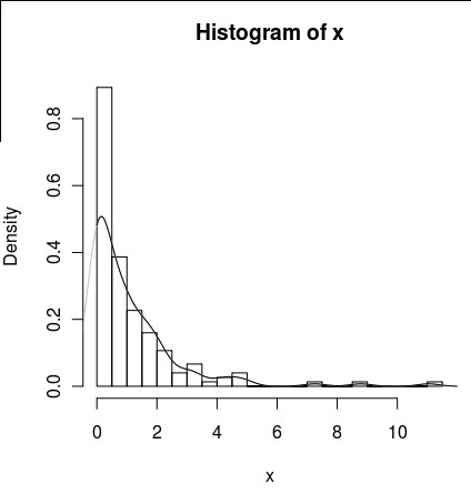
hist(x,probability=TRUE,breaks = 25)
I would like to draw a line for its density, but the density() function uses a moving window that calculates negative values of x.
lines(density(x), col = 'grey')
There is a density(... from, to) arguments, but these seem to only truncate the calculation, not alter the window so that the density at 0 is consistent with the data as can be seen by the following plot :
lines(density(x, from = 0), col = 'black')
(if the interpolation was changed, I would expect that the black line would have higher density at 0 than the grey line)
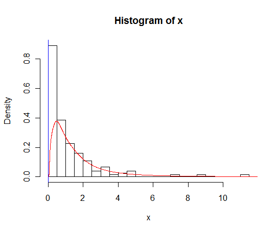
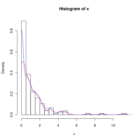
Are there alternatives to this function that would provide a better calculation of the density at zero?


