I was asked to perform a Gaussian smearing on the bins of an histogram. What does this mean?
2 Answers
There appears to be a difference in terminology (as so often is the case with a discipline used in so many areas), so I'm not 100% sure, but I think they're referring to kernel density estimation, with a Gaussian kernel, but performed on binned data.
[Edit: if someone familiar with how the term "Gaussian smearing" is used in physics - and how it would apply in relation to a histogram - could chime in, that would be good]
In that case, each observation is replaced with a scaled density (or more generally, a kernel, which needn't necessarily be positive), which has been scaled to area $\frac{1}{n}$, centered on the observation.
The scale (the standard deviation in the case of a Gaussian) of the kernel is a tunable smoothing parameter.
Presumably the intent is to place observations at bin-centers before smoothing (this discreteness leads to a need for larger kernel bandwidth to achieve a given amount of smoothness, though if the bins are small relative to the default bandwidth the effect is very small); another alternative would be to spread the observations throughout their bins, though I suspect this isn't the intent of the request in your case.
In the unbinned case, here's an illustration of the idea. Below are 7 observations
(5.996 22.687 8.868 15.883 14.727 5.896 9.397) marked with "+" symbols (there are two almost coincident at the far left), with one point (14.727) marked in bold red. The little red density there is the gaussian kernel of bandwidth 2.5; there are gray kernels placed above each of the other points. The green dashed curve is the kernel density estimate, which came from summing up the densities at a fine grid of points and joining to give a smooth curve.

The bandwidth I used in my illustration is a little small. There are automatic methods for choosing the bandwidth that usually do pretty well. I did my calculations in R; like many other stats packages, it comes with a function to automate the whole procedure, so I could do the following to get a plot like the green dashed one:
a = c(5.996, 22.687, 8.868, 15.883, 14.727, 5.896, 9.397)
plot(density(a,bw=2.5))
Below is the kernel density estimate generated by the default bandwidth in the same program (i.e. by using density(a)):

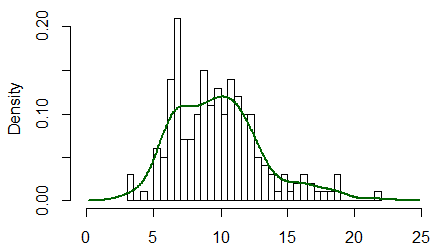
As you see, it's wider, and achieves a smoother looking result. Of course, 7 observations is unrealistic; here's a histogram and kernel density estimate for 200 observations from a gamma(10,1):

If you click on the kde tag that your post has (I believe it was added in an edit), you'll see many posts on the topic here. There's also a kernel tag by the look of it, which mostly seems to be doing the same job (though kernel can refer to other things than density estimation), and that has more hits still.
The requester is probably referring to a kernel density smoother as Glen_b notes, but "smearing" is evocative of the shadowgram featured in the book Visual Statistics. To address the issue of choosing the right bin or kernel width, the shadowgram is a overlay of many different width choices.

-
2$\begingroup$ What has been seen cannot be unseen. I find that shadowgram to be one of those plots I'd rather forget about. $\endgroup$– MomoCommented Sep 5, 2013 at 19:57
-
$\begingroup$ I wouldn't go as far as saying you should unsee it, but I believe it would be nicer instead of visualizing the superimposed areas to visualize only the smeared lines of the different PDF estimates. Although if one were to continually widen the bandwidth it would just continually flatten down to a constant (or nothing if the bandwidth grows larger than the data). $\endgroup$– Andy WCommented Sep 5, 2013 at 20:05
-
$\begingroup$ +1 This seems like a reasonable guess. I initially thought of gaussian blur when the question was first asked. Which in one dimension is just one potential KDE estimate. $\endgroup$– Andy WCommented Sep 5, 2013 at 20:07
-
$\begingroup$ If one finds presenting the information from different density estimates bandwidths interesting, I suppose a waterfall plot with bandwidth as (flattened) third dimension would do the job much better. $\endgroup$– MomoCommented Sep 5, 2013 at 21:23
-
1$\begingroup$ I think this is an interesting idea (and +1 for bringing it up), though I doubt it's the original intent. $\endgroup$– Glen_bCommented Sep 5, 2013 at 23:26
