1
$\begingroup$

I am working in a hobby project, and I'd like some help with the following problem:

I'm pulling pricing information from an internet marketplace, so if I provide a keyword (say, iphone cases) I'm going to get the first 500 items that show up in that marketplace, along with their prices.

My question is, how can I properly visualize price distribution, so that I can get meaningful information?

I've tried scatter plots, but I don't think the graph tell me much about the prices in that marketplace:
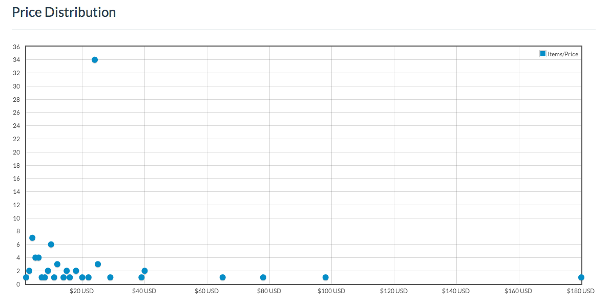
my attempt to visualize price distribution

I've also tried to plot the mean, and the standard deviation in the scatter plot, but I'm not sure if I'm mixing pears and apples, when I plot those values in a scatter chart.

I'm not a data miner, nor a stats person. I'm doing this just as a hobby and using this small project as a personal learning experience.

Any help would be greatly appreciated.

$\endgroup$
3
  • $\begingroup$ Your "scatter plot" appears to plot frequency of price versus price. As such, it's a histogram with points for bar tops, rather than bars. The obvious question is why the spike of 34 for a price about USD 22. $\endgroup$
    – Nick Cox
    Commented Nov 26, 2013 at 1:46
  • $\begingroup$ That outlier is a retailer with the same item posted 34 times, and he/she just changed the title/picture. $\endgroup$
    – ILikeTacos
    Commented Nov 26, 2013 at 1:50
  • $\begingroup$ OK, so it seems that the graph tells you quite a lot. There is an overall pattern and a striking exception you can interpret. You win both ways. $\endgroup$
    – Nick Cox
    Commented Nov 26, 2013 at 1:52

1 Answer 1

1
$\begingroup$

For a dataset like that, I would start with histograms. First, do simple ones of price ranges, one histogram per keyword. Double check any outliers to make sure the data collection is correction (ie, you don't accidentally get an iPhone mixed in with your iPhone cases). Make sure the distributions make intuitive sense and there's no strange patterns for a given keyword.

Then, for each retailer, make a histogram of all of their products. Similarly, look for outliers or any issues you can spot. And then try to get sense of overall trends.

I might then create bar charts, one per retailer, with their range and average price across all products. How much do the ranges vary retailer to retailer ? It may be interesting to dig further into these by taking subsets of products (ie, who's cheapest for phone accessories ?) along with subsets of the retailers.

I would also want to add in some extra variables. For example, one that could be interesting is time. If you re-run the data collection each day for a couple of weeks, it would be interesting to look into the price fluctuations. Which retailers vary their prices the most ? What day of the week do you get the cheapest prices for each kind of product ?

That's a few initial ideas. As with any dataset, you will have to look at it a number of different ways and ask a number of different questions of it to find what's interesting and useful.

$\endgroup$
0

Your Answer

By clicking “Post Your Answer”, you agree to our terms of service and acknowledge you have read our privacy policy.

Not the answer you're looking for? Browse other questions tagged or ask your own question.