4
$\begingroup$

I have a predictor variable (water height in metres) and a response variable (feeding rates of birds). The relationship between them looks similar that shown in the plot below.

tidal_effect <- iris[,3:4]
library(plyr); tidal_effect <- rename(tidal_effect, c("Petal.Length" = "feeding.rate", "Petal.Width" =  "water.height"))

tidal_effect_extra <- data.frame(water.height = sample(seq(2.5, 3, 0.1), 50, replace = T), feeding.rate = sample(seq(4, 4.5, 0.1), 50, replace = T))

tidal_effect_extra <- rbind(tidal_effect, tidal_effect_extra)

library(ggplot2)
ggplot(tidal_effect_extra, aes(water.height, feeding.rate)) + geom_point() + xlab("water.height (m)")
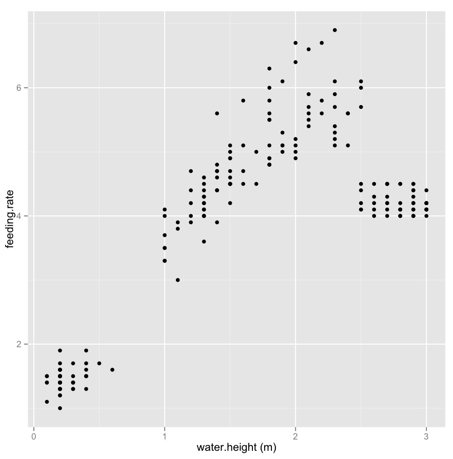
enter image description here

I'm considering cutting water height into a three level factor. As can be seen in plot above, the obvious point at which to cut water height is about 0.7, 2.5 and 3, which means that the distance between the minimum/maximum values at each level of the factor are not equal

I can cut the predictor variable like this:

tidal_effect_extra$water.height.cut <- cut(tidal_effect_extra$water.height, breaks = c(0, 0.7, 2.5, 3), labels = c("low", "mid", "high"))

And then perform this model:

lm(feeding.rate ~  water.height.cut, tidal_effect_extra)

My question: is there anything wrong with cutting water height into groups in which distances between the minimum/maximum values at each level of the factor are not equal?

$\endgroup$
6
  • $\begingroup$ sure, why not....? $\endgroup$
    – charles
    Commented Dec 19, 2013 at 22:00
  • 1
    $\begingroup$ or rather, (1) this is obviously a data driven and has the limitations of other data driven approaches (increase variance and decreased bias) (2) unclear if you're really getting any benefit from the split (how is this better than using all the data) (3) but is how we learn about data. If same cut-points seem in multiple samples you've possibly learned something about the relationship of the data $\endgroup$
    – charles
    Commented Dec 19, 2013 at 22:36
  • 6
    $\begingroup$ Okay in what sense? Your question is too vague. Statistics is not some priesthood where we can either declare your actions as anathema or as sanctioned - and even less so without context - it depends on what you're trying to achieve and what characteristics of the resulting analysis are important. Such data-dependent actions can certainly have consequences, but if those consequences don't matter to you, you may well regard the result as 'okay'. On the other hand, such a choice may impact your results in ways that matter to you deeply. How could we tell? You don't give anything to go on. $\endgroup$
    – Glen_b
    Commented Dec 20, 2013 at 1:24
  • 4
    $\begingroup$ The scatterplot does not suggest there is any merit to making water height a polychotomous variable. Instead, it looks like the data may have been collected in a small number of groups and that each group has contributed its own smaller circular cloud of points--perhaps only five or six groups were involved. If that is the case, you need to approach this question differently by accounting for this grouping in your model (so that the correlations it induces will properly be accommodated). $\endgroup$
    – whuber
    Commented Dec 20, 2013 at 13:55
  • 2
    $\begingroup$ Why not model water height as a continuous variable, rather than cut it, and use non-linear analysis? That could be useful if the underlying science supports the idea that feeding rate is maximum at some intermediate water height. $\endgroup$
    – EdM
    Commented Dec 20, 2013 at 15:16

1 Answer 1

3
$\begingroup$

Partially answered in comments:

Why not model water height as a continuous variable, rather than cut it, and use non-linear analysis? That could be useful if the underlying science supports the idea that feeding rate is maximum at some intermediate water height. – EdM

The scatterplot does not suggest there is any merit to making water height a polychotomous variable. Instead, it looks like the data may have been collected in a small number of groups and that each group has contributed its own smaller circular cloud of points--perhaps only five or six groups were involved. If that is the case, you need to approach this question differently by accounting for this grouping in your model (so that the correlations it induces will properly be accommodated). – whuber

$\endgroup$

Your Answer

By clicking “Post Your Answer”, you agree to our terms of service and acknowledge you have read our privacy policy.

Not the answer you're looking for? Browse other questions tagged or ask your own question.