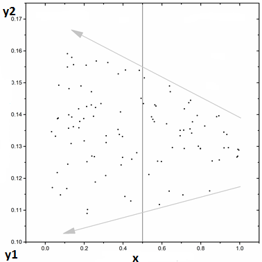
Please help me to interpret this graph in terms of correlation type. Which type involves two vectors in directions observed below (see graph screenshot)? Thanks in advance.

Please help me to interpret this graph in terms of correlation type. Which type involves two vectors in directions observed below (see graph screenshot)? Thanks in advance.

Assuming the dots are your observations, the vectors seem to express upper and lower bounds on the range of $y$ as a function of $x$. The correlation appears weakly negative at a glance, but I wouldn't really trust my eyeballs to estimate Pearson's $r$. What does seem clear enough is that $y$ exhibits heteroscedasticity across $x$. Wikipedia's Consequences section may be of further interest to you. See also for comparison
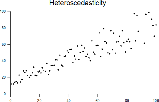
Wikipedia's plot with random data showing heteroscedasticity: by Q9.
Like most distributional characteristics, heteroscedasticity is a matter of degree, and few real datasets are truly, absolutely homoscedastic. Despite my own behavior here, you may not want to "eyeball" a scatterplot for heteroscedasticity any more than for a correlation. Many tests of homoscedasticity exist, including levenes-test. Fixes are available, but the best may be robust methods that tolerate heteroscedasticity. This is not to say heteroscedasticity is only a data-analytic nuisance – it may also be of focal theoretical interest. An example from Wikipedia describes wealth and diet variability:
A classic example of heteroscedasticity is that of income versus expenditure on meals...A poorer person will spend a rather constant amount by always eating inexpensive food; a wealthier person may occasionally buy inexpensive food and at other times eat expensive meals. Those with higher incomes display a greater variability of food consumption.
Interested readers may wish to check the tag wiki for heteroscedasticity; I've edited in more info like this.