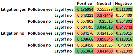
How about some old-school table showing predicted means? (See below)

Once you have all these data, it's possible to plot them. Use Negative > Neutral > Positive as the x-axis, predicted RET on the y-axis. And experiment different ling layouts:
- All eight lines: possible if they separate from each other very clearly.
- Four lines on each graph, two panels: For instance, split the graph by litigation yes/no, then then within each use colors to represent pollution, and line styles to represent layoff.
- Two lines on each group, four panels: Suitable if your eight lines are really close and messy.
