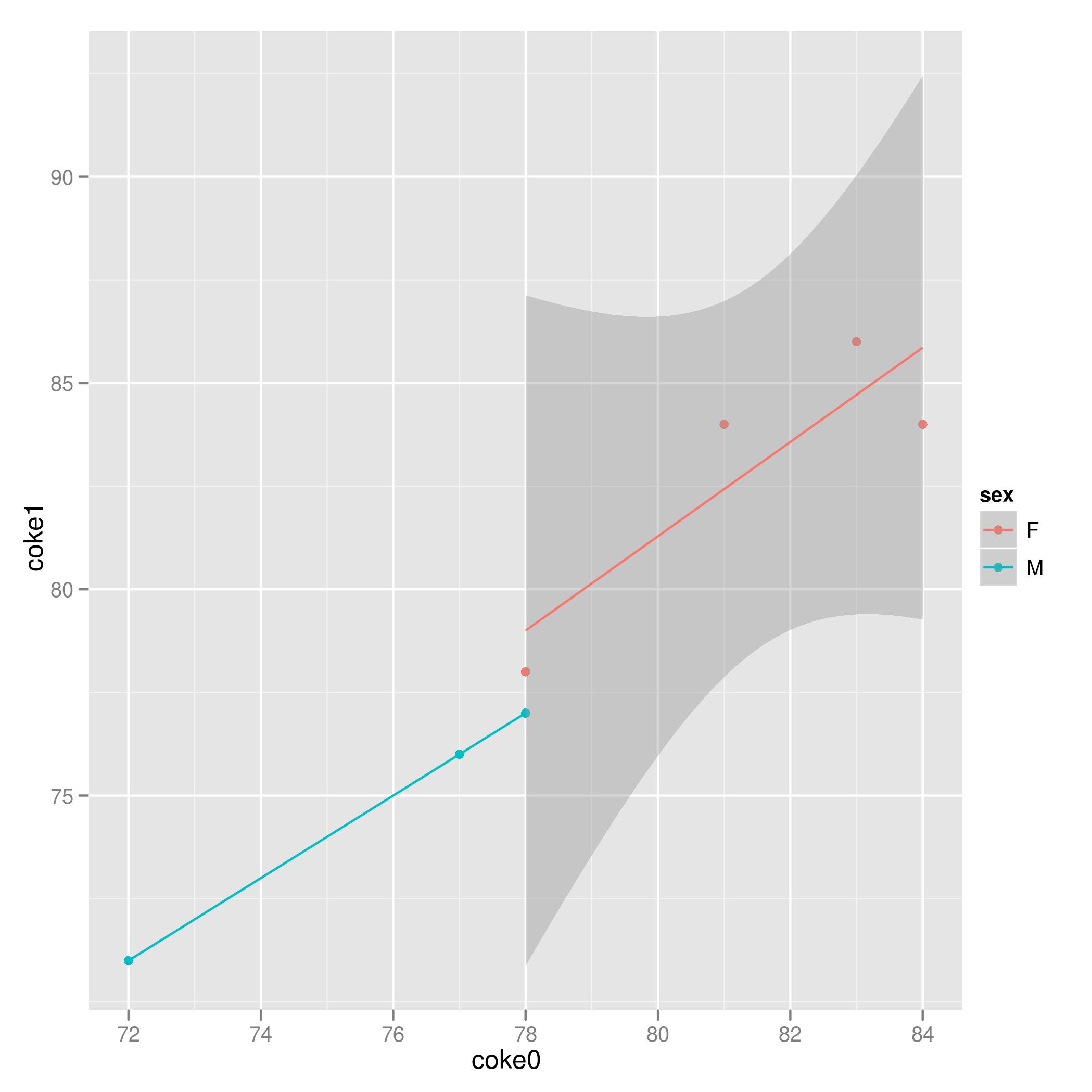
If you think in terms of linear models instead of going directly to ANOVA you may see something very important in the data. Consider the following plot of the data for looking at the response `coke1` as a function of `coke0` and `sex`. You'll notice that the responses for Males are perfectly linear making the use of a linear model moot as we already know the 'line of best fit' since the data is a line.
library(ggplot2)
ggplot(dat) +
aes(x = coke0, y = coke1, color = sex) +
geom_point() +
stat_smooth(method = 'lm')

You may continue with an ANOVA, I would do so as:
g <- lm(coke1 ~ sex + coke0, data = dat)
plot(g) # graphics to check some model assumptions
anova(g)
The ANOVA results should look like:
Analysis of Variance Table
Response: coke1
Df Sum Sq Mean Sq F value Pr(>F)
sex 1 128.000 128.000 72.804 0.0003639 ***
coke0 1 49.209 49.209 27.989 0.0032170 **
Residuals 5 8.791 1.758
---
Signif. codes: 0 ‘***’ 0.001 ‘**’ 0.01 ‘*’ 0.05 ‘.’ 0.1 ‘ ’ 1