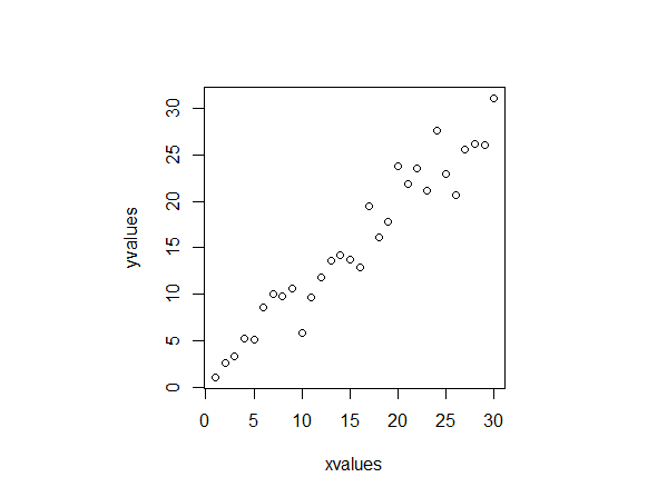
This is a plot of my data

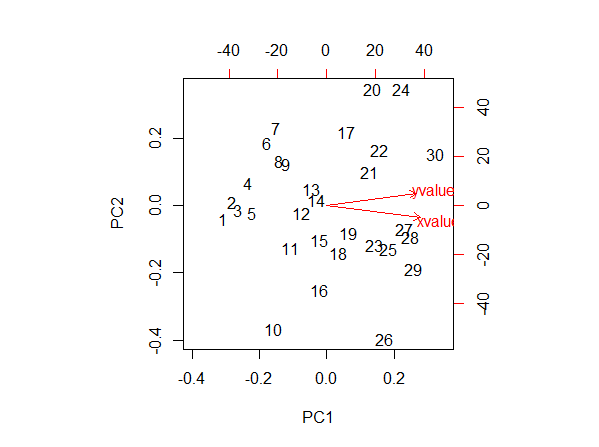
I do now a PCA and a biplot of it

According to Jeromy Anglim in: Interpretation of biplots in principal components analysis
The left and bottom axes are showing the loadings; the top and right axes are showing principal component scores.
I want to be sure I really get this.
Lets start with the loadings: these can be visualized in R by writing ´results$rotation´
(being: results <- prcomp(your_data))

          PC1        PC2
xvalues   0.7235616  -0.6902599
yvalues   0.6902599   0.7235616
Now lets look at the red arrow of xvalues. Its tip is around 0.25 in the x-axis of the loadings. But according to the loadings I have just writen, it should be around 0.72. What am I missing?
Finally, lets look at the point 1. According to the axes, that is telling me the principal component score. Is it that the coordinate in the new frame of reference? It doesn't make sense to me because I think that the new origin of the axes is around the point (15,15) in the Plot 3. If I look at that (and I guess that I am completely wrong here), the point one should have a coordinate around -20 or so, and not 40. Where is my mistake?
