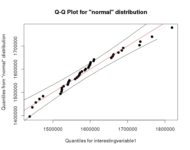
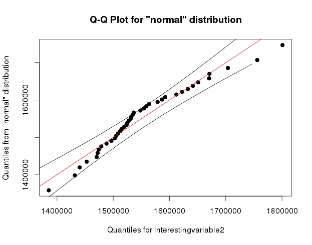
I have read enough thread here on QQplot to understand that a QQplot can be more informative than other normality tests. However, I am inexperienced with interpreting QQplot. I googled a lot; I found a lot of graphs of non-normal QQplot, but no clear rules on how to interpret them, other than what it seems to be comparison with know distribution plus "gut feeling". I would like to know if you have (or you know of) any rule of thumb to help you decide for non-normality. This question came up when I saw these two graphs:   I understand that the decision of non-normality depends on the data and what I want to do with them; however, my question is: generally, when do the observed departures from the straight line constitute enough evidence to make unreasonable the approximation of normality? For what it's worth, the Shapiro-Wilk test failed to reject the hypothesis of non-normality in both cases.