I could use some guidance about presenting some data.
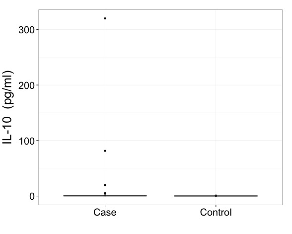
This first plot is a case-control comparison for the cytokine IL-10. I've manually set the y axis to include 99% of the data.

The reason I set this manually is because the case group has an extreme outlier.

My collaborators are hesitant to perform an outlier removal to our dataset. I'm OK with it, but they'd rather not. That'd be the obvious solution. But if I'm going to keep all the data and not remove this outlier, how can I present this boxplot optimally? Split axis? Is it acceptable to use just the first graph and note that it was constructed to include all the data? (This option feels dishonest to me). Any advice would be great.
